Key Takeaways:
- Data visualization converts complex information into intuitive charts and graphs, serving as a bridge between raw data and human understanding through formats like bar charts, line graphs, and heatmaps.
- Conventional tools like Excel require manual data processing and chart formatting, creating significant bottlenecks that often bury insights beneath technical complexity and time constraints.
- Modern solutions like Excelmatic use natural language processing to eliminate technical barriers, enabling instant visualization through simple conversation rather than complex manual processes.
The Data Dilemma: A Common Scenario
Let's walk through a common scenario many professionals face. Imagine it's 4 PM on a Thursday afternoon. Your manager asks you to pull key insights from last quarter's sales data for an important strategy meeting the next morning. You open the report and find a massive spreadsheet with 10,000 rows detailing product lines, regional performance, and customer segments.
As you start sorting, filtering, and creating pivot tables, you can sense there's valuable information hidden somewhere in this sea of numbers—but it remains just out of reach. The pressure builds, not because you don't have enough data, but because you're spending so much time and manual effort just trying to make the data tell a clear story.
This gap between having data and being able to easily understand what it means is exactly where traditional tools like Excel show their limitations. However, a significant change is taking place with the emergence of AI Data Visualization tools like Excelmatic. This time-consuming process is no longer unavoidable.
The What, Why, and How of Data Visualization
What is Data Visualization?
Data visualization is the process of converting raw data into visual formats like charts or maps. The human brain processes visual information much more efficiently than lists of numbers, making it easier to spot trends, patterns, and outliers that are difficult to detect in spreadsheets.
Why Does Data Visualization Matter?
Data visualization turns complex data into clear visual stories, making it easier to spot patterns and trends. Think of it as a translator that converts numbers into insights everyone can understand.
It's not just about making pretty charts—it's a powerful discovery tool that reveals hidden connections in your data. More importantly, it enables effective communication, helping teams align on goals and make confident decisions.
With modern live dashboards, you get real-time visibility into key metrics, allowing your organization to stay agile and responsive. Ultimately, data visualization bridges the gap between raw information and actionable understanding.
What Are the Common Types of Data Visualization?
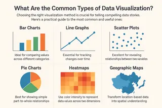
Choosing the right visualization method is crucial for telling compelling data stories. Here's a practical guide to the most common and useful types:
Bar Charts: Ideal for comparing values across different categories. Perfect for showing sales by region or performance metrics across teams.
Line Graphs: Essential for tracking changes over time. Excellent for monitoring stock prices, website traffic growth, or seasonal fluctuations.
Scatter Plots: Excellent for revealing relationships between two variables. Helps identify correlations between factors like advertising spend and revenue.
Pie Charts: Best for showing simple part-to-whole relationships. Works well for market share distribution or budget allocation.
Heatmaps: Use color intensity to represent data values across two dimensions. Valuable for showing user behavior patterns or performance metrics.
Geographic Maps: Transform location-based data into spatial understanding. Ideal for sales distribution or population density patterns.
The Traditional Approach: Data Visualization in Excel
For decades, Microsoft Excel has served as the fundamental tool for business data analysis. The process of creating visualizations within this environment remains largely manual and sequential, requiring considerable user expertise. It typically begins with the essential yet often tedious stage of data preparation—involving tasks like removing duplicates, standardizing formats, and organizing data into structured tables.
Once the data is properly organized, users face the manual task of selecting relevant cells and choosing from Excel's array of chart types. This often requires educated guessing to determine which visualization style would best represent their dataset.

However, creating the initial chart is merely the starting point. What follows is an extensive manual formatting process: adjusting color schemes for better clarity, refining axis labels for improved readability, and customizing legends to enhance data interpretation.
For users aiming to build more sophisticated dashboards, the complexity increases substantially. This typically involves combining multiple formulas, pivot tables, and intricate cell relationships. While this hands-on approach provides detailed control over the final output, it also creates significant workflow bottlenecks.
Users frequently find themselves torn between two demanding tasks: analyzing the actual data, and overcoming the technical challenges of creating effective visual representations. This divided attention often leads to "analysis paralysis," where users become overwhelmed by operational complexity. Even more concerning, valuable insights may remain undiscovered due to these practical constraints.
Excelmatic in Action: Transforming Data Visualization with AI
This is where AI Data Visualization marks a revolutionary departure. It introduces an intelligent layer between the user and the data, automating the technical heavy lifting and elevating the user to the role of a conductor rather than a single musician.
Let's take a concrete example using an AI-powered tool like Excelmatic. Imagine you have a spreadsheet containing monthly sales data for different regions and product lines. The traditional process would involve creating pivot tables and then building a chart. With AI Data Visualization, you could simply type a prompt: " According to the chart you think is suitable, display the monthly trend comparison of "sales revenue" based on the "Customer Region."

Excelmatic's AI immediately processes your request, automatically identifying key data columns such as "Month," "Customer Region," and "Sales Revenue." Within seconds, it generates a comprehensive multi-line chart showing regional trends, complete with proper labeling and formatting. But the real power lies in what happens next.
Based on the initial visualization, Excelmatic's AI can automatically detect and highlight key patterns in your data. For instance, it might identify that "South China consistently shows the highest sales revenue, while Western regions remain consistently lower" or notice that "North China experienced significant sales spikes in March and May." The system can then proactively suggest deeper analysis, asking if you'd like to "investigate the factors behind South China's strong performance" or "analyze the percentage change in sales month-over-month for each region."
Excelmatic doesn't just create charts—it becomes your analytical partner, helping you discover the stories behind your numbers and make data-driven decisions with confidence
Frequently Asked Questions (FAQ)
Q1: I'm not sure which chart type to use for my data. How can Excelmatic help?
A: This is exactly where Excelmatic shines. You don't need to be a data visualization expert. Simply describe what you want to see in plain language, like "show sales trends over time" or "compare regional performance." The AI will analyze your data structure and automatically select the most appropriate chart type, whether it's a line chart for trends, a bar chart for comparisons, or other visualization formats that best represent your data patterns.
Q2: What if the AI generates a chart that's not what I wanted?
A: No problem at all. This is where the conversational interface really helps. You can simply provide additional instructions like "make it a bar chart instead" or "focus only on the last 6 months." The AI will immediately regenerate the visualization based on your feedback. Think of it as having a conversation with a data analyst who instantly incorporates your suggestions.
Q3: How accurate are the insights generated by Excelmatic?
A: Excelmatic's analysis is based directly on your source data, ensuring mathematical accuracy. The AI follows strict analytical principles while identifying patterns and trends. However, we always recommend verifying that the AI has correctly interpreted your data columns and business context, especially when working with complex datasets for the first time.
Q4: What types of data analysis can Excelmatic perform besides basic charts?
A: BBeyond standard visualizations, Excelmatic can perform comparative analysis, trend identification, percentage calculations, and pattern recognition. You can ask questions like "show me the percentage growth month over month" or "which products are performing above average" to uncover deeper insights.
Ready to Transform Your Data Experience?
The era of struggling with complex formulas and endless menu options is over.
Try Excelmatic Today —— where asking a question is all it takes to get answers from your data.
Start Your AI Visualization Journey Here
No learning curve • No technical expertise required • Just instant insights
Your data has stories to tell —— let Excelmatic help you hear them.

