Key Takeaways:
Visual Project Blueprint: Gantt charts provide an intuitive visual framework for project planning, offering clear timeline visualization, task dependencies, and progress tracking across all project phases.
AI Revolution: Modern AI tools like Excelmatic have transformed Gantt chart creation, enabling instant generation and dynamic updates through simple natural language commands instead of manual spreadsheet work.
Practical Efficiency: Traditional Excel-based Gantt chart creation is complex, labor-intensive, and prone to errors. AI-powered solutions dramatically improve efficiency by automating the entire process, allowing teams to focus on execution rather than manual chart maintenance.
The Modern Project Management Dilemma
In today's fast-paced work environment, effective project management is more critical than ever. Yet without the right tools, staying on top of multiple tasks, deadlines, and dependencies can quickly become overwhelming. How often have you found yourself smoothly checking off to-do's, only to run into an unexpected bottleneck? Before you know it, timelines slip, resources stretch thin, and that sense of control starts to fade.
More often than not, this kind of chaos stems from task dependencies — those subtle but critical links between activities that, when left unmanaged, quietly dictate the fate of your project.
What is a Gantt Chart?
A Gantt chart is a specialized project management tool that uses horizontal bars to provide a clear visual representation of project tasks, timelines, and key deadlines. It offers an intuitive overview of the entire project schedule in one glance.
While similar chart styles date back to the late 19th century, it was American engineer Henry Gantt who popularized this visualization method in the early 20th century. Since then, Gantt charts have been widely adopted across industries — from manufacturing and construction to software development and marketing.
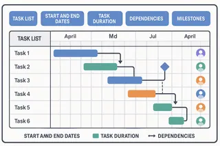
A standard Gantt chart includes several key elements that make it so effective:
- Task List: A breakdown of all activities required to complete the project
- Start and End Dates: The planned beginning and completion times for each task
- Task Duration: How long each activity is expected to take
- Dependencies: Relationships between tasks (e.g., one task must finish before another can start)
- Assigned Owners: Team members responsible for each activity
- Milestones: Key checkpoints or significant achievements in the project timeline
Why Gantt Charts Remain Indispensable for Project Success
The true value of a Gantt chart lies in its ability to visualize task sequences and timelines, simplifying the management of even the most complex projects. By providing a shared source of truth, it ensures every team member clearly understands their responsibilities, task dependencies, and deadlines — fostering better collaboration and more efficient workflows.
For decades, Gantt charts have been indispensable in project management for visualizing tasks, dependencies, and progress. However, traditional methods of creating them have often been time-consuming, labor-intensive, and prone to human error.
The emergence of AI-powered Gantt chart tools like Excelmatic is now revolutionizing this landscape, bringing unprecedented accuracy, speed, and adaptability to project visualization.
How to Generate a Gantt Chart with Excelmatic in 3 Steps
Creating a professional Gantt chart no longer requires hours of manual formatting in a spreadsheet. With Excelmatic, you can transform a simple task list into a dynamic project timeline through a simple, conversational workflow.
Step 1: Prepare Your Project Plan
Start by organizing your core project information into a clear, structured format. You can use a simple table with the following columns:
| Task ID | Task Name / Phase | Start Date (YYYY-MM-DD) | End Date (YYYY-MM-DD) | Duration (Days) | Progress (%) | Key Details / Deliverables |
|---|---|---|---|---|---|---|
| 1 | xxxxxxx | 20xx-xx-xx | 20xx-xx-xx | xx | xx% | xxxxxxxxxxxxxxxxxxxx |
| 1.1 | xxxxxxx | 20xx-xx-xx | 20xx-xx-xx | xx | xx% | xxxxxxxxxxxxxxxxxxxx |
| 1.2 | xxxxxxx | 20xx-xx-xx | 20xx-xx-xx | xx | xx% | xxxxxxxxxxxxxxxxxxxx |
The table we used to create the Gantt chart today is as follows:

Step 2: Provide a Clear Instruction to Excelmatic
This is where the magic happens. Instead of complex software menus, you simply tell Excelmatic what you need. Copy your project table and provide a clear, instructional prompt.
Basic Prompt Example:
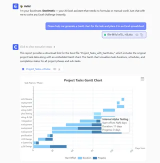
"Please help me generate a Gantt chart for the task and place it in an Excel spreadsheet"
Advanced Prompt for Better Results:
If you want to view more exquisite and insightful charts, you can further inquire
"What are the dependencies between the tasks in the Gantt chart?"
Step 3: Utilize Your Instantly Generated Chart
Option A: Direct Use
Excelmatic will directly present you with a fully-formed Gantt chart, ready for immediate use. You can review it with your team, share it in reports, or use it to track progress.
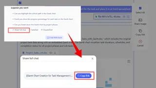
Option B: Advanced Customization (For a Rendered, Multi-colored Chart)
If you require a more stylized chart for a presentation or a specific platform, you can take it a step further. Simply ask Excelmatic to provide the chart in a standard code format (like Mermaid JS).
Example Prompt:
"Please provide the Mermaid JS code for this Gantt chart so I can render it elsewhere."
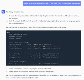
You can then copy this clean, precise code into a dedicated diagram tool (like the Mermaid Live Editor) to generate a high-fidelity, visually customizable version with 3D effects, diverse color schemes, and other advanced styling.
The Traditional Path: Manually Building a Gantt Chart in Excel
Creating a Gantt chart in Excel involves a logical sequence of steps. While it may appear straightforward at first, the process requires careful execution to produce a clear and accurate visual timeline. Below is a general outline of how it's done.
Prepare the Project Data Table
Begin by organizing the core project details into a structured table. Essential columns typically include Task Name, Start Date, and Duration. The Duration can be in days, weeks, or another consistent unit.Generate a Stacked Bar Chart
Using your prepared data, insert a "Stacked Bar Chart" into the worksheet. This type of chart is the foundation upon which the Gantt visualization is built.Refine the Data Series
This is a crucial and non-intuitive step. You must add the "Duration" data as a new series to the chart. Then, you will format the "Start Date" series by making it transparent — effectively rendering it invisible. This clever trick leaves only the "Duration" bars visible, positioned correctly along the timeline according to their start dates.Adjust the Task Order
By default, Excel often lists tasks in the chart in reverse order. To correct this and display tasks from top to bottom logically, you must access the axis formatting options and select the setting to show "Categories in reverse order."Apply Final Formatting The final phase involves manual polishing to improve readability. This includes fine-tuning the date range on the horizontal axis, adjusting bar colors and spacing for clarity, and adding labels or a title.
The Hidden Challenges of the Manual Process
While the steps above provide a simplified roadmap, the practical execution is often fraught with difficulties. The process is inherently manual and static, leading to several key challenges:
- Managing Dependencies: Visualizing task relationships (e.g., Task B cannot start until Task A finishes) is not a native feature. You must manually draw and maintain connector lines and arrows, which is time-consuming and difficult to keep updated.
- Handling Project Updates: Any change to a task's timing creates a domino effect. You are forced to manually recalculate dates, adjust the corresponding bars, and reposition all dependency lines, a process that is both tedious and prone to errors.
- Fragile Formatting: The chart is easily disrupted. Simply adding a new task or adjusting the data range can break the formatting, requiring you to repeatedly troubleshoot axis scales and layout issues.
This manual method is not just cumbersome; it diverts valuable time from actual project management to the technicalities of graphic maintenance. It highlights precisely why leveraging artificial intelligence is a game-changer. AI tools can interpret a simple project list and instantly generate a dynamic, professional Gantt chart, freeing you from the burdensome mechanics of building and updating it by hand.
Manual vs. AI-Powered Gantt Chart Creation
Creating a Gantt chart doesn't have to be a complex, manual task. Here's a quick comparison of the traditional and modern AI-driven approaches.
| Aspect | Manual Method (e.g., Excel) | AI-Powered Method (e.g., Excelmatic) |
|---|---|---|
| Process | Complex, multi-step formatting requiring chart manipulation expertise | Simple, conversational workflow using natural language commands |
| Speed | Time-consuming; can take hours to build and format | Instant; generates a complete chart in seconds |
| Updates | Manual and tedious; changing one task requires recalculating and reformatting | Dynamic and automatic; a simple command updates the entire timeline |
| Dependencies | Difficult to manage; requires manually drawing and maintaining connector lines | Handled automatically; the AI maps task relationships based on your instructions |
| Accuracy | Prone to human error in calculations, formatting, and updates | Highly accurate; directly reflects your input data without manual errors |
| Flexibility | Static and fragile; adding tasks or changing data can break the chart | Dynamic and adaptable; easily accommodates changes and customizations |
| Primary Focus | Chart mechanics and manual maintenance | Project strategy and execution |
In short, AI doesn't just make creating Gantt charts faster—it transforms them from a static report into a dynamic, intelligent tool that grows with your project.
Frequently Asked Questions (FAQ)
Q1: What technology powers AI Gantt chart generation?
A: It primarily uses Natural Language Processing (NLP) and chart generation models that understand your project description and automatically convert it into structured timeline visualizations.
Q2: Can AI handle complex task dependencies?
A: Absolutely. When you clearly specify relationships in your prompt, the AI accurately maps predecessor-successor links and critical paths in the resulting chart.
Q3: How accurate are AI-generated Gantt charts?
A: They're precisely based on your input data. The AI eliminates manual formatting errors, ensuring bar lengths and dates directly reflect your provided information.
Conclusion: Step into the Future of Visualization
The Gantt chart remains one of the most effective methods for managing and visualizing projects. With AI-driven tools like Excelmatic, you can quickly generate dynamic and customizable charts, which enhances planning, execution, and collaboration.
Whether you are a project manager or a team contributor, mastering the use of Gantt charts can help you maintain clarity, ensure that projects proceed as planned, and achieve better results.
Traditional use of Excel to create Gantt charts is quite complex. With Excelmatic, you can completely skip these tedious steps. Just provide your project list, and our AI will immediately generate a dynamic and professional Gantt chart for you.
Plans will always change, and when they do, a simple command can automatically update the entire timeline. Save your time, eliminate human errors, and focus on what truly matters: leading your project to success.
Visit Excelmatic today and experience the future of project visualization.


