Key Takeaways:
- Creating histograms in Excel traditionally requires navigating complex menus, setting up bin ranges, and dealing with formula syntax that confuses many business users
- Excelmatic eliminates the technical complexity by allowing you to generate histograms using simple language commands like "create a histogram of age data"
- Compared to Excel's built-in tools, Excelmatic automatically handles bin sizing, chart formatting, and data analysis without manual configuration
- For professionals needing quick data insights, the AI approach delivers professional-looking histograms instantly, making data visualization accessible to everyone
Think of histograms as enhanced bar charts that illustrate how your data is distributed—for instance, how many students scored between 80 and 90 on a test or how often a specific sales figure appears. Unlike regular column charts that compare individual values, histograms group numbers into ranges (or "bins"), allowing you to spot trends and patterns quickly.
And the best part? You don’t need to be an Excel wizard to create one. While Excel provides multiple ways to get the job done—from built-in tools to complex formulas—what if you could skip the steps entirely? Modern AI tools now offer an even faster path.
This guide will break down everything into simple, easy-to-follow steps. We'll start with the revolutionary AI approach and then cover the traditional Excel methods. By the end, you’ll be able to create histograms like a pro, choose the method that best suits your needs, and impress your boss, professor, or even yourself.
What Is a Histogram in Excel?
A histogram is a type of chart that displays the frequency distribution of numerical data. It groups data into intervals, known as bins, and shows the number of occurrences in each bin as a bar.
You might be wondering, how do histograms differ from column charts? Three things:
- Grouped Data: Histograms show grouped data distributions, while column charts compare individual values.
- Numeric Sequence: Histogram bins follow a numeric sequence, whereas column charts use categorical labels.
- No Gaps: Histogram bars typically have no gaps, reinforcing the idea of continuous data.
For example, a histogram can display student exam scores grouped into ranges, such as 0-50, 51-70, and 71-100, rather than individual scores.
Method 1: The Instant AI-Powered Way with Excelmatic

Before diving into manual methods, let's explore the fastest and most intuitive approach: using an Excel AI Agent like Excelmatic. Instead of clicking through menus or writing formulas, you simply ask for what you want in plain language. Excelmatic handles the data analysis, chart generation, and formatting for you.
For this section, we will use the same Age Distribution Dataset.
1. Upload Your Data
Navigate to Excelmatic and upload your Excel file containing the People Age Data.
2. Ask in Plain Language
In the chat interface, simply type your request. For example:
Create a histogram of the Age column
Or, you can be more specific:
Show me the distribution of ages with a bin width of 10
3. Get Your Chart Instantly
Excelmatic will analyze your data and instantly generate a perfectly formatted histogram based on your request. There's no need to select data ranges, format axes, or adjust gap widths manually.

This AI-driven approach not only saves time but also eliminates the potential for manual errors, making it ideal for both beginners and seasoned analysts who need fast, accurate reports.
Method 2: Creating a Histogram Using Excel's Built-in Chart
If you prefer the hands-on approach and are using Excel 2016 or later, the built-in histogram chart is an excellent option.
1. Select your data
- Open the Excel file and navigate to the sheet containing the People Age Data.
- Select the Age column (excluding the "Name" column).
2. Insert a histogram chart
- Click on the Insert tab in the ribbon.
- Go to Insert Statistic Chart → Histogram.
- Excel will generate a default histogram chart based on your selected data.
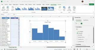
3. Adjust the bin settings
- Click on the horizontal axis of the chart.
- Right-click and select Format Axis.
- Under the Axis Options panel, locate the Bin settings.
- Adjust the bin width manually or let Excel determine it automatically.
- Optionally, use the Overflow Bin and Underflow Bin to group extreme values.
4. Customize the chart
Modify the title, colors, and labels to enhance clarity and visual appeal.

Method 3: Creating a Histogram in Excel Using Formulas
For ultimate control and compatibility with all Excel versions, you can use formulas to calculate frequencies before creating a chart. We'll cover two functions: COUNTIFS() and FREQUENCY().
Using COUNTIFS() to create a custom histogram
This method gives you full control over defining your bins.
1. Create bin ranges
If not already available, manually create the bin ranges. For our example, we can create a helper column that categorizes each age. In cell C2, enter this formula and drag it down:
=IF(B2<=24, "18-24", IF(B2<=34, "25-34", IF(B2<=44, "35-44", IF(B2<=54, "45-54", IF(B2<=64, "55-64", "65-79")))))
In Column E, list the unique bin labels ("18-24", "25-34", etc.) that will be used for your chart's axis.
2. Calculate frequency using COUNTIFS()
In Column F (Frequency), next to your unique bin labels, we'll count the occurrences. This formula cleverly extracts the lower and upper bounds from your text-based bin labels. In F2, enter the following formula and drag it down:
=COUNTIFS(Age_Numbers,">="&LEFT(E2,2),Age_Numbers,"<="&RIGHT(E2,2))
Note: This formula assumes "Age_Numbers" is the named range for your age data.
3. Create a histogram chart
- Select Column E (Bins) and Column F (Frequency).
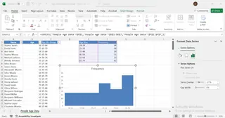
- Go to Insert → Column Chart → Clustered Column.
- Right-click the bars and select Format Data Series.
- Set Gap Width to 0% to make it look like a histogram.
4. Customize the chart as needed.

Using the FREQUENCY() function for dynamic histograms
The FREQUENCY() function is an array formula that dynamically counts how many values fall within specified ranges.
1. Define bins
- In a column (e.g., Column D), list the upper boundaries of your bins (e.g., 24, 34, 44, 54, 64, 79).
- In an adjacent column (Column E), list the corresponding bin labels ("18-24", "25-34", etc.) for your chart.
2. Apply the FREQUENCY() function
Select the range of cells where you want the frequencies to appear (e.g., F2:F7) and enter the formula:
=FREQUENCY(B2:B105, D2:D7)
Where:
B2:B105is the range containing the ages.D2:D7is the range containing the bin upper limits.
If you are not using Microsoft 365, you may need to press Ctrl + Shift + Enter to apply this as an array formula.
3. Create the histogram
- Select your bin labels (Column E) and the frequency counts (Column F).
- Go to Insert → Charts → Clustered Column Chart.
- Format the chart to remove gaps between bars (Gap Width to 0%).
- Adjust axis labels and title for clarity.

Method 4: Creating a Histogram Using the Data Analysis ToolPak
For users of older Excel versions, the Data Analysis ToolPak is a powerful add-in that can generate a histogram with just a few clicks.
First, enable the add-in:
- Go to File → Options → Add-ins.
- In the Manage box, select Excel Add-ins and click Go.
- Check the Analysis ToolPak box and click OK.
Now you are ready to generate a histogram:
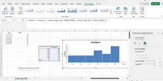
- Go to the Data tab and click Data Analysis.
- Select Histogram from the list and click OK.
- Set the Input Range to your age data and the Bin Range to your predefined bin upper boundaries.
- Choose an Output Range and check the Chart Output box.
Finally, customize the chart by adjusting bin width, labels, and formatting.

Excel Histogram Best Practices
Avoid common issues by keeping these tips in mind:
- Choose appropriate bin sizes: Too few bins can oversimplify the data, while too many can clutter the chart and hide the pattern.
- Remove gaps: A true histogram has no gaps between bars. Always set the Gap Width to 0% if you're using a column chart.
- Label axes clearly: Ensure your horizontal and vertical axes are clearly labeled so there is no room for misinterpretation.
- Use the right data type: Histograms are designed for numerical, continuous data.
- Interpret correctly: Remember, a histogram shows the frequency of data within intervals, not a comparison of discrete categories like a bar chart.
Pros and Cons of Each Histogram Method
| Method | Pros | Cons |
|---|---|---|
| Excelmatic (AI Agent) | Extremely fast and easy; no Excel skills needed; handles complex requests in plain language. | Requires an internet connection; operates outside the native Excel environment. |
| Built-in Histogram Chart | Very easy to use; quick to create; integrated into Excel. | Only available in Excel 2016 and later; limited flexibility compared to formulas. |
| COUNTIFS Function | Works in all Excel versions; allows for fully custom bin definitions. | Requires manual setup of bins and formulas; more time-consuming. |
| FREQUENCY Function | Updates automatically when data changes (dynamic). | Can be tricky for beginners to set up, especially older array formula versions. |
| Data Analysis ToolPak | Performs all calculations for you; fast setup once enabled. | Requires enabling an add-in; generates a static chart that doesn't update with data changes. |
Conclusion
Creating a histogram in Excel is a powerful way to visualize data and understand frequency distributions. From the instant results of an AI agent like Excelmatic to the hands-on control of Excel's built-in tools and formulas, you have a range of options at your disposal.
For speed and simplicity, the AI approach is unmatched. For control and customization within the Excel environment, the built-in chart or formula-based methods are excellent choices. Just remember to select the appropriate bin size, remove gaps between bars, and clearly label your axes for an accurate, professional-looking chart.
Ready to create histograms effortlessly? Try Excelmatic today and experience the ease of generating professional data visualizations with simple language commands.
FAQ
What is a histogram in Excel?
A histogram is a chart that displays the frequency distribution of numerical data by grouping values into bins, making it easier to identify patterns.
How is a histogram different from a column chart?
Unlike column charts, histograms group data into ranges (bins) and show distributions, whereas column charts compare individual data points.
Can I create a histogram in older Excel versions?
Yes! You can use formulas like COUNTIFS() or enable the Data Analysis ToolPak to create histograms in Excel versions before 2016.
How do I adjust bin size in a histogram?
In Excel’s built-in histogram tool, you can right-click the horizontal axis, select Format Axis, and adjust the bin width manually in the Axis Options panel.
What’s the easiest way to make a histogram in Excel?
The absolute easiest way is to use an AI tool like Excelmatic, where you just upload your file and ask for a histogram. If you're using Excel 2016 or later, the built-in histogram chart is the quickest manual method.


