In schools, training centers, and bootcamps, student score tracking often starts with good intentions and ends in spreadsheet chaos. Teachers and academic managers find themselves stuck between grading, calculating averages, and generating performance reports—all inside Excel.
Sounds familiar?
Let’s say you want to know:
Which students are consistently underperforming in Science?
Who has improved the most across subjects?
How many students received an average score above 85?
Sure, you can do this manually in Excel. But if you’ve ever fought with IF(), AVERAGE(), conditional formatting, or chart wizard popups, you know—it’s not always straightforward.
The Traditional Way: You Need Time, Formulas, and Patience
Let’s take a common task: class performance distribution by grade.
Here's how you’d do it with standard Excel:
Calculate average scores across all subjects with a formula like:
=AVERAGE(B2:E2)— assuming B to E are subject columns.Assign letter grades using nested
IF()orIFS()functions:=IF(F2>=90, "A", IF(F2>=80, "B", IF(F2>=70, "C", IF(F2>=60, "D", "F"))))Summarize grade counts using
COUNTIF()per letter grade.Build a grade distribution chart with a bar graph from the count data.
Create conditional formatting rules to highlight students below 60, top performers, or large subject gaps.
Copy your chart into a report or PDF, and hope no one asks to change the range or grade thresholds at the last minute.
Each step opens the door to potential error—especially when you duplicate tabs for multiple classes, reuse spreadsheets each semester, or let different instructors tweak the logic.
Excelmatic to the Rescue: Skip the Formulas. Just Ask.
Now imagine uploading that exact Excel file to Excelmatic, and simply typing:
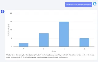
Show a Bar Chart of grade distribution.

List students with a score below 65 in any subject.
Who improved the most from Math to Science?

Instead of building formulas and pivot charts, Excelmatic gives you instant answers: summaries, charts, filters, or tables—all from plain English prompts.
It’s fast, visual, and forgiving. And best of all: it doesn’t care if your columns are out of order or if your sheet names aren’t perfect.
Excel vs Excelmatic: What’s the Real Difference?
| Task | Traditional Excel | Excelmatic AI |
|---|---|---|
| Average Score Calculation | Manual with AVERAGE() formula |
Ask: “What is the class average?” |
| Grade Assignment | Nested IF() logic |
Done for you automatically |
| Chart Creation | Build manually with selected data | “Draw grade distribution Bar Chart” |
| Filtering Underperformance | Use filters + conditions | “Who scored under 60 in any subject?” |
| Report Generation | Copy/paste charts + explain logic | Download chart and insights in seconds |
Real Insight, Without the Excel Gymnastics
Whether you're managing a classroom, a training program, or internal skill benchmarks, analyzing performance should be about decisions—not decoding formulas.
Excelmatic helps you skip the grunt work and get straight to insight. Want to compare two students? See progress across subjects? Summarize top and bottom performers?
Just upload your spreadsheet. Ask your question. Get the answer.
Simple.
Try Excelmatic Now
Experience how fast, visual, and human-friendly Excel analysis can be. Say goodbye to formulas and hello to clear student performance insights.


