You know that feeling when someone sends you an Excel file and says, “Can you make a chart from this?” — but the data is a mess?
Same. That used to mean hours of cleaning before I could even think about analysis.
Now, I’ve got a shortcut:
- Use ChatGPT to help clean up, restructure, or extract useful columns
- Use Excelmatic to turn the clean data into charts and summaries
Here’s how I use them together — with real examples.
Scenario 1: Cleaning Customer Feedback Data (and Charting Themes)
The raw Excel snippet:
| Name | Feedback | Region | Date |
|---|---|---|---|
| John | too slow, not friendly | West | 1/3/24 |
| Sara | GOOD SERVICE but bit pricey | EAST | 2024.01.04 |
| Mark | ok experience, clean place | west | 3-Jan-2024 |
| ALEX | rude staff | east | 01/04/24 |
| Lauren | GREAT! Loved the quick support. | West | Jan 4 2024 |
Step 1: Clean it with ChatGPT
Prompt I gave:
“Can you standardize this feedback table? Capitalize names, normalize regions, fix date formats to YYYY-MM-DD, and classify the sentiment as Positive, Neutral, or Negative based on Feedback.”
ChatGPT gave me back:
| Name | Feedback | Region | Date | Sentiment |
|---|---|---|---|---|
| John | too slow, not friendly | West | 2024-01-03 | Negative |
| Sara | GOOD SERVICE but bit pricey | East | 2024-01-04 | Neutral |
| Mark | ok experience, clean place | West | 2024-01-03 | Neutral |
| Alex | rude staff | East | 2024-01-04 | Negative |
| Lauren | GREAT! Loved the quick support. | West | 2024-01-04 | Positive |
Step 2: Upload to Excelmatic
I uploaded the cleaned table and typed:
“Show a chart of sentiment by region and summarize key patterns.”
Excelmatic returned:
- A stacked Bar Chart (Positive / Neutral / Negative by region)
- Summary:
WEST region shows a clearly positive sentiment dominance, with twice as many positive feedbacks compared to negative.
EAST region has no positive feedback in the data but a balanced mix of negative and neutral sentiments.
Both regions have negative feedback, suggesting some dissatisfaction areas needing attention.
✅ Took less than 2 minutes total.
Scenario 2: Fixing Sales Log Exports (And Finding What’s Selling)
Original data (cut from a CSV dump):
| Date | Item | Units | Total |
|---|---|---|---|
| 2024/1/3 | red tshirt (m) | 3 | $45.00 |
| 3-Jan-2024 | T-Shirt - Red M | 2 | 30 USD |
| Jan 3 2024 | RED TEE MEDIUM | 4 | 60.00 |
Yes, it’s all the same item — but not really.
ChatGPT to the rescue:
Prompt:
“Standardize item names (e.g. ‘red t-shirt medium’), make sure totals are numeric, and combine identical items with aggregated totals.”
📄 Output:
| Date | Item | Units | Total |
|---|---|---|---|
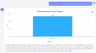
| 2024-01-03 | Red T-Shirt M | 9 | 135 |
🎯 Then I uploaded to Excelmatic and asked:
“Do a chart of sales + dollars by product category with a paragraph of analysis.”
📈 Result: A simple Bar Chart and trendline + summary of what sold when.

Scenario 3: Quarterly Spend by Department — But the Data’s a Mess
| Dept | Budget | Actual Spent | Notes |
|---|---|---|---|
| HR | $5,000 | $5300 | good Q1, new hire |
| Ops | 6000 | 6200.00 | delayed maintenance |
| Mkt | 7000 | $6500 | Q1 ad campaign underused |
ChatGPT prompt:
“Clean this budget table: format all currencies, rename depts properly, and show variance.”
Cleaned result:
| Department | Budget | Actual | Variance |
|---|---|---|---|
| HR | 5000 | 5300 | +300 |
| Operations | 6000 | 6200 | +200 |
| Marketing | 7000 | 6500 | -500 |
Excelmatic prompt:
“Create charts that show budget vs. actual for each department and show overspending.”
Result: bars chart:
“HR and Operations departments have exceeded their budgets, with overspend amounts of 300 and 200 respectively.Marketing department remains within budget.”
Why This Combo Works
On their own, ChatGPT and Excelmatic are useful. Together? They’re kind of magic.
- ChatGPT is great at making messy data usable
- Excelmatic is great at turning cleaned data into insights
If your work involves getting messy Excel files and turning them into something useful, this workflow will save you time, clicks, and energy.
Give it a shot — next time someone drops a messy CSV on your desk.
👉 Try Excelmatic FREE now! and pair it with ChatGPT next time you're cleaning up a mess.


