Key Takeaways:
- The Challenge: Your raw data is often a jumble of all regions, all time periods, and all categories, making it useless for creating a specific chart directly.
- The Old Way: In Excel, this requires a tedious process: first, you filter the data; then, you create a PivotTable to summarize it; and finally, you can insert a chart.
- The AI Way: Use a single sentence to give both the "filter" and "chart" instructions at once, getting you directly to the final pie chart.
"Which product category is our top performer in the Chicago market?" When you get a question like this, you need a pie chart—something that clearly shows parts of a whole—not a wall of raw numbers.
Why Are You Drowning in Clicks to Create One Simple Chart?
Imagine you have a master sales spreadsheet with five years of data covering every city and product. Your task is to create one pie chart showing the sales breakdown by product category, but only for Chicago and only from 2020 to 2023.
In Excel, your workflow would look something like this:
- Filter Data: First, you apply a filter for "Chicago" in the city column. Then, you set up a custom date filter for the range between January 1, 2020, and December 31, 2023.
- Summarize Data: The filtered data is still just a list of individual sales. You must create a PivotTable, dragging "Product Category" to Rows and "Sales" to Values to get the totals for each category.
- Insert Chart: Finally, with your PivotTable complete, you can select that summary and insert a pie chart.
You've just navigated a frustrating maze of filters, clicks, and PivotTables for one simple chart. And when your boss asks the dreaded follow-up, "Great, now how about New York?", you have to start the whole process over again.
Ask a Question, Don't Build a Report
In the past, you were the data filterer, the report builder, and the chart creator. Now, you can hand all three jobs to AI.
Excelmatic is built to understand complex requests in plain English, intelligently combining separate tasks into a single, seamless action.
| Comparison | Traditional Excel Charting | Excelmatic |
|---|---|---|
| Workflow | Filter → Pivot → Chart (3 separate jobs) | Ask a Question (1 seamless step) |
| Speed | Slow, measured in minutes | Fast, measured in seconds |
| Flexibility | Low; changing criteria means starting over | High; just change a few words in your question |
| The Outcome | A chart based on your manual work | A chart that directly answers your question |
Excelmatic transforms you from a data processor into an insight finder.

Get Your "Answer Chart" in Three Steps
Let's use the "Chicago market analysis" scenario to see Excelmatic in action.
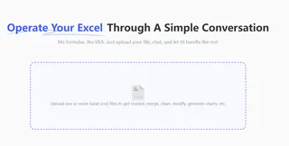
Step 1: Upload Your Master Spreadsheet
Simply upload the complete, unfiltered sales spreadsheet. Don't worry about cleaning it up first.

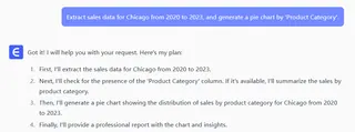
Step 2: Ask Your Analysis Question in One Sentence
In the chat box, clearly state the data you want and the chart you need:
“Extract sales data for Chicago from 2020 to 2023, and generate a pie chart by 'Product Category'.”

Step 3: Get the Presentation-Ready Pie Chart Instantly
With no intermediate steps, Excelmatic will:
- Automatically filter the data for "Chicago" within the specified date range.
- Automatically group and sum the sales figures by "Product Category."
- Instantly render the results as a clean, properly-labeled pie chart.
You don't get a half-finished chart; you get an "answer chart" ready for your presentation or report.
Frequently Asked Questions (FAQ)
1. Can the AI handle more complex filtering? Absolutely. You can make your requests as specific as you need. For example: "Show me a pie chart for 'Electronics' and 'Office Supplies' sales in 'Chicago' and 'New York' for last year." The AI will understand and execute it.
2. Can it create charts other than pie charts? Yes. You can specify any appropriate chart type at the end of your command, such as "...and generate a bar chart" or "...and show the trend with a line graph." Excelmatic will create the chart that best fits your request.
3. My raw data isn't summarized. Can the AI calculate the totals? That's one of its core strengths. You don't need to provide pre-summarized data. The AI reads your command (e.g., "...by 'Product Category'") and automatically performs the necessary grouping and calculations, saving you from the hassle of PivotTables.
Your Value Is in the 'Why,' Not the 'How'
Spend your time understanding what the pie chart means for the business—which slice is biggest? Why? What should we do next?—not on the tedious steps it takes to create it.
Let AI handle the heavy lifting of turning massive datasets into clear, actionable visuals.
Try Excelmatic now and get a clear picture of your data in a single sentence!


