Key Takeaways:
- Creating frequency distributions in Excel traditionally requires complex formulas, Pivot Table configuration, or add-in setup that challenges non-technical users
- Excelmatic eliminates formula memorization and manual steps by allowing you to generate frequency distributions using simple language commands
- Compared to traditional methods that require bin definition and formula writing, Excelmatic handles the entire analysis with a single instruction and provides instant results
- For business professionals analyzing customer data, sales patterns, or operational metrics, Excelmatic transforms complex statistical analysis into accessible, time-saving insights
A frequency distribution, often visualized with a frequency histogram, organizes data points into specified ranges, allowing for an easy understanding of how often each value occurs. This technique is vital for identifying patterns, trends, and potential outliers, providing deeper insights into the data.
This tutorial will explore frequency distributions, their significance in data analysis, and how to create them. We will walk through a step-by-step guide to generating a frequency distribution for a real-world dataset using both traditional Microsoft Excel methods and Excelmatic's modern AI tools, helping you choose the best approach for your needs.
The Quick Answer: How to Create a Frequency Distribution in Excel
There are two main paths to creating a frequency distribution in Excel: the AI-powered way and the manual way.
- The AI Method (Easiest): Use an AI tool like Excelmatic. Simply upload your spreadsheet, and ask in plain language, "Create a frequency distribution for the customer age data, grouped in 10-year intervals." The AI handles all the steps and provides an instant table and chart.
- The Manual Method: Use Excel's built-in features. The most direct function is
FREQUENCY(). Start by defining your data and bin ranges, then use the formula=FREQUENCY(data_array, bins_array)to calculate the distribution. Other manual methods include Pivot Tables and the Data Analysis ToolPak.
This guide will cover both approaches in detail.
Why Frequency Distributions Are Important
A frequency distribution is a statistical technique that organizes data into categories or intervals. Generally, the result is a table displaying the number of observations for a provided interval of the underlying data.
Frequency distributions are helpful in several ways:
- Summary of Data: They summarize large datasets in an organized and understandable manner, allowing for a quick overview of the distribution of values.
- Visual Representation: The frequency distribution can be easily represented as histograms and pie charts, giving a visual understanding of the data.
- Identifying Patterns, Trends, and Outliers: They reveal patterns in the data, such as peaks, clusters, and outliers. This can be used in statistical analysis to explore the shape and characteristics of data further.
- Comparison of Data: The distribution of values enables you to compare different datasets and understand their similarities and differences.
- Communication: They can be used as a simple and effective tool for communicating insights from the data to a broader audience, including decision-makers.
- Decision-Making: A clear understanding of the distribution and its patterns helps in decision-making. For example, understanding the supply of goods by season will assist in deciding when to make purchases.
Now that we’ve understood frequency distributions and their importance, let’s dive into several methods to create them in Microsoft Excel.
Methods to Create a Frequency Distribution in Excel
Imagine you work for a cosmetic company that offers products for a wide range of age groups. Now, they are looking to specialize in a few products targeting the specific age group that has more customers. To understand that, you’re tasked with analyzing the customers by age group.
To address this, they have sampled data on customer age from the customer database. The following table has been given to you:
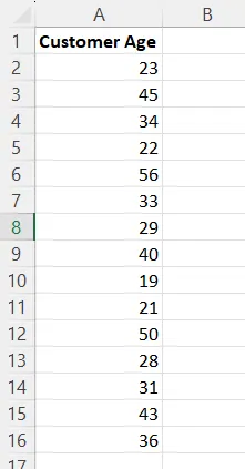
As part of analyzing demand by customer age group, you’ve realized that calculating the frequency distribution will be a good starting point. Here are five methods to calculate the frequency distribution, starting with the fastest and easiest.
Method 1: Using an AI Excel Agent (The Excelmatic Way)

The fastest way to get a frequency distribution without writing formulas or navigating complex menus is by using an AI-powered tool like Excelmatic. It's an AI agent designed to understand plain English commands and perform Excel tasks for you.
With Excelmatic, the multi-step manual process becomes a simple, two-step conversation.
- Upload Your File: Drag and drop your Excel file containing the customer age data into Excelmatic.
- State Your Request: In the chat interface, simply type what you need. For this example, you would ask:
Create a frequency distribution for the Customer Age column. Group the ages by these bins: 20, 30, 40, 50, 60.
Excelmatic will instantly process your request and generate a clean, accurate frequency distribution table, just like the ones created by the manual methods below. It can also create a histogram chart to visualize the data if you ask.
Why this is better:
- Speed: It's instantaneous. No need to define bins manually in a separate column, write formulas, or configure Pivot Tables.
- Simplicity: You don't need to remember function syntax (
FREQUENCY,COUNTIFS) or the steps to create and group a Pivot Table. Just ask. - Accuracy: The AI handles the logic, reducing the risk of human error in formula writing or range selection.
For those who prefer to work directly within the Excel interface or want to understand the underlying mechanics, the following traditional methods are powerful alternatives.
Method 2: Using the FREQUENCY() function
The FREQUENCY() function is Excel's dedicated tool for calculating frequency distributions. It returns a list that shows the frequency of values at given intervals.
Here is the syntax of the FREQUENCY() function:
=FREQUENCY(data_array, bins_array)
The function takes two parameters:
data_array: An array of or reference to a set of values for which you want to count frequencies.bins_array: An array of or reference to intervals (bins) into which you want to group the values.
For this use case, we can define the bins as <20, 20–30, 30–40, 40–50, 50–60 and >60. Fill out column B in your worksheet, as shown below.
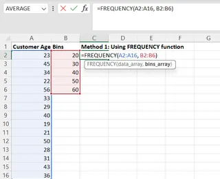
Having prepared the data_array and bins_array, write the formula to calculate the frequency distribution in cell C2.
=FREQUENCY(A2:A16, B2:B6)
The output from executing the above formula will look like the following:
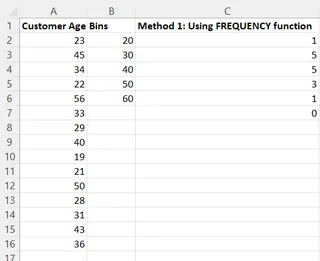
Looking at the frequency distribution above, we see:
- The company has only one customer who is less than 20 years old.
- Five customers are in the age range of 20–30 and 30–40.
- Three customers are in the age range of 40–50.
- One customer is in the age range of 50–60.
- No customers are older than 60.
From the frequency distribution, you understand that most customers are between 20 and 40 years old.
Method 3: Using Pivot Tables
Pivot tables are a quick and easy way to summarize and analyze large amounts of data. They offer features like aggregation, grouping, and slicers.
To calculate frequency distribution using Pivot Tables, click on Insert from the menu and select PivotTable.

Specify the data range for which you wish to create the Pivot Table (A2:A16) and select New Worksheet to get the output in a new sheet.
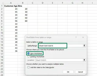
In the PivotTable Fields pane, drag and drop Customer Age into both the Rows and Values areas.
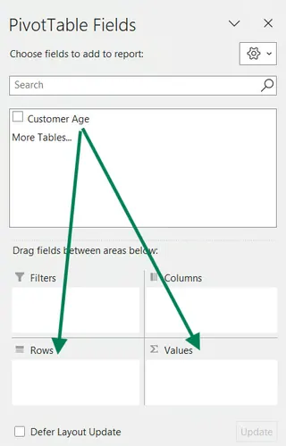
Initially, the Pivot Table will show the sum of ages for each unique age. We need to group these ages and change the calculation from Sum to Count.
First, right-click on any row value in the Pivot Table and select Group.
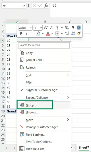
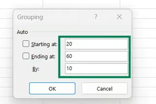
In the grouping dialog, set the starting and ending values and the interval. We'll start at 20, end at 60, and group by 10.
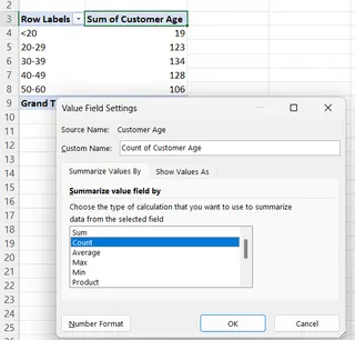
Next, change the calculation. Right-click on the Sum of Customer Age cell and select Value Field Settings.
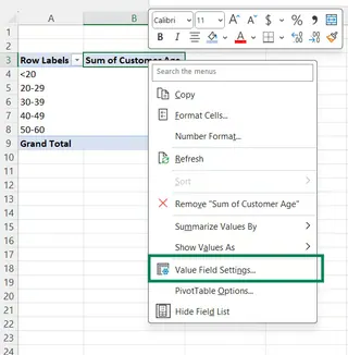
In the popup dialog, under Summarize Values By, change Sum to Count and press OK.
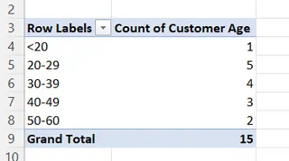
The final Pivot Table will show the correct frequency distribution.
Method 4: Using the Data Analysis ToolPak
The Data Analysis ToolPak is an Excel add-in that provides tools for data analysis tasks, including creating histograms (which are visual frequency distributions).
First, ensure the add-in is enabled. Go to the Data tab. If you don't see a Data Analysis button on the far right, you need to enable it.
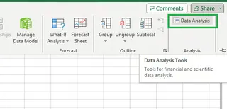
To enable it:
- Go to File > Options > Add-ins.
- At the bottom, in the Manage box, select Excel Add-ins and click Go.
- Check the box for Analysis ToolPak and click OK.
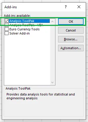
Now, click the Data Analysis button on the Data tab. Select Histogram from the list and click OK.
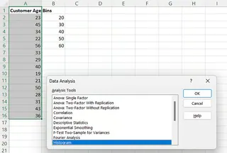
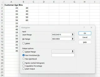
In the Histogram dialog box, configure the parameters:
- Input Range:
A2:A16(your customer age data). - Bin Range:
B2:B6(your predefined bins). - Output Options: Select New Worksheet Ply to create the output in a new sheet.
- Click OK.
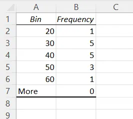
The ToolPak will generate a frequency distribution table in a new worksheet.
Method 5: Using COUNTIF() and COUNTIFS() functions
You can also build a frequency distribution manually using the COUNTIF() and COUNTIFS() functions. COUNTIF() counts cells that meet a single criterion, while COUNTIFS() handles multiple criteria.
This method is the most manual and requires writing a separate formula for each bin.
To calculate the frequency for each age group, enter the below formulas in cells D2 to D7, respectively.
# In cell D2 (Age <= 20)
=COUNTIF(A2:A16, "<=20")
# In cell D3 (Age >20 and <=30)
=COUNTIFS(A2:A16, ">20", A2:A16, "<=30")
# In cell D4 (Age >30 and <=40)
=COUNTIFS(A2:A16, ">30", A2:A16, "<=40")
# In cell D5 (Age >40 and <=50)
=COUNTIFS(A2:A16, ">40", A2:A16, "<=50")
# In cell D6 (Age >50 and <=60)
=COUNTIFS(A2:A16, ">50", A2:A16, "<=60")
# In cell D7 (Age >60)
=COUNTIF(A2:A16, ">60")
The final output will look like this:
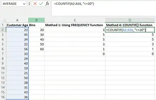
Compared to other methods, a limitation of using COUNTIF()/COUNTIFS() is that it's tedious and requires manually defining the logic for each bin within the formulas.
Final Thoughts
In this tutorial, we learned the importance of frequency distribution and explored five different ways to calculate it in Excel.
- Excelmatic offers the fastest and most intuitive path, using AI to eliminate manual steps.
- The
FREQUENCY()function is the most direct formula-based approach. - Pivot Tables provide a flexible and powerful way to group and summarize data without formulas.
- The Data Analysis ToolPak is great for more formal statistical analysis.
COUNTIFS()gives you granular control but is the most labor-intensive.
The best method depends on your comfort level with Excel and the complexity of your task. For quick, error-free results, AI tools are changing the game. For deep, manual control, Excel's traditional features remain as powerful as ever.
Ready to simplify your data analysis? Try Excelmatic today and experience the power of AI-driven frequency distributions - no formulas, no complex setup, just instant insights from your data.
FAQ
What are bins in a frequency distribution?
Bins are ranges that group data points in a frequency distribution. Each bin represents a range of values, and the frequency is the count of data points within each bin.
How do I create custom bins for my frequency distribution?
Creating custom bins differs based on the method you use. For AI tools like Excelmatic, you specify them in your request. For FREQUENCY() or the Data Analysis Toolpak, you list the upper limit of each bin in a column. For Pivot Tables, you define them in the Grouping dialog.
What is the difference between COUNTIF() and COUNTIFS()?
COUNTIF() counts the number of occurrences that meet a single condition. COUNTIFS() counts the number of occurrences that meet multiple conditions.
How do you create a frequency distribution with unequal bin sizes?
Modify the bins’ values. For example, if you had 20, 30, 40, 50, and 60 as your bins earlier, you can change them to 20, 30, 50, and 60, where the range of 30–50 makes bin sizes unequal. Afterwards, the FREQUENCY() function is used as usual to compute the frequency distribution. With a tool like Excelmatic, you would simply state the unequal bins in your request.
What are some limitations of using COUNTIF() in calculating frequency distribution?
COUNTIF() requires predefined bin ranges hardcoded into the formulas. Changing the bin range requires a manual update of each COUNTIF() or COUNTIFS() formula, which is time-consuming and prone to error.


