“What percentage of our total sales came from the East Region this quarter?” When your manager asks that question in a meeting, what’s your first move? Do you frantically open Excel and start a multi-step process of filtering and summing, or do you confidently deliver the answer in seconds?
Key Takeaways:
- The Pain Point: The most time-consuming part of making a simple pie chart isn't creating the chart itself—it's the tedious data filtering and aggregation that must happen first.
- The Old Way: In Excel, you have to meticulously filter your data, then use a PivotTable or formulas to summarize it, and only then can you finally generate a chart. One wrong move and you have to start over.
- The AI Way: Combine your filtering, summarizing, and charting needs into a single sentence. The AI acts like a smart analyst, understanding your full intent and delivering the final pie chart directly.
Why Does One Simple Chart Feel Like a Math Exam?
Imagine you have a spreadsheet with a full year of sales transactions from every region. Your boss wants to see: "For the North Region, what is the sales share for each product category?"
In Excel, this is far more than a one-click "Insert Pie Chart" task. Your standard workflow is:
- Multi-Level Filtering: You go to the "Region" column's filter dropdown and carefully select only "North Region." If your dataset is large, you might wait for the filter to even load.
- Complex Aggregation: Next, you create a PivotTable from the filtered results. You drag "Product Category" to the Rows field and "Sales" to the Values field, hoping you didn't misclick.
- Final Charting: Based on that small summary table, you can finally insert your pie chart. Then, you still have to manually add percentage labels, adjust the title, and make sure the legend is readable.
The entire process is slow and unforgiving. If your manager follows up with, "Great, now let's see the South Region," you have to take a deep breath and do it all over again from scratch.
The Meaning of AI: From Executing Clicks to Understanding Questions
A traditional tool is a hammer in your hand—you have to tell it exactly where to strike. An AI is an analyst by your side—you just have to tell it what problem you want to solve.
The revolution of Excelmatic is that it shifts your work from "micromanaging a tool" to "defining an objective."
| Comparison | Traditional Excel | Excelmatic |
|---|---|---|
| Work Mode | You break down the task and command each step | You state your goal; the AI handles all the steps |
| Mental Load | High (You must remember the process: filter, pivot, chart) | Low (Just describe the final result you want in plain English) |
| Efficiency | Low (Changing criteria means starting over) | High (Just change a keyword in your sentence for a new chart) |
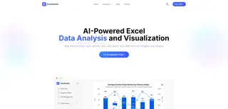
You no longer need to be an Excel operator. You just need to be a business expert who knows what questions to ask.
Get an Insight-Ready Pie Chart in Three Steps
Now, let's use AI to solve the problem from earlier.
Step 1: Upload Your Raw Sales Transaction Sheet
Upload your complete dataset. No pre-processing or cleaning is needed.
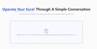
Step 2: Ask Your Full Question in One Sentence
In the chat box, send your complete request:
“Filter for the North Region, then generate a pie chart of sales share by product category.”

Step 3: Get Your Answer Instantly
In seconds, a precise and clear pie chart appears. It has automatically performed the filtering and aggregation, presenting the sales breakdown of each product category in the most intuitive way.
This chart is ready to be downloaded for your presentation.
Frequently Asked Questions (FAQ)
1. Can the pie chart show percentages and actual values? Absolutely. You can specify this in your initial prompt, e.g., "...generate a pie chart with percentage and value labels," or ask as a follow-up: "Add the sales values to the labels."
2. Can AI handle my massive dataset with hundreds of thousands of rows? Yes. The AI performs computations in the cloud, processing large-scale filtering and aggregation much faster than desktop Excel, so you can say goodbye to lag and frozen screens.
3. If I want to see this as a bar chart instead, is it easy to switch? Extremely easy. Just ask, "Show this as a bar chart instead." The AI understands the context and will instantly re-visualize the same data in a new format without requiring you to start over.
Your Value Is in Asking the Next Great Question
Stop letting data preparation tasks drain the energy you could be using to find business insights. Delegate the repetitive work to AI and spend your time figuring out what the data is telling you.
Try Excelmatic now and turn your business questions into visual answers with a single sentence!

