Key takeaways:
- The core challenge for executives is not data collection, but delivering the right insights at the right time to enable agile decisions.
- An Executive Dashboard is a strategic lens for leadership, answering "Is our strategy working?" not just tracking operational execution.
- Effective dashboards vary by role (CEO, CFO, COO, CMO, CTO), each focusing on specific high-level metrics tied to their strategic responsibilities.
- The right metrics fall into key categories: Financial Performance, Growth Drivers, Operational Efficiency, Customer Value, and Organizational Capability.
- Build your dashboard by starting with critical business questions, not data, then select a few key metrics to answer them.
- AI-powered tools (like Excelmatic) are transforming dashboard creation by enabling conversational, instant generation of insights from data, dramatically speeding up the decision cycle.
Too much data, too few insights
This was Microsoft CEO Satya Nadella's observation about the data dilemma facing businesses.
In the information age, this line is becoming an all-too-real description for executives. Forbes research shows 67% of executives say the volume of data exceeds their decision-making capacity, while the insights that truly move the needle are often buried.
The core problem is clear: the real leadership challenge is no longer about collecting data, but about delivering the right information to the right person at the right time.
What is an executive dashboard, and what makes it unique?
An executive dashboard is a centralized, real-time interactive interface that presents key performance indicators (KPIs). Its sole purpose is to enable executives to make agile, data-driven decisions. By improving decision speed and quality, it directly impacts productivity, revenue growth, and risk management.
What sets it apart from departmental reports is a matter of perspective and purpose. Department dashboards monitor "is execution on track?" Executive dashboards answer "is our strategy working?" It's not a tool for "managing" operations; it's a lens for "leading" the organization.
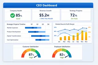
Five types of executive dashboards, each solving different problems:
1. CEO Dashboard: See the big picture
- What it shows: overall company health, progress on strategic initiatives
- Key need: balance short-term performance with long-term growth, and identify priorities amid complex information
2. CFO Dashboard: Control the financial lifeline
- What it shows: cash flow, profit quality, capital efficiency
- Key need: ensure financial safety and evaluate the financial impact of decisions
3. COO Dashboard: Optimize the operations engine
- What it shows: efficiency of core business processes, resource utilization
- Key need: find the right trade-off between quality, speed, and cost
4. CMO Dashboard: Drive effective growth
- What it shows: marketing ROI, customer acquisition efficiency
- Key need: prove the return on every marketing dollar and find the most efficient growth paths
5. CTO/CIO Dashboard: Secure the technology backbone
- What it shows: system stability, ROI on tech investments
- Key need: ensure technology supports business goals and balance maintenance with innovation
Which metrics really deserve attention?
Choosing the right metrics is crucial. A good executive dashboard usually includes these core areas:
| Metric category | Common metrics | What it tells you |
|---|---|---|
| Financial performance | Gross margin, cash flow, ROI | Is the business healthy and profitable? |
| Growth drivers | Customer acquisition cost, revenue growth rate | Can growth be sustained? |
| Operational efficiency | Inventory turnover, project completion time | Is the company running efficiently? |
| Customer value | Customer satisfaction, repeat purchase rate | Do customers recognize your value? |
| Organizational capability | Key talent retention, strategic project progress | Can the team deliver on goals? |
How to start building your dashboard?
The process is actually straightforward:
Step 1: Start with the questions, not the data
Ask yourself first: "What three business questions do I most need answered?" For example: "Is our profit growth sustainable?" or "Which product line deserves more investment?"
Step 2: Choose the right metrics
For each question, pick 2-3 metrics that best explain the situation. Remember: fewer metrics = clearer focus.
Step 3: Identify reliable data sources
Pin down where the data for those metrics comes from. It might be your finance system, sales reports, or customer feedback.
Step 4: Design clear views
Make each view immediately understandable. Put the most important items first, group related items together, and use color to indicate good or bad.
Step 5: Iterate and refine
Improve based on actual usage. When business priorities change, the dashboard should change too.
From long waits to instant insight: How AI reshapes dashboard building
Recently I discovered a tool that generates analytical views directly from conversational requests — Excelmatic. It changed how I prepare materials for strategy meetings.
Traditionally, building an executive dashboard that answers strategic questions is slow. You ask IT or the analytics team to pull, clean, and combine data from multiple systems, then build charts with specialized tools. That cycle often takes weeks, and changes are equally painful.
Excelmatic's core advantage is compressing that long process into minutes. Its value is putting business decision-makers back in control of the data. Key differences from the traditional approach are:
| Comparison | Traditional approach | AI-driven approach (like Excelmatic) |
|---|---|---|
| Core process | Request → wait for development → receive static report | Ask in business language → get interactive charts instantly |
| Time required | Days to weeks | Minutes |
| Skills needed | Dependence on analysts or complex software skills | Just clearly describe your business question |
| Flexibility | Low — views are fixed, new questions require redevelopment | Very high --- explore new hypotheses on the fly |
In short, conversational AI assistants like Excelmatic turn executives from passive "report recipients" into active "insight explorers." You can ask directly: "Compare this quarter's revenue and margin trends by product and region," and the AI will handle the data processing and generate visualizations. That makes it a powerful ally for agile decision-making and deep analysis.
If you are interested in Excelmatic generating various types of dashboards, you can click here for future reading.
Embrace agile, insight-driven decisions
The purpose of an executive dashboard is to turn key data into clear strategic signals that support fast, accurate decisions. Yet traditional dashboard building is often cumbersome and slow, blocking timely insights.
Excelmatic offers a faster alternative. By using natural conversation, it lets you ask questions of your data and receive interactive charts in minutes, without waiting for technical teams. That dramatically shortens the cycle from question to insight, turning you from a passive report recipient into an active data explorer.
If your team struggles with data overload and decision delays, consider changing how you work. Ask one pressing business question now and try getting the answer with Excelmatic — experience how efficient data-driven decisions can be.
Click here to start building your first smart dashboard.
Frequently Asked Questions (FAQ)
Q: Can a single dashboard work for both the CEO and department heads?
A: It's not recommended. The CEO dashboard shows the strategic "why," while departmental dashboards show the tactical "how." They should be linked but have different scopes and levels of detail.
Q: Beyond AI tools like Excelmatic, what are other modern trends in executive dashboards?
A: Key trends include predictive analytics (forecasting), increased mobile accessibility, automated narrative insights (AI explaining why a trend is happening), and seamless integration across more data sources.
Q: How do we ensure data accuracy and trust in the dashboard?
A: Establish a single source of truth for each metric, document definitions clearly, and implement regular data quality checks. Trust is built on transparent and reliable data governance.
Q: What's the role of design in an effective dashboard?
A: Critical. A well-designed dashboard uses visual hierarchy, intuitive layout, and consistent color coding (e.g., green for good, red for caution) to make complex information graspable within seconds. The goal is glanceability—understanding the situation without conscious effort.


