Organizing and analyzing data is one of the essential tasks at work. Data report, is an important way to show the results of the analysis. Today, I'm going to share with you a great gadget -- Excelmatic, and how to use it to quickly make a professional and good-looking report.
First, let's think about what elements a professional report usually needs to contain. There should be a clear presentation of data, intuitive charts and graphs to assist in the description, but also a concise and clear summary and conclusion. If you go through all these elements manually, it may take a lot of time and effort. But with Excelmatic, this process can be greatly simplified.
Step 1: Data Organization
Before we start creating the report, we need to prepare the data first. The accuracy and completeness of the data is the basis of the quality of the report, Excelmatic can help us quickly organize the data. For example, we can sort, filter, find and replace functions, quickly clean and organize data, so that the data more neat and organized.
For example, suppose we want to create a sales report, and the data table may contain some repetitive or incorrect information. Using Excelmatic's Find and Replace feature, we can easily correct these errors or just delete the duplicates to make the data in the report more accurate.
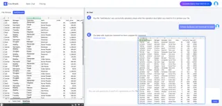
Step 2: Select Report Type and Template
Excelmatic provides a variety of report types and templates for us to choose from, including Bar Charts, pie charts, line graphs, etc. We can choose the most suitable report type and template according to the purpose and characteristics of the data. We can choose the most suitable report type and template according to the purpose of the report and the characteristics of the data.
For example, if we want to show the sales of different products, we can choose a Bar Chart report, which can visually compare the sales volume of each product. If we want to show the market share, a pie chart is more appropriate because it can clearly show the proportional relationship of each part. And if you want to analyze the trend of the data over time, a line chart is the best choice.

Step 3: Detailed processing
The details of a professional report are equally important. In Excelmatic, we can adjust many details of the report, such as setting the data format, so that the report looks more beautiful and professional.
For example, in the report, we can change the date format to MM-DD-YYYY format.

Step 4: Report Analysis
Excelmatic performs in-depth data analysis to help users quickly understand trends and relationships in the data presented in a report, as well as summarize the data in the report to grasp the essence of the data as a whole.
For example, you can type Analyze the correlation between data growth by region and time from 2018 to 2019 and Excelmatic will automatically calculate the correlation coefficients and generate a chart.

Conclusion
Overall, Excelmatic is a very powerful and easy-to-use tool that can help us quickly create professional and good-looking reports. With the above steps, I believe you have mastered the basic skills of creating reports with Excelmatic. I hope this content will be helpful to you! Try Excelmatic FREE now!


