Key takeaways:
- Performance dashboards help bridge the gap between raw Excel data and business decision-making by replacing manual reporting with automated insight generation.
- Traditional Excel dashboards rely heavily on pivot tables and formulas, which are fragile, time-consuming, and difficult to scale.
- AI-powered data visualization tools understand data structure, detect anomalies, and generate meaningful charts without manual configuration.
- Compared with traditional BI tools, AI dashboards are designed for non-technical users who need fast, reliable reporting from single Excel files.
- Tools like Excelmatic enable teams to move from spreadsheet wrangling to insight-driven decisions in minutes, not days.
Introduction: Why Manual Excel Reporting is Costing You Hours
In today’s data-driven market, speed is the only competitive advantage. Yet, most professionals are still stuck in the “Spreadsheet Trap” — spending 80% of their time formatting data and only 20% analyzing it. If you’ve ever felt the frustration of a broken Excel Pivot Table or a chart that won't update, you’re not alone.
The transition from Excel to Dashboard used to require advanced technical skills. Today, Generative AI has simplified this process. You can now transform a single, static CSV export into an executive-ready dashboard in under 60 seconds.
The Top 3 Challenges of Creating an Excel Dashboard Manually
To understand why AI is a game-changer, we must look at the structural failures of traditional methods. Using Pivot Tables for data visualization presents several “silent” bottlenecks:
1. The Reliability Crisis
One accidental “merged cell” or a trailing space in your original data can cause a Pivot Table to return incorrect sums or, worse, the dreaded #REF! error. In a high-stakes meeting, you can't afford a fragile dashboard.
2. The “What” vs. the “Why”
A manual Pivot Table is a summary, not an analysis. It shows you that sales dropped in Q3 (the what), but it doesn't automatically highlight the correlation between ad spend and conversion rates (the why).
3. The Aesthetic Barrier
Let’s be honest: default Excel charts look dated. To make them “Executive-Ready” requires another 30 minutes of tweaking colors, labels, and borders—time that could be spent on strategy.
How AI Data Visualization Tools Automate Your Reporting Workflow
Modern AI visualization doesn't just “plot points” on a graph. It uses Natural Language Processing (NLP) and Pattern Recognition to interpret your single Excel file like a human analyst would.
1. Semantic Understanding:
AI recognizes that a column titled “SKU” is a dimension and “Gross Margin” is a metric, automatically choosing the most logical visualization (e.g., a Pareto chart for SKUs vs. a Trend line for Margins).
2. Anomaly Detection:
As you upload your file, the AI scans for outliers — those sudden spikes or dips in your data — and highlights them before you even have to ask.
3. Zero-Formula Logic:
AI eliminates the need for Calculated Fields. If you want to see Year-over-Year (YoY) growth, the AI calculates the delta internally based on your date column.
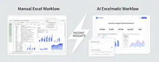
Excelmatic vs. Power BI: Choosing the Best Dashboard Tool for Non-Techies
Many users ask: “Why not just use a professional BI tool?” While platforms like Power BI or Tableau are powerful, they are built for data engineers, not busy managers.
| Feature | Traditional BI Tools (Power BI/Tableau) | Excelmatic (The AI Alternative) |
|---|---|---|
| Learning Curve | Weeks of training required | Zero (Intuitive Interface) |
| Data Integration | Complex API & SQL connections | Simple One-Click Excel Upload |
| Setup Time | Hours/Days per report | Seconds |
| Best For | Enterprise Data Architecture | Fast Business Decision Making |
The Excelmatic Advantage: Unlike complex BI tools that require “Data Modeling,” Excelmatic is built for the file user. It’s the perfect solution for those who have a monthly export and need a professional report now, not next week.
The Excelmatic Workflow: Data Visualization for the Rest of Us
We built Excelmatic to solve a specific problem: making professional-grade data visualization accessible to people who hate Pivot Tables. Our philosophy is “Single File, Infinite Insight.”
Step 1: The “Drop & Done” Upload
You don’t need to clean your data. Whether your export has empty rows, messy headers, or thousands of entries, simply upload your single .xlsx or .csv file.
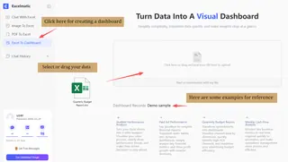
Step 2: Automated Structural Mapping
To get the best results, you can express your needs precisely in the dialog box — for instance, by asking the AI to "Compare budget execution rates across departments". If you are unsure what to ask, simply use Excelmatic’s suggested prompts, such as "Perform a visual comparison of budgeted and actual expenses," to generate insights with a single click.
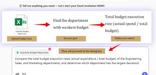
Step 3: Insight-Driven Visualization
Instead of a blank canvas, you get a concise, fully-formed dashboard featuring a high-level Overview and diverse visualization charts.
The AI provides unique insights into your data, allowing you to hover over charts to drill down into specific details. If you want to make adjustments, you can manually fine-tune the dashboard or simply use the AI chat to request modifications until the result is perfect.
Why Every Business Needs an AI-Driven Dashboard Strategy in 2026
We are moving away from “looking at data” and toward “interacting with data.” An AI-driven dashboard strategy isn't just about aesthetics; it's about democratizing data.
By using a tool like Excelmatic, you empower every member of your team — from HR to Sales — to generate their own professional visuals without waiting for the IT department. This shift from manual spreadsheets to automated AI insights is the hallmark of a high-growth company.
Conclusion: Stop Wrangling Data and Start Growing Your Business
Your time is your most valuable asset. If you are still fighting with Pivot Tables and manual formatting, you are losing hours that could be spent on high-level strategy.
Excelmatic bridges the gap between raw data and actionable intelligence. No formulas, no complexity — just the insights you need to win.
Ready to upgrade your reporting? Try Excelmatic for free and transform your Excel file into a stunning dashboard in 60 seconds.
Frequently Asked Questions (FAQ)
Q: What does “Excel to Dashboard” mean?
A: Excel to Dashboard refers to transforming spreadsheet data into interactive visual dashboards that make trends, anomalies, and performance metrics easier to understand.
Q: Why are pivot tables not ideal for dashboards?
A: Pivot tables are fragile and require manual maintenance. Small data issues can break calculations, making them unreliable for decision-making dashboards.
Q: How does AI create dashboards from Excel files?
A: AI analyzes the structure of an Excel file, identifies metrics and dimensions, and automatically selects appropriate visualizations without formulas or data modeling.
Q: Is an AI dashboard a replacement for Excel?
A: No. Excel remains useful for data collection, while AI dashboards turn those files into insight-ready views for analysis and presentation.
Q: Who should use AI dashboard tools like Excelmatic?
A: Business users, analysts, and managers who rely on Excel exports and need fast, professional dashboards without learning complex BI tools.


