Key Takeaways:
- Sparklines provide compact, in-cell trend visualizations essential for business dashboards and reports, but manual creation requires multiple steps and technical knowledge
- Excelmatic's AI approach eliminates the need for menu navigation and formula memorization by generating sparklines instantly using simple language commands
- Compared to traditional methods, Excelmatic handles complex sparkline customization and multi-dataset visualization without compatibility issues or manual formatting
- For business professionals, adopting AI tools means faster dashboard creation and more time for data analysis rather than technical implementation
Excel is a data analysis tool that is used in many enterprise settings. Having a good grasp of Excel fundamentals is critical for any data professional, regardless of their technical acumen in Python or SQL. You may be used to creating visuals in Excel, but using sparklines is a creative way of generating space-efficient visualizations. And now, with the rise of AI assistants, creating these powerful mini-charts is faster and more intuitive than ever before.
Excel Sparklines are small charts that sit inside cells that provide quick, visual summaries of data trends. Since sparklines sit within spreadsheet cells, they are a compact way to visualize data without taking up extra space. They’re especially useful for spotting trends at a glance. Excel supports three main sparkline types: Line, Column, and Win/Loss, each designed for different analytical needs.

Example of Sparklines from Excel
TL;DR: How to Create Sparklines in Excel
Whether you prefer using Excel’s interface, formulas, or the power of AI, here are three ways to add sparklines for instant trend insights:
Method 1 – Ribbon (Classic Way)
- Select data → e.g.
B2:E2 - Go to Insert → Sparklines → Line (or Column/Win/Loss)
- Set location range → e.g.
F2 - Click OK, then drag down (
F3:F5) to fill other rows
Method 2 – Formula (Microsoft 365 / Excel Online) In F2, enter:
=SPARKLINE(B2:E2)
Or customize:
=SPARKLINE(B2:E2, {"charttype","column"; "color1","green"})
Method 3 – The AI-Powered Way with Excelmatic

- Upload your Excel file to Excelmatic.
- Ask in plain language: "For each region, add a sparkline in a new 'Trend' column to show the quarterly sales trend."
- Excelmatic analyzes the data and adds the sparklines for you instantly.
Understanding the Basics of Sparklines
Before jumping into Excel, it helps to understand where sparklines came from and how they fit into the broader world of data visualization.
Theoretical foundation and historical development
The concept of sparklines was popularized by Edward Tufte, a pioneer in data visualization who described them as "intense, simple, word-sized graphics." His vision was to make visualizations compact enough to embed in text or tables, providing context without clutter. Microsoft later integrated sparklines into Excel (starting with Excel 2010), making them accessible to a broad audience of data practitioners.
Types of sparklines and their applications
Excel supports three primary types of sparklines:
- Line Sparklines are best for showing continuous data trends, like monthly sales or stock prices.
- Column Sparklines are useful when comparing discrete values, such as revenue per region.
- Win/Loss Sparklines are designed for binary outcomes, such as profit vs. loss or game results.
By choosing the right type, you can ensure your sparkline communicates insights effectively.
Creating Sparklines in Excel
Creating sparklines in Excel is pretty straightforward for tabular data organized in a sequence. Let's explore the traditional methods and the new, AI-driven approach.
Preparing your data
Sparklines work best with clean, tabular data. Arrange your values in rows or columns with consistent intervals (such as months, quarters, or categories). Watch out for missing values or inconsistent formats, as these can distort the sparkline’s meaning.
Take, for example, the data we had in the first image:
| Region | Q1 | Q2 | Q3 | Q4 |
|---|---|---|---|---|
| Asia | $ 140,787 | $143,549 | $46,210 | $66,404 |
| Europe | $78,944 | $115,252 | $198,783 | $182,729 |
| South America | $100,961 | $119,646 | $83,233 | $99,524 |
| North America | $82,889 | $68,945 | $187,202 | $110,372 |
The data here is organized by region over four quarters. This is the ideal organization for sparklines.
Creating Sparklines with the SPARKLINE Formula
If you’re using Excel for Microsoft 365 or Excel for the Web, you can create sparklines directly with a formula. This method is especially handy when building dynamic dashboards.
Using the sample data:
| Region | Q1 | Q2 | Q3 | Q4 | Trend |
|---|---|---|---|---|---|
| Asia | 140,787 | 143,549 | 46,210 | 66,404 | (Sparkline here) |
In cell F2, enter the following formula:
=SPARKLINE(B2:E2)
This creates a line sparkline summarizing Asia’s quarterly performance. To customize it, you can specify the chart type and color:
=SPARKLINE(B2:E2, {"charttype","column"; "color1","green"})
Then, drag the formula down through F3:F5 to generate sparklines for other regions. This formula-based method automatically updates as your data changes.
Inserting sparklines via the Ribbon
To insert a sparkline in other versions of Excel, highlight the data range and go to the Insert tab. In the top ribbon, there should be a section labeled Sparklines. Select Line, Column, or Win/Loss Sparkline.

Sparkline is to the right of Charts
You’ll then specify the location range—the cell(s) where the sparkline will appear.
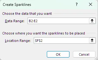
Choose the columns of interest
This will generate the sparklines. If you drag the bottom right corner of the cell down to the other rows, it will automatically generate the other sparklines as shown below:
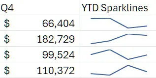
Final output of the sparklines
Alternatively, you can use Excel’s Quick Analysis tool by highlighting your dataset and clicking on the icon in the bottom right.
The AI Alternative: Generating Sparklines Instantly with Excelmatic
While the manual methods offer control, they require you to know where to click or what formula to write. An AI assistant like Excelmatic streamlines this entire process.
With Excelmatic, you simply state your goal in plain English. After uploading your spreadsheet, you could ask:
Create line sparklines for the data in columns B through E and place them in column F.
Or, more conversationally:
For each region, show me the sales trend in a new column called 'Trend'.
Excelmatic interprets your request, analyzes the specified data, and generates the sparklines for you—no clicking through menus, no remembering formula syntax, and no manual dragging to fill cells. It's the fastest way to get from data to visual insight.
Customizing Sparklines
Customization helps make sure sparklines follow graphical standards and stand out based on their level of importance.
Basic customization options
Once you insert a sparkline, the Sparkline Tools Design tab appears. Here, you can change the sparkline type (Line, Column, Win/Loss), modify colors, and adjust line weight to fit your design standards.
Advanced customization techniques
You can make sparklines more informative by customizing markers. For instance, you can highlight the highest/lowest points to show overall differences, negative points to show poor performance, or the first/last point to show change over time. You can even customize the colors for each of these markers.
While the Design tab offers granular control, this manual process can be tedious. With an AI tool like Excelmatic, customization is as simple as making a request. You could follow up your initial prompt with:
Now, change the sparklines to green and mark the highest point in red.
The AI handles the clicks and settings, delivering the final, customized result instantly.
Style and format adjustments
The Style Gallery offers quick formatting presets. You can also Group sparklines to ensure they share the same formatting and axis scaling, or Ungroup them for individual customization.
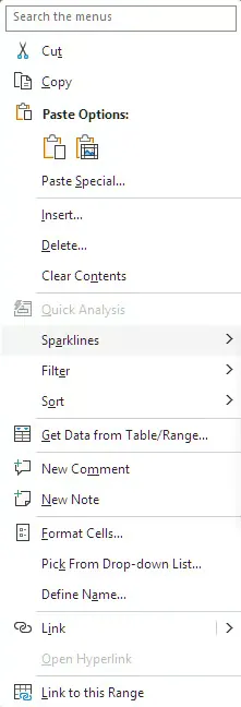
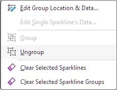
Settings where you can group/ungroup sparklines
Resizing the cells containing sparklines can also help. Wider cells show more detail, while narrower cells improve compactness.
Working with Excel Sparkline Axes
Axes aren’t always visible in sparklines, but customizing them can make comparisons clearer.
Customizing axis settings
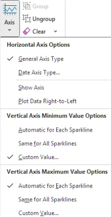
By default, Excel auto-scales each sparkline to fit its cell, which can be misleading if different rows have vastly different values. In the Axis menu on the Design tab, you can set fixed minimum and maximum values for the vertical axis to ensure all sparklines are compared on the same scale.
Handling Hidden and Empty Cells
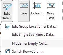
Data isn’t always perfect. You can control how sparklines treat gaps by going to Edit Data → Hidden & Empty Cells.
Treating empty, zero, or hidden value cells
In Excel’s settings, you can choose to show empty cells as gaps (breaking the line), treat them as zeros, or connect data points with a line (the default). Connecting points can be misleading, as it might imply a trend that doesn't exist. You can also decide whether sparklines should ignore data in hidden rows and columns.
Grouping, Ungrouping, and Deleting Sparklines
Managing sparklines across multiple cells helps maintain consistency.
Grouping and ungrouping sparklines
Grouping allows you to apply consistent formatting and scaling across multiple sparklines at once. Ungrouping restores independence for individual customization. This setting is in the “Group” section of the Design tab.

Editing and deleting sparklines
If your data source changes, you can edit the Data Range or Location Range via the “Edit Data” option. To remove sparklines, use the Clear button in the Design tab. You cannot delete sparklines by simply pressing the Delete key on your keyboard.
Using Sparklines in Tables and PivotTables
Sparklines become even more powerful when combined with other Excel features.
Sparklines in Excel Tables
When added to a structured Excel Table, sparklines automatically expand as you add new rows of data. This makes them particularly effective for growing datasets like monthly financials or sales logs.
Sparklines in PivotTables
Adding sparklines to PivotTables allows for interactive exploration of trends. However, be careful, as refreshing a PivotTable can change its structure and potentially break or overwrite your sparklines.
Best Practices for Effective Excel Sparklines
To avoid creating misleading visualizations, follow these best practices:
- Placement and Scaling: Place sparklines near their source data for context. Keep axis scaling consistent across related sparklines to ensure fair comparisons.
- Color and Markers: Use colors that are accessible and align with your workbook's theme. Apply markers selectively to highlight key data points without cluttering the visual.
- Data Preparation: Ensure your data is clean and accurate before creating sparklines. Document any special settings (like fixed axes) so others can interpret them correctly.
Troubleshooting Common Issues
Data range and scaling problems
Errors often arise from incorrect data ranges or inconsistent scaling. Double-check your references and consider setting fixed axis values when comparing data across different rows.
Compatibility and performance issues
Versions of Excel before Excel 2010 do not support sparklines. When sharing workbooks, make sure recipients have a compatible version. In very large datasets, numerous sparklines may slow down calculations, so consider using them primarily on summary reports.
Comparative Analysis with Other Tools
Traditional charts vs sparklines
Traditional charts provide more detail, labeling, and interactivity, making them better for formal presentations. Sparklines excel in compactness and at-a-glance trend analysis, making them ideal for dashboards and operational reports.
Manual Creation vs. AI-Powered Generation
The traditional methods of creating sparklines (Ribbon, Formulas) offer deep control and are built directly into Excel, but they require you to know the steps and syntax. AI-powered tools like Excelmatic offer a massive leap in speed and ease of use. They abstract away the technical steps, allowing you to focus on the desired outcome rather than the process. This is perfect for users who need quick insights without getting bogged down in Excel's interface.
Conditional formatting and specialized software
Sparklines work well with conditional formatting to add another layer of visual cues. Compared to specialized BI tools like Tableau or Power BI, sparklines are lightweight and fully integrated into the spreadsheet environment but lack advanced interactivity.
Real-World Applications of Sparklines
Sparklines are used across many industries:
- Finance: Monitoring stock trends, expense reports, or revenue growth.
- Sales: Tracking monthly or quarterly performance by representative.
- Healthcare: Visualizing patient vitals or case counts over time.
- Operations: Summarizing production trends or defect rates for different product lines.
- Social Media: Tracking viewership across different videos to gauge campaign effectiveness.
Conclusion
Excel Sparklines are powerful mini-visualizations that make trends and patterns instantly visible without cluttering your spreadsheets. By mastering their creation, customization, and best practices, you can transform raw data into clear, contextual insights.
While mastering the manual methods is a valuable skill, embracing modern AI assistants like Excelmatic can significantly boost your productivity, allowing you to move from raw data to visual insights in seconds. The future of spreadsheet analysis is not just about knowing the right buttons to click, but about knowing the right questions to ask.
Ready to transform your data visualization workflow? Try Excelmatic today and experience how AI-powered sparkline generation can accelerate your business reporting.
Excel Sparklines FAQs
What are the main differences between line, column, and win/loss sparklines?
- Line sparklines show continuous trends, making them ideal for time series.
- Column sparklines display discrete values for comparison.
- Win/Loss sparklines are used for binary outcomes such as positive/negative changes or yes/no results.
Can I use sparklines to compare trends across multiple datasets?
Yes. You can insert sparklines for different rows or columns and align them side by side. To ensure fair comparisons, set a consistent vertical axis scale for the entire group of sparklines.
How do I troubleshoot issues when sparklines are not showing in Excel?
Check that you’re using a version of Excel that supports sparklines (Excel 2010 or later). Ensure your data range is valid, the location cell is not empty, and that sparklines haven’t been hidden due to formatting or small cell sizes.
Is it better to use a formula or an AI tool to create sparklines?
It depends on your workflow. The =SPARKLINE formula is great for dynamic dashboards where you build the logic yourself. An AI tool like Excelmatic is ideal for quick, ad-hoc analysis or for users who prefer to get results without writing formulas or navigating menus. It prioritizes speed and ease of use.
How can I customize the appearance of sparklines in Excel?
You can use the Sparkline Tools Design tab to change colors, add markers, adjust line thickness, and apply styles. Advanced options include customizing axes, highlighting highest/lowest values, and grouping sparklines for consistent formatting.


