Key Takeaways:
- Understanding data relationships is essential for business decisions in marketing, sales, and finance, but traditional correlation analysis requires statistical knowledge
- Excelmatic's AI approach eliminates complex formulas by letting you analyze correlations using simple language commands
- Compared to CORREL() function, Excelmatic provides not just correlation coefficients but also instant visualizations and business insights
- For business professionals, adopting AI tools means faster data insights and more time for strategic decision-making rather than technical analysis
Analyzing the relationship between two sets of data is a fundamental task in business analysis. By calculating the correlation coefficient, you can quickly assess whether two variables move together, move in opposite directions, or have no relationship at all. This is crucial in fields like sales, where you might analyze marketing spend against revenue, or in operations, to see how customer satisfaction affects retention rates.
In this guide, we'll explore two powerful methods for analyzing correlation in Excel: the traditional formula-based approach and a modern, AI-powered solution. You'll learn how to apply both and see how AI tools are making complex analysis more accessible than ever.
Understanding Correlation
Before diving in, let's clarify what we're measuring. Correlation analysis measures the strength and direction of the linear relationship between two variables. The result, known as the correlation coefficient (or Pearson correlation coefficient), ranges from -1 to 1:
- 1 indicates a perfect positive correlation (as one variable increases, the other increases).
- -1 indicates a perfect negative correlation (as one variable increases, the other decreases).
- 0 indicates no linear correlation.
For instance, you might find a strong positive correlation (close to 1) between advertising spend and sales, or a strong negative one (close to -1) between price increases and customer retention.
Method 1: The Traditional Approach with the CORREL() Function
Excel's CORREL() function is a powerful statistical tool for calculating the correlation coefficient directly. It's reliable and has been a go-to for analysts for years.
CORREL() Syntax and Arguments
To use the CORREL() function, you need to understand its simple syntax:
=CORREL(array1, array2)
array1: The first range of values.array2: The second range of values.
A critical requirement is that both arrays must have the same number of data points. If they don't, CORREL() will return a #N/A error.
How to Use CORREL() in Excel
Follow these steps to calculate correlation using the CORREL() function:
- Enter your two data sets in separate columns.
- Click on the cell where you want the correlation coefficient to appear.
- Type the
CORREL()formula, referencing your data ranges. - Press Enter to display the result.
For example, if your data for interest rates and bond prices is in columns A and B from rows 2 to 11:
=CORREL(A2:A11, B2:B11)
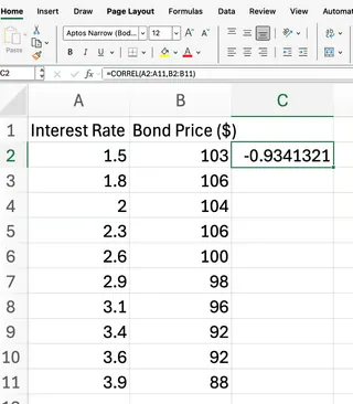
Our formula returns the correlation coefficient between the two data sets. Based on business logic, we expect a result close to 1, indicating a strong positive correlation—as marketing spend increases, sales revenue typically grows.
Method 2: The AI-Powered Approach with Excelmatic
While the CORREL() function is effective, what if you could get the same result without memorizing formulas? This is where AI agents like Excelmatic shine. Excelmatic allows you to perform complex data analysis by simply asking questions in plain language.

How to Analyze Correlation with Excelmatic
Instead of typing formulas, you can get instant answers, charts, and AI insights. Here’s how you'd solve the same problem with Excelmatic:
- Upload your file containing the two data sets (e.g., marketing spend and sales revenue).
- Ask a simple question in the chat interface. For example:
- "What is the correlation between 'Marketing Spend' and 'Sales Revenue'?"
- Or more broadly: "Analyze the relationship between our ad spend and monthly sales."
- Get instant results. Excelmatic will process your request and provide the correlation coefficient instantly.
What makes this approach powerful is that Excelmatic often goes beyond just giving you a number. It can also generate a scatter plot to visualize the relationship and provide a brief, AI-driven interpretation of the result, saving you even more time.
Comparing the Methods: CORREL() vs. Excelmatic
| Feature | CORREL() Function (Traditional) |
Excelmatic (AI-Powered) |
|---|---|---|
| Ease of Use | Requires knowledge of function syntax and cell references. | Uses simple, plain language commands. No formulas to remember. |
| Speed | Fast for experienced users. | Instantaneous. Eliminates time spent recalling and typing formulas. |
| Error Handling | Returns cryptic errors like #N/A or #DIV/0!. |
Provides user-friendly feedback if data is inconsistent or missing. |
| Insights | Provides a single numerical output (the coefficient). | Delivers the coefficient, plus potential visualizations and AI-generated interpretations. |
| Learning Curve | Moderate; requires learning specific Excel functions. | Minimal; if you can ask a question, you can use it. |
Interpreting the Results
Whether you use CORREL() or Excelmatic, interpreting the resulting coefficient is key. The value will always fall between -1 and 1:
- Values close to 1: Strong positive correlation (as one variable increases, so does the other).
- Values close to -1: Strong negative correlation (as one variable increases, the other decreases).
- Values close to 0: Little or no linear relationship.
Remember a crucial point: correlation does not imply causation. A high correlation coefficient simply indicates that a relationship exists, not that one variable causes the other to change.
Common Errors with the Manual Method
When using the CORREL() function, you may encounter some common errors. Understanding these can help you troubleshoot quickly.
#N/Aerror: Occurs if the two arrays have different numbers of data points.#DIV/0!error: Happens if either array has less than two data points or if the standard deviation of either array is zero.#VALUE!error: Appears if non-numeric values are included in the data ranges.
Ensuring your data ranges are equal in length and contain only numeric values will help you avoid these issues. One of the benefits of an AI tool like Excelmatic is that it handles these data validation checks for you, often providing clearer guidance on how to fix the source data.
Conclusion
The CORREL() function remains an essential tool in any Excel analyst's toolkit for its direct and reliable calculations. However, the landscape of data analysis is evolving. AI agents like Excelmatic are democratizing data analysis, making it faster, more intuitive, and more insightful.
By allowing you to use natural language to ask complex questions, these tools empower business users of all skill levels to move beyond manual formulas and focus on what truly matters: understanding the story their data is telling and making better business decisions.
Ready to transform how you analyze data relationships? Try Excelmatic today and discover how AI-powered correlation analysis can accelerate your business insights.


