Key Takeaways
- Stop wasting time on complex Excel charts - Box plots reveal data distribution but traditionally require tedious manual steps
- AI eliminates the technical headache - Excelmatic creates perfect box plots from simple language commands - no formulas or menu navigation needed
- From 30 steps to 1 command - Compare distributions across categories instantly instead of building charts piece by piece
- Perfect for business analysis - Quickly identify outliers, compare performance, and make data-driven decisions without technical expertise
Creating box and whisker plots in Excel is a valuable skill for any data analyst. These plots provide a clear, five-number summary of our data distribution (minimum, first quartile, median, third quartile, and maximum), helping us make informed decisions based on our analysis.
In this tutorial, we'll explore why box and whisker plots are essential and compare three distinct methods for creating them in Excel. We'll cover the modern, AI-powered approach, the standard built-in chart feature, and the traditional "from scratch" method. We'll also explore how to customize your plots to make them even more insightful.
The AI-Powered Way: The Fastest Method with Excelmatic

The most modern and efficient way to create charts in Excel is by using an AI agent like Excelmatic. Instead of navigating menus or writing complex formulas, you can simply state your request in plain language. Excelmatic handles all the underlying steps instantly.
Here’s how you would create a box and whisker plot with Excelmatic:
- Upload your data file to the Excelmatic web app.
- Type your request in the chat box. For example: "Create a box and whisker plot for the 'Age' column to show the distribution."
- Done. Excelmatic instantly generates a clean, accurate box and whisker plot directly in your spreadsheet.
Want to compare categories? It's just as simple. A prompt like "Create side-by-side box and whisker plots to compare the ages of cats and dogs" is all it takes.
This approach eliminates the clicks, calculations, and potential errors of manual methods, transforming a multi-step process into a single command.
The Standard Method: Using Excel's Built-in Chart
For users who prefer the traditional interface, Excel (2016 and later) includes a dedicated Box & Whisker chart type. While not as fast as an AI agent, it's a reliable way to get the job done in just a few clicks.
To create a box and whisker plot using this feature, follow these steps:
- Select the Excel cells containing the values to be plotted.
- Open the Insert tab on the Excel ribbon.
- Click on the Recommended Charts button of the Charts group.
- Open the All Charts tab in the pop-up window.
- Select the Box & Whisker chart type.
- Press OK.

Creating a box and whisker plot using a dedicated Excel feature. Image by Author
To make sure your box and whisker plot in Excel yields valuable insights, you need to ensure first that your data is meaningful and properly cleaned and transformed.
Why Box and Whisker Plots Are Important
Box and whisker plots, also known as box plots, are a powerful type of visualization used to display the distribution of a data series. They are particularly helpful for statistical data analysis since they allow us to:
- Gather a comprehensive statistical summary of the data, including the minimum, maximum, median, and mean values, as well as the first and third quartiles (Q1 and Q3).
- Understand the overall data distribution at a high level.
- Figure out if our data distribution is normal or skewed (and the direction of skewness).
- Identify the spread of our data.
- Detect outliers and their magnitude.
- Estimate data variability.
- Determine the best measure of center (median or mean).
- Compare the distribution of multiple categories next to each other.
The Manual Method: Building a Box Plot From Scratch
For those who want to understand the inner workings of a box plot or are using older versions of Excel, it's possible to build one from scratch. Be warned: this method is complex, time-consuming, and prone to error. It involves manual calculations and layering multiple chart elements. It's a great educational exercise, but for practical, day-to-day work, the AI or built-in methods are far superior.
Let’s consider a simple table containing the ages of cats and dogs from a hypothetical pet adoption center.
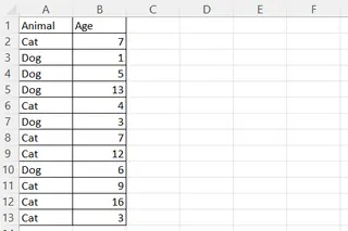
An example Excel table with cats and dogs. Image by Author
Calculating the statistical values
First, you need to calculate all the statistical components of the plot manually.
- In a separate area of your sheet, create labels for: “Min“, “Q1“, “Median“, “Q3“, “Max“, and “Mean“.
- In the adjacent column, use the following Excel formulas to calculate each value, where
your_data_rangeis the column of values for your plot:=MIN(your_data_range)=QUARTILE.EXC(your_data_range, 1)=MEDIAN(your_data_range)=QUARTILE.EXC(your_data_range, 3)=MAX(your_data_range)=AVERAGE(your_data_range)
Calculating the box heights and whisker lengths
Next, you need to calculate the dimensions for the chart components.
- In the next column, create labels for: “Underlying box height“, “Lower box height“, “Upper box height“, “Lower whisker length“, “Upper whisker length“.
- In the adjacent column, calculate these values using formulas that reference your statistical results:
=Q1=Median-Q1=Q3-Median=Q1-Min=Max-Q3
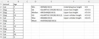
Calculating a statistical table in Excel. Formulas shown. Image by Author
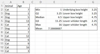
Calculating a statistical table in Excel. Results. Image by Author
Creating and Formatting the Chart
Now, you assemble the chart piece by piece using a stacked column chart and error bars.
Create the boxes:
- Select the three calculated box height values.
- Go to Insert > Recommended Charts > All Charts > Column > Stacked Column.
- Press OK.
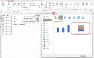
Creating the boxes from scratch in Excel. Image by Author
Format the boxes:
- Right-click the bottom segment (the "Underlying box") and select Format Data Series....
- Under Fill, choose No fill. This makes the base of the stack invisible.
- Select the other two segments and format their fill and border colors as desired.

Formatting the underlying box from scratch in Excel. Image by Author
Create the whiskers:
- Select the invisible bottom box segment.
- Click the Chart Elements button (+) and go to Error Bars > More Options....
- For the lower whisker, set Direction to Minus and Error Amount to Custom. In the Specify Value dialog, select the cell containing your "Lower whisker length" for the Negative Error Value.
- Select the upper visible box segment and add Error Bars.
- For the upper whisker, set Direction to Plus and Error Amount to Custom. In the Specify Value dialog, select the cell with your "Upper whisker length" for the Positive Error Value.
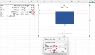
Creating the lower whisker from scratch. Image by Author
Add the mean point:
- Copy the cell with the calculated mean value.
- Select the chart and press Ctrl+V.
- Right-click the chart and choose Change Series Chart Type....
- Find the new "mean" series and change its chart type to Scatter.
- Press OK.
Clean up:
- Delete the chart legend and the horizontal axis label to finalize the plot.

A simple box and whisker plot from scratch in Excel. Image by Author
As you can see, this process is incredibly detailed. A single mistake in any formula or formatting step can break the entire cha`rt, highlighting the efficiency and reliability of using a tool like Excelmatic.
Creating a horizontal box and whisker plot in Excel
Creating a horizontal plot is even more complex, as Excel has no native support for it. The manual method involves using a Stacked Bar chart instead of a column chart and requires a tricky workaround to correctly position the mean point using a secondary axis.
The steps are largely the same as the vertical plot but adapted for a horizontal orientation, with additional steps for aligning the mean point on a secondary axis.
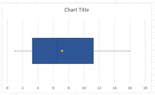
A horizontal box and whisker plot in Excel. Image by Author
In contrast, with an AI tool like Excelmatic, you would simply adjust your prompt: "Create a horizontal box and whisker plot for age." This transforms a difficult 30-step hack into a simple instruction.
Creating box and whisker plots for multiple categories in Excel
Comparing distributions across categories is a primary use for box plots.
With the built-in Excel method, you can achieve this by selecting both the category column and the data column before inserting the chart.
- Select both the column containing the categories and the one with the corresponding values. (Hold Ctrl to select non-adjacent columns).
- Follow the standard process: Insert > Recommended Charts > All Charts > Box & Whisker.
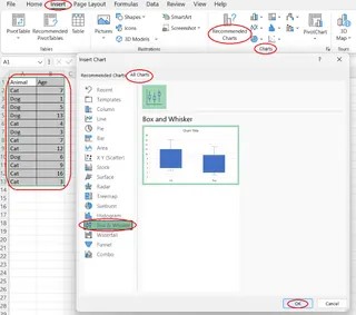
Creating a box and whisker plot for multiple categories. Image by Author
With Excelmatic, this is handled by your natural language prompt, such as "Compare the age distribution for cats versus dogs with a box plot."
Customizing a Box and Whisker Plot in Excel
Once your plot is created using Excel's built-in feature, you can customize it. Select the plot, and in the Format Data Series pane that appears, you can adjust several options specific to box plots:
- Gap Width: Change the space between plots for multiple categories.
- Show inner points: Display all individual data points.
- Show outlier points: Toggle the visibility of outliers.
- Show mean marker/line: Display the mean as a marker or a line connecting the means of different categories.
- Quartile Calculation: Choose between inclusive and exclusive median calculations.
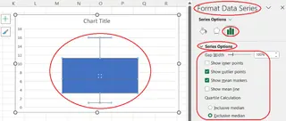
Customizing a box and whisker plot in Excel. Image by Author
AI tools like Excelmatic provide similarly intuitive customization options through simple follow-up commands, allowing you to refine your chart after it's been generated.
Conclusion
We've explored three ways to create box and whisker plots in Excel, each with its own trade-offs:
- The AI Method (Excelmatic): By far the fastest, easiest, and most reliable. It turns complex charting into a simple conversation.
- The Built-in Method: A solid, multi-click approach for users with modern versions of Excel who prefer the standard interface.
- The Manual Method: A highly complex and error-prone process that is valuable for learning but impractical for efficient analysis.
For business analysts, marketing managers, and operations professionals who need quick insights without technical hurdles, Excelmatic is the clear winner. Stop wrestling with Excel formulas and menu navigation - get the visual insights you need in seconds, not hours.
Ready to create box plots instantly? Try Excelmatic today and experience the future of Excel data visualization. Upload your spreadsheet and transform your data analysis workflow!
FAQ
How to find the Box & Whisker feature in Excel?
By opening the Insert tab on the Excel ribbon, clicking on the Recommended Charts button of the Charts group, opening the All Charts tab in the pop-up window, and selecting Box & Whisker from the list on the left side of the pop-up window.
What kind of statistics can be shown on a box and whisker plot in Excel?
The minimum, maximum, median, and mean values, the first and third quartiles, and the outliers.
Is it possible to create a horizontal box and whisker plot in Excel?
Yes. While Excel doesn't offer a direct feature for it, you can use a complex workaround with a stacked bar chart. Alternatively, AI tools like Excelmatic can create one from a simple text command.
How to create box and whisker plots for multiple categories in Excel?
By selecting the Excel columns containing the category labels and corresponding values to be plotted, opening the Insert tab on the Excel ribbon, clicking on the Recommended Charts button, opening the All Charts tab, selecting the Box & Whisker chart type, and pressing OK.
What can be customized on a box and whisker plot in Excel?
Apart from general chart adjustments, you can change the gap width, display inner points, hide outlier points, show the mean marker or line, and adjust the quartile calculation method.


