Every e-commerce seller knows this story:
- Sales spike in November.
- Dip in February.
- Weird blip in June (why??)
But when you can’t see the full picture across multiple years or categories, it’s just guesswork.
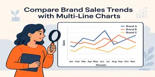
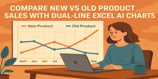
That’s where multi-line charts come in—powered by Excel AI, of course.
Why You Need Seasonal Trend Analysis
By comparing sales trends over months across years or categories, you can:
- Spot recurring peaks and slumps
- Plan inventory more precisely
- Launch campaigns before your competitors
- Understand your product lifecycle rhythm
Trends don’t lie. But they sure love to repeat themselves.
The Old Way: Tedious + Time-Consuming
Let’s say you want to compare 2022, 2023, and 2024 monthly sales.
In Excel, you’d have to:
- Group data by month AND year
- Create a pivot table with years as series
- Convert to a multi-line chart
- Format legends, axis labels, colors… manually
- Fix that “Month” sort issue (yes, you know the one )
All that just to answer:
When do our sales usually peak?
Excelmatic Does It Instantly
Just ask:
Compare monthly sales trends across 2022–2024
Display total annual sales for 2022, 2023, and 2024 in a Bar Chart
Show a table of average monthly sales per year for seasonal trend analysis
You’ll get:
- Clean multi-line chart (Jan–Dec on X-axis)
- Each line representing a year or category
- Ready-to-analyze visualization
- Optional table summary, if you want deeper stats
When to Use This Chart
- Comparing multiple years of sales by month
- Visualizing holiday / festival spikes (e.g. 11.11, Black Friday)
- Comparing seasonality between products (e.g. sunscreen vs jackets)
- Planning inventory and staffing cycles
Manual vs Excelmatic AI
| Task | Traditional Excel | Excelmatic AI |
|---|---|---|
| Group by month + year | Pivot + formatting | Auto-aligned |
| Create multi-line chart | Many steps | One-prompt clean chart |
| Adjust X-axis sort | Painful | Fixed automatically |
| Add legends and color | Manual | Auto-colored lines |
| Time required | 30–45 mins | < 1 minute |
Pro Tips
- Use 2–4 years max for clear comparison
- Sort months chronologically, not alphabetically 😅
- Add annotations for campaign dates or anomalies
- Pair with Bar Charts if you want volume breakdown too
Final Words
Your sales data is full of seasonal signals. You just need the right chart to see them.
With Excelmatic, a one-line question gives you years of pattern recognition, ready to act on.
If you are interested in Excel AI charts, you may also like the following articles:
How to Instantly Create Bar Chart with Excel AI (No Manual Work Needed)
Compare Ad Channel Sales with a Bar Chart in Excel AI
Track Monthly Sales Trends in Seconds with Excel AI Line Chart
Compare Brand Sales Trends with Multi-Line Chart in Excel AI
Visualize Category Sales by Region with Donut Charts in Excel AI


