Visualize Regional Sales with Pie Chart Using Excel AI

Let’s say you’re running an e-commerce business across several regions—maybe North, South, East, West. Your ads are running, warehouses are stocked, and sales are rolling in. But then the CEO drops this one-liner:

Which region is our biggest revenue driver?

Cue the panic Unless… you’ve got Excelmatic.


Why This Question Matters

Knowing your regional sales distribution helps with:

  • Targeted marketing: Double down on high-performing regions
  • Logistics: Plan warehousing and shipping routes efficiently
  • Sales strategy: Know where to push, where to pause
  • Budget allocation: Not all regions deserve equal $$$

Pie Chart make this crystal clear.


Traditional Method = Many Clicks

To get that insight in regular Excel, you'd:

  1. Group sales by region using Pivot Table
  2. Sum and sort
  3. Create a pie chart manually
  4. Format labels, percent, colors
  5. Then realize you forgot one region... and start again

All that just to say: “North is doing well.” Bruh.


Excelmatic to the Rescue

Ask something like:

Display regional sales distribution in a pie chart

depart

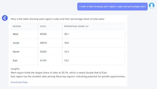
Create a table showing each region's sales and percentage share
depart

Which region has the highest sales share in the dataset?

depart

These prompts help you:

  • Get a clean pie chart with auto-colored regions
  • Output a summary table with total + % share
  • Identify top-performing regions without complex formulas
  • Present insights visually, in under a minute

When Pie Chart Are Your Best Friend

Use them when you want to:

  • Compare proportions across categories
  • See which region dominates visually
  • Communicate clearly to non-technical folks
  • Present clean, top-level summaries

Just don't use them when:

  • You’ve got 10+ regions (too messy)
  • You need to show trends over time (use Line Chart!)

Manual vs Excelmatic AI

Task Traditional Excel Excelmatic AI
Group + summarize Manual Pivot setup One-line prompt
Chart formatting Needs tweaking Clean and auto-ready
Showing % of total Extra formulas/settings Built-in
Highlighting top region Manual sorting Prompt & table output
Visual clarity Varies by skill level Always neat
Time saved 15–30 minutes < 1 minute

Pro Tips

  • Keep regions limited (3–6 is sweet spot)
  • Always sort by value descending when showing a table
  • Pair Pie Chart with Bar Chart if you want to compare AND trend
  • Add a “Rest of Regions” group if long tail is too small

Final Slice

You can’t grow a business without knowing where your strength lies. With Excelmatic and a simple pie chart, your regional revenue spread becomes obvious—no spreadsheets harmed, no brains melted.

Stop guessing. Ask smart. Visualize fast.

👉 Try Excelmatic now >>

If you are interested in ExcelAI charts, you may also like the following articles:

How to Create a Line Chart Instantly Using Excel AI Tools

How to Instantly Create Pie Chart in Excel with AI Tools

Create Combo Charts in Excel Instantly with AI: Sales + KPIs in One View

Visualize Your E-commerce Category Sales with a Pie Chart

How to Instantly Create Bar Chart with Excel AI (No Manual Work Needed)

Compare Ad Channel Sales with a Bar Chart in Excel AI

Track Monthly Sales Trends in Seconds with Excel AI Line Chart

Compare Brand Sales Trends with Multi-Line Chart in Excel AI

Compare New vs Old Product Sales with Dual-Line Excel AI Charts

Ditch Complex Formulas – Get Insights Instantly

No VBA or function memorization needed. Tell Excelmatic what you need in plain English, and let AI handle data processing, analysis, and chart creation

Try Excelmatic Free Now

Recommended Posts

Visualize Your E-commerce Category Sales with a Pie Chart
Data Visualization

Visualize Your E-commerce Category Sales with a Pie Chart

Stop wasting time building charts manually. Discover how Excel AI can generate clean, insightful pie charts from your data with just one simple prompt.

Sally
Compare Brand Sales Trends with Multi-Line Charts in Excel AI
Data Visualization

Compare Brand Sales Trends with Multi-Line Charts in Excel AI

Want to track your brand against competitors over time? Multi-line charts in Excel AI let you compare monthly sales trends instantly—no formulas, no formatting headaches.

Sally
How to Instantly Create Pie Charts in Excel with AI Tools
Data Visualization

How to Instantly Create Pie Charts in Excel with AI Tools

Make stunning pie charts in Excel without touching a pivot table. Learn how Excel AI makes data slices easy to understand and beautiful to present.

Sally
Compare Ad Channel Sales with a Bar Chart in Excel AI
Data Visualization

Compare Ad Channel Sales with a Bar Chart in Excel AI

Tired of guessing which ad channel works best? Let Excel AI generate bar charts comparing Facebook, Google, TikTok, and more—instantly and insightfully.

Sally
Create Combo Charts in Excel Instantly with AI: Sales + KPIs in One View
Data Visualization

Create Combo Charts in Excel Instantly with AI: Sales + KPIs in One View

Combine sales and profit metrics in one clear Excel chart—Excel AI tools like Excelmatic make combo charts effortless and beautiful.

Sally
Track Monthly Sales Trends in Seconds with Excel AI Line Charts
Data Visualization

Track Monthly Sales Trends in Seconds with Excel AI Line Charts

Ditch manual work and discover how Excel AI tools like Excelmatic can create dynamic, trend-focused line charts from your raw data. Analyze monthly changes with zero stress.

Sally