You launched a new product. Now what? You wanna know:
- Is it growing the pie?
- Or eating the old product’s slice?
With Excelmatic’s dual-line charts, you can visualize product cannibalization or expansion success—instantly. No pivot drama. No axis wrestling.
Traditional Analysis: Old School Meets Overkill
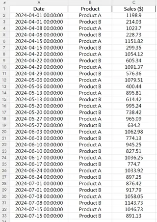
Let's say you have the following files:

Here’s how this usually goes in Excel:
- Group sales by product and date
- Align both on the same time scale
- Build a dual-line chart (if you’re lucky)
- Try to label the lines clearly… then fix the x-axis, again 🙄
- Still kinda ugly, and hard to read
You’ve spent 40 minutes—and still no answers.
Excelmatic to the Rescue
Just ask:
Prompt: Compare weekly sales of Product A and Product B since April 2024 using a dual-line chart.
or
Prompt: Show total weekly sales combining both products alongside individual lines.
And boom:
- Two distinct, styled lines
- Matching dates on the x-axis
- Insightful, clear visuals
- Ready to share with your team, investors, or boss
When to Use a Dual-Line Chart
- Measure impact of new product launches
- Detect sales cannibalization or growth
- Track performance of product pairs over time (bundles, upgrades, etc.)
Excel vs Excelmatic AI
| Step | Traditional Excel | Excelmatic AI |
|---|---|---|
| Data aggregation | Manual/grouped | Automatic |
| Time series alignment | Painful | Smart & synced |
| Chart layout | Manual + tweaking | Beautiful by default |
| Style & labels | Basic | Clean, pro-level |
| Actionable insights | Needs interpretation | Visually obvious |
| Time to generate | 30–45 mins | < 1 min |
Pro Tips
- Use different colors and thickness to show primary vs secondary products
- Add annotations at crossover points
- Consider stacked area chart if you want to show total volume growth
Final Thoughts
Product launches are full of hopes and hunches. But with a dual-line chart, you move from "I think it’s doing okay" to "I know it’s growing our revenue."


