You’ve got website traffic data. Your boss wants to see which channels are bringing in the most visitors. You know the answer: a pie chart. Easy, right?
Well… unless you’ve spent your fair share of time in Excel fiddling with data ranges, clicking “Add Labels,” struggling with overlapping text, and making colors that don’t look like someone dropped a bag of Skittles on your dashboard.
Let’s break down the old-school pain, and then see how Excel AI can make pie chart creation an absolute breeze.
The Traditional Way: Making a Pie Chart in Excel
You start with a list of traffic sources and visitor counts. Seems simple.
But then:
- You accidentally select the wrong column as your label range.
- Excel defaults to a 3D exploded donut with unreadable labels.
- The color scheme looks like 2003 called and wants its gradients back.
- You can’t figure out how to show % and raw values together.
- Your “Email” slice is so small it doesn’t even get a label.
- You try switching to a donut chart to make it pretty—and now everything is misaligned.
Then comes the classic:
Hey, can you break this down by device type too?
Back to square one. You copy-paste, re-group data, re-insert chart. More minutes lost.
And even after all that, the chart doesn’t really “pop.” It shows the numbers, but not the story.
Excelmatic to the Rescue: AI-Generated Pie Charts That Just Work
Now, let’s do this the smart way.
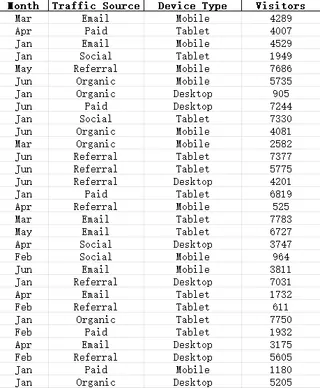
You upload your Excel file with this structure:

Then, you type one simple prompt:
Create a pie chart of visitors by traffic source.
Excelmatic instantly gives you:
- A clean, proportional pie chart
- Color-coded slices with readable labels
- Percentages + visitor counts
- An AI-generated summary like: “Organic traffic accounts for 42% of total visits, followed by Paid at 29%.”
And if you want a different flavor, just say:
Show device type distribution in a donut chart.
Or:
Compare traffic sources for Jan and Feb with side-by-side pie charts.
It’s charting, at the speed of thought.
3 Prompt Examples for Pie Chart Magic
Here are three questions you can ask Excelmatic to create smart, insightful pie charts:
"Create a pie chart of traffic sources by total visitors." Great for understanding which channels matter most.
"Generate a donut chart showing visits by device type." Donuts > Pies when you want to show more context.
"Compare traffic source distribution for each month." Useful when you want to track how your marketing mix is shifting.
You don’t need to group the data or build formulas—Excelmatic handles all the prep work.
Manual Pie Charts vs. Excelmatic AI: Who Wins?
| Step | Traditional Excel | Excelmatic AI |
|---|---|---|
| Data grouping | Manual (SUMIFs/Pivots) | Automatic |
| Chart type selection | Too many, confusing | Smart defaults |
| Label customization | Manual + finicky | Clean & auto-arranged |
| Showing % + counts | Advanced formatting | Built-in |
| Drill-down by dimension | Requires new chart | Just ask a new question |
| Design/Color themes | Meh | Modern and balanced |
| Time to finish | 15–25 mins | Under 1 min |
Why Pie Charts Still Matter (When Done Right)
They’ve been overused and abused, but when used sparingly and smartly, pie charts still have their place. Especially when:
- You want to show how a whole breaks down into parts
- There are fewer than 6 categories
- The focus is on proportions, not exact values
With Excel AI tools like Excelmatic, pie charts are no longer clunky eye candy—they’re insight engines that bring clarity at a glance.


