In e-commerce, knowing how your sales evolve month by month is how you stay ahead of the game. Are you growing? Plateauing? Secretly tanking? 😬
A line chart is your ultimate truth-teller—and with Excelmatic, you can build one in under 10 seconds.
Traditional Method: Manual Mountain Climb
If you’ve tried this before, you know the steps:
- Group raw data by month (good luck with those
=TEXT()formulas) - Sum sales per month manually or via Pivot Table
- Insert a line chart and customize axis, labels, style
- Pray it doesn’t look like spaghetti
It’s accurate… but exhausting.
Why Use a Line Chart?
- Spot sales trends over time (growth, seasonality, dips)
- Track campaign impact (hello, 11.11 and Black Friday )
- Share results with investors or your boss without explaining the whole Excel backend
Real-Life Example
Let’s say you’re running a Shopify store and exported this:
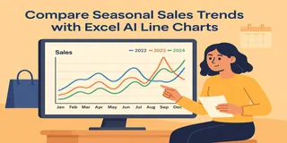
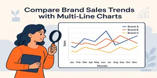
With a simple prompt, Excelmatic turns this into a smooth line chart showing clear monthly trends—no need to wrestle with group-by logic or formatting.
Try asking:
Show a line chart of monthly sales from Jan to Dec 2024.
Yup. That’s it.
Excelmatic:
- Groups your data by date
- Sums it monthly
- Plots a clean line chart
- Even adjusts the date axis spacing & styles so it looks ✨chef’s kiss✨
Manual vs AI Charting Breakdown
| Step | Traditional Excel | Excelmatic AI |
|---|---|---|
| Group by month | Complex formula | Auto-parsed |
| Aggregating sales | Manual/Pivot required | Instant |
| Insert + style chart | Many clicks | Pre-styled |
| Adjust x-axis | Needs fixing | Smart auto-format |
| Highlight peaks/dips | Manual annotation | Trendline ready |
| Time to completion | 20–30 mins | < 1 min |
Pro Tips
- Pair your line chart with annotations like campaign names or promo dates
- Use a dual axis if comparing with cost, conversion rate, or ad spend
- Make it interactive with slicers or filters (if you're fancy like that )
Final Words
You shouldn’t have to become an Excel wizard just to see your own trends. With Excelmatic, your line chart is just one sentence away.


