If you’ve ever been asked “What’s our traffic trend this quarter?” you know the drill. Dig into rows of data, line it up just right, and build that line chart. Except, the chart rarely comes out right the first time. Something is always misaligned—months are out of order, numbers don’t look right, axis labels get cut off, and your retention rates disappear into the abyss of the secondary axis.
Let’s be honest: Excel line charts are powerful but fiddly. If your job depends on visualizing trends—be it website visits, app usage, or customer retention—you need to tame this beast. Or better yet, use a smarter way. That’s where Excelmatic, a sleek Excel AI tool, changes the game.
But first, let’s relive the pain.
The Traditional Way: Building a Line Chart in Excel from Scratch
You’ve got a dataset with monthly traffic and retention numbers. Now what?
First, you need to sort the months correctly (because Excel sometimes alphabetizes them like 'Apr, Aug, Dec…').
Then, you:
- Create a pivot table if your data is long-form (which it usually is).
- Group your visits by month using SUM.
- Insert → Chart → Line Chart → select the right type.
- Realize retention rate is on a different scale, so you need a secondary axis.
- Tweak labels, axes, legends, colors (ugh).
- Try adding data labels. Excel auto-places them in awkward spots.
- Notice outliers. Think, “Should I smooth the line? Add a trendline?”
- Get a Slack ping: “Can you also split this by source?”
Before you know it, 30 minutes are gone and you’re still elbow-deep in chart formatting.
Enter Excelmatic: Line Charts Powered by AI
Imagine just uploading your Excel file and typing:
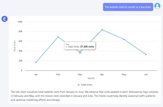
Plot website visits by month as a line chart.

Boom. Excelmatic gives you:
- A clean, sorted line chart with months in proper order.
You can go even deeper with:
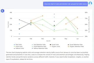
Show line chart of visits and retention rate, grouped by traffic source.

or
Compare monthly trends for Organic and Paid traffic.
In every case, Excelmatic understands the structure, does the grouping, and delivers a publication-ready chart in seconds. You focus on insights. Not formatting.
3 Powerful Prompts You Can Try
Here are some natural language prompts that generate accurate, insightful line charts using Excelmatic:
"Plot monthly website visits as a line chart." – Perfect for tracking overall trend over time.
"Show retention rate per month using a dual-axis line chart." – Two metrics, two y-axes, one sleek result.
"Compare line charts of visits by traffic source." – Useful when analyzing marketing performance.
These simple questions would take 15+ steps in traditional Excel. With Excel AI, it’s just one sentence.
Traditional vs Excel AI Charting: A Reality Check
| Feature | Traditional Excel | Excelmatic AI |
|---|---|---|
| Month sorting | Manual | Auto-sorted |
| Secondary axis setup | Tricky | Done for you |
| Data grouping | Pivot table needed | Handled automatically |
| Chart formatting | Tedious | Clean & clear by default |
| Time to complete | 20–30 mins | < 1 minute |
| Natural language input | Nope | Absolutely |
The Big Picture: Why Line Charts Matter More Than Ever
In marketing, product, or ops—you’re often asked to spot trends. And while Bar Charts show static comparisons, line charts bring the rhythm. Peaks, dips, plateaus—they tell a story over time. And that story is what decision-makers want.
Using Excel AI tools like Excelmatic, you stop wrestling with mechanics and start delivering meaning.
Ready to try it yourself?Try Excelmatic now >>


