Key takeaways:
- Manually filtering Pivot Tables using field filters, report filters, and slicers is time-consuming, prone to errors, and inflexible when faced with ad-hoc analysis requests.
- An Excel AI agent like Excelmatic replaces this entire process. You simply upload your data and ask for the specific filtered view you need in plain language, such as "show me UK sales for products over $1000".
- Using Excelmatic drastically reduces the time spent on reporting from hours to minutes, increases accuracy, and empowers any user to perform complex data slicing without needing to master Pivot Table intricacies.
The Challenge: Drowning in Pivot Table Filters
You've done the hard work of organizing your raw data. You've created a Pivot Table to summarize thousands of rows of sales transactions, inventory movements, or project tasks. It’s a great first step, but the initial report is a data dump—a massive table showing everything. To get real insights, you need to slice and dice.
This is where the filtering marathon begins. You need to see sales for just the 'North' region. Then, you need to exclude certain product categories. Your manager walks over and asks, "Can you show me the top 5 customers in Germany for last quarter, but only for sales over €5,000?"
Suddenly, you're navigating a labyrinth of dropdown menus, checkbox lists, and value filters. You set up Slicers to make it look like an interactive dashboard, but soon you're spending more time managing the slicers and their connections than analyzing the data itself. Every new question feels like starting over, and the risk of making a mistake with a stray click is always present.
The Traditional Way: A Deep Dive into Manual Pivot Table Filtering
For decades, Excel has provided a powerful, albeit manual, toolkit for filtering Pivot Tables. These tools are effective but demand a significant investment in time and a deep understanding of their mechanics. Let's briefly review the conventional methods.
Method 1: Field and Value Filters
The most direct way to filter is using the built-in field filters. A Pivot Table summarizing sales by product will have a dropdown arrow on the "Row Labels" header.
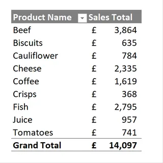
To exclude certain items, like beverages, you would:
- Click the filter arrow next to "Row Labels".
- Manually uncheck the boxes for 'Coffee' and 'Juice'.
- Click OK.
The table updates, but now you have to remember that a filter is active. You can also apply Value Filters to show, for example, only products with sales "greater than or equal to 1000".
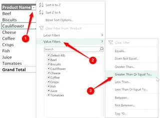
This process is functional for simple, one-off filters. However, it quickly becomes cumbersome. Combining multiple label and value filters requires navigating different sub-menus, and it's easy to lose track of which filters are active.
Method 2: Report Filters
For a more "dashboard-like" feel, you can drag a field, like 'Region', into the "Filters" area of the PivotTable Fields pane. This places a dropdown menu above your Pivot Table.
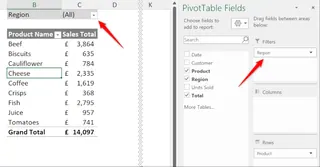
This is a step up, allowing users to select a region to filter the entire report. However, it's still clunky. Selecting multiple items requires checking a specific box, and the UI feels dated. Adding multiple report filters (e.g., for 'Region' and 'Customer') stacks them, making the layout progressively more cluttered.
Method 3: Slicers
Slicers, introduced in Excel 2010, are the most visually appealing of the traditional methods. They are essentially large, user-friendly buttons for filtering.
You can insert a Slicer by selecting your Pivot Table and going to PivotTable Analyze > Insert Slicer.
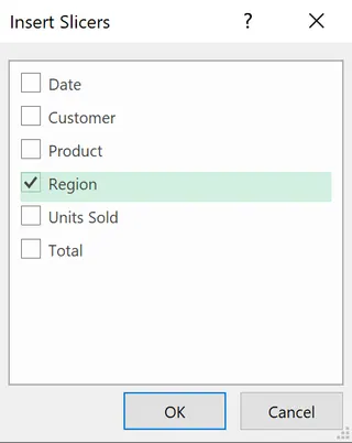
The true power of Slicers comes from connecting them to multiple Pivot Tables. This allows you to build a cohesive dashboard where one click on a Slicer filters several charts and tables simultaneously.
The Limitations of the Manual Approach
While powerful, these methods share fundamental weaknesses:
- Labor-Intensive: Every filter, every slicer, every connection requires a series of manual steps. Building a complex dashboard can take hours.
- Rigid and Inflexible: Your dashboard is only as flexible as the slicers you've pre-configured. When your boss asks a question that falls outside those parameters, you're back to manual filtering or redesigning your setup.
- High Cognitive Load: You have to be the computer, remembering which filters are active, how slicers are connected, and what to do if a combination of filters returns an empty result.
- Error-Prone: A wrong click, a forgotten filter, or a broken slicer connection can lead to incorrect data and bad decisions.
- Steep Learning Curve: Mastering
Report Connectionsand advanced filtering logic is not a trivial skill. It creates a barrier for team members who aren't Excel power users.
The New Way: Conversational Filtering with Excel AI (Excelmatic)
What if you could bypass the clicks, the menus, and the complex setup entirely? What if you could filter your data just by describing what you want to see? This is the promise of Excel AI agents like Excelmatic.
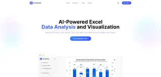
Excelmatic transforms the entire paradigm. Instead of you manually manipulating a Pivot Table to find an answer, you simply ask the AI your question. It analyzes your raw data and generates the precise, filtered result—whether that's a simple table, a complex pivot summary, or a chart—in seconds.
Step-by-Step: From Raw Data to Insight in Seconds
Let's revisit the same sales analysis scenario, but this time using Excelmatic.
1. Upload Your Raw Data File
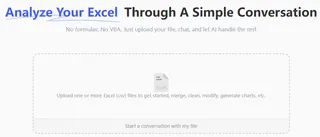
First, you upload your source Excel or CSV file containing all the sales transactions to Excelmatic. There's no need to pre-format it or create a Pivot Table first. Just ensure your columns have clear headers like 'Date', 'Region', 'Product', 'Sales', and 'Customer'.
2. Ask for What You Need in Plain Language
Instead of clicking through menus, you type your request into the chat interface. Here are the same filtering tasks from before, reimagined as simple questions:
To exclude products:
Summarize total sales by product, but exclude coffee and juice.
To filter by value:
Show me a pivot table of sales by product, but only for products with total sales greater than £1,000.
To use a report filter:
Filter the sales data to only show the UK region. Then create a summary of sales by product.
To replicate a multi-slicer dashboard:
Create two pivot tables from my sales data. The first should show sales by product, and the second should show sales by customer. Filter both to show results for Germany only.
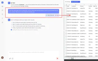
3. Review and Iterate with Follow-up Questions
Excelmatic will instantly generate the requested table or pivot summary. But the real magic is in the conversation. You can refine the results with simple follow-up prompts.
- "Great. Now sort the products from highest to lowest sales."
- "Can you add a column showing the percentage of total sales for each product?"
- "Turn this table into a bar chart."
This iterative process allows you to explore your data at the speed of thought, something that is impossible with the rigid structure of manual Pivot Tables.
4. Export Your Final Result
Once you have the exact view you need, you can download the result as a new, clean Excel file. The output is a ready-to-use table or Pivot Table, not a static image.
A Sample Conversation in Excelmatic
Imagine this dialogue, which accomplishes in seconds what would take many minutes of manual clicking:
User: I've uploaded my sales data. Can you create a pivot table showing total sales by region and product?
Excelmatic: Done. I have created a pivot table with Region and Product as rows and the sum of Sales as the value. The grand total is £550,000.
User: Perfect. Now, filter this to show only the UK and Germany, and only for products where the total sales are over £10,000.
Excelmatic: I've updated the pivot table. It now displays data for the UK and Germany, filtered to only include products with sales exceeding £10,000 in those combined regions. Would you like me to visualize this?
User: Yes, create a stacked bar chart showing the product sales, with regions stacked.
Excelmatic: Here is the stacked bar chart. You can download the Excel file containing the filtered pivot table and the chart below.
Traditional Filters vs. Excelmatic: A Quick Comparison
| Feature | Traditional Pivot Table Filtering | Excelmatic (Excel AI) |
|---|---|---|
| Workflow | Click-driven: Build table, add filters, configure slicers. | Conversation-driven: Ask a question, get an answer. |
| Speed | Minutes to hours, depending on complexity. | Seconds to minutes. |
| Flexibility | Rigid. Answering ad-hoc questions is slow. | Highly flexible. Ask any question, any time. |
| Learning Curve | Moderate to high. Requires learning specific features. | Very low. If you can ask a question, you can use it. |
| Error Rate | Higher risk of manual errors in setup and filtering. | Low. AI consistently interprets and applies logic. |
| Maintenance | Requires manual refresh and management of connections. | None. Each analysis is generated fresh from source data. |
FAQ
Q: Do I need to know how to build a Pivot Table to use Excelmatic?
A: No. You don't need to know anything about Pivot Tables. You just describe the summary you want (e.g., "summarize sales by region"), and Excelmatic will determine that a pivot table is the best way to show it and build it for you.
Q: Does Excelmatic modify my original Excel file?
A: Absolutely not. Excelmatic works on a copy of your data in a secure environment. Your original file remains untouched on your computer.
Q: Can Excelmatic handle complex filtering like Slicers connected to multiple tables?
A: It does something even better. Instead of you managing connections, you just tell the AI what you want. For example: "Show me sales by product and sales by customer, both filtered for the UK." The AI will generate two separate, correctly filtered summaries in one go.
Q: Is it safe to upload my company's financial data to Excelmatic?
A: Excelmatic is built with enterprise-grade security. All data is encrypted in transit and at rest. For specific details on data handling and privacy, you can always refer to the official privacy policy on the website.
Q: What if my data isn't perfectly clean? Can Excelmatic still help?
A: Excelmatic's AI can often understand and work around minor inconsistencies in data, such as slight variations in naming or formatting. However, for best results, starting with well-structured data (e.g., clear column headers) is always recommended. You can even ask Excelmatic to help you clean the data first!
Q: Can I get the generated formulas or Pivot Table settings from Excelmatic?
A: Yes. When you download the results as an Excel file, you get a fully functional file. If Excelmatic generated a Pivot Table, you can interact with it, see its field settings, and use it just like one you created yourself.
Take Action: Upgrade Your Excel Workflow Today
Stop wasting your valuable time clicking through endless filter menus. The hours spent building and maintaining complex Pivot Table reports could be spent on what really matters: making strategic decisions based on your data.
An Excel AI agent like Excelmatic isn't just a tool; it's a new way of working. It empowers every member of your team to become a data analyst, capable of asking complex questions and getting instant, accurate answers.
Ready to see for yourself? Try Excelmatic for free today. Upload one of the spreadsheets you're currently working on and try asking it one of the questions from this article. Experience the power of conversational data analysis and reclaim your time.


