Sometimes, a simple pie chart just won’t cut it.
If you're selling multiple product categories across different regions, you need more than “who sold most.” You want:
What are people buying in each region? Which category dominates across all zones?
That’s when Donut Charts—especially multi-ring ones—become your best friend. And with Excelmatic, you can generate one with just a sentence.
Old Way = Multi-layered Headache
Let’s say you want to compare sales of 5 product categories across 3 major regions.
In traditional Excel, you’ll need to:
- Summarize sales by both
RegionandCategory - Format a multi-series chart (likely clustered bar)
- Manually switch to donut type
- Build legend manually. Then label slices manually.
- Fix inner ring to show only one level. Cry a little.
Total time: 45+ minutes. Total value: buried under clutter.
Donut Charts to the Rescue
Ask Excelmatic:
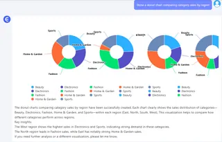
Show a donut chart comparing category sales by region

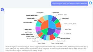
Create a multi-ring donut chart of regional category distribution

Show how product categories contribute to sales in each region
Boom
- Inner ring: Region-level sales
- Outer ring: Category-level breakdown within each region
- All clean, auto-labeled, and styled
When to Use Donut Charts
- You want to compare groups and subgroups
- You need a clear, category breakdown inside regions
- You want to combine two levels of summary in one glance
- Pie chart’s too simple, and stacked bars too messy
Manual vs Excelmatic AI
| Task | Traditional Excel | Excelmatic AI |
|---|---|---|
| Group by 2 levels | Manual Pivot setup | Automatic |
| Create donut chart | Not default | Default-supported |
| Style inner/outer ring | Tedious | Auto-adjusted |
| Insight clarity | Moderate | Instant |
| Time saved | 40–60 mins | 60 seconds |
Pro Tips
- Limit to 3–4 regions and 4–6 categories for clarity
- Use contrasting ring colors to separate layers
- Sort categories by value in each region
- Add total at center for bonus impact
Final Thoughts
Donut charts don’t just look pretty—they let you tell two stories at once.
With Excelmatic, all you need to do is ask the right question—and get a chart that does the talking.
If you are interested in Excel AI charts, you may also like the following articles:
How to Instantly Create Bar Chart with Excel AI (No Manual Work Needed)
Compare Ad Channel Sales with a Bar Chart in Excel AI
Track Monthly Sales Trends in Seconds with Excel AI Line Chart
Compare Brand Sales Trends with Multi-Line Chart in Excel AI
Compare New vs Old Product Sales with Dual-Line Excel AI Charts


