Key takeaways:
- Traditional Excel data analysis involves a complex web of manual tasks like sorting, filtering, writing formulas, and configuring pivot tables, which is time-consuming and prone to human error.
- An Excel AI agent like Excelmatic revolutionizes this process by allowing you to use natural language prompts to perform complex analysis, generate pivot tables, and create charts automatically.
- By switching to an AI-powered workflow with Excelmatic, you can slash your analysis time from hours to minutes, improve accuracy, and gain the flexibility to explore data through conversational follow-up questions.
Problem Background & Pain Points
Imagine you're a marketing analyst, and every Monday morning, your first task is to analyze the previous week's website performance. You have a spreadsheet with thousands of rows, detailing daily traffic with columns like Date, Views, and Clicks.
Your manager needs answers to critical business questions:
- "What were our highest and lowest traffic days?"
- "Which days had high views but low clicks?"
- "What is the weekly trend of our user engagement?"
- "Can I get a summary report with total views and clicks, broken down by week?"
Answering these seemingly simple questions in Excel kicks off a cascade of manual operations. You'll need to sort data, apply multiple filters, maybe write some IF or SUMIFS formulas to calculate engagement rates, and then wrestle with the PivotTable Fields pane to summarize the data. Each new question sends you back to the spreadsheet for another round of clicks, drags, and formulas. This process isn't just tedious; it's a minefield of potential errors and a massive time sink.
The Traditional Excel Solution: Steps and Limitations
For decades, the "correct" way to tackle this in Excel has been to master a suite of built-in tools. While powerful, these tools demand significant expertise and manual effort.
A typical workflow might look like this:
Sorting Data: To find the highest traffic days, you'd select your data range, navigate to
Data > Sort, and configure the dialog box to sort by the 'Views' column in descending order.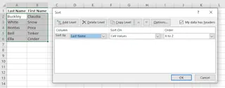
Filtering for Insights: To find days with high views (> 60) but low clicks (< 20), you'd apply an AutoFilter. You'd click the filter arrow on the 'Views' column, set a number filter for "> 60", then repeat the process on the 'Clicks' column for "< 20". For more complex
ORconditions, you might even need to set up a separate criteria range for an Advanced Filter.Using Formulas for Calculation: To calculate an engagement rate, you'd add a new column and type a formula like
=C2/B2(assuming Clicks are in column C and Views in B). Then you'd drag the fill handle down to apply it to all rows, and finally, format the column as a percentage.Summarizing with Pivot Tables: To create a weekly summary, you'd go to
Insert > PivotTable. Then, you'd drag theDatefield to the 'Rows' area (and group it by week), and dragViewsandClicksto the 'Values' area. If you want to count days instead of summing clicks, you have to find and change the 'Value Field Settings'.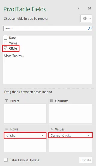
The Limitations of the Manual Approach
While this "classic" method works, it's fraught with inefficiencies in the modern workplace:
- High Cognitive Load: You must remember the syntax for dozens of functions (
VLOOKUPvs.XLOOKUP,SUMIFvs.SUMIFS) and the specific steps for each tool. It's a constant mental juggling act. - Rigid and Inflexible: Your pivot table is built for one specific view. If your manager asks a follow-up question like, "Great, now can you show me the top 3 days within each of those weeks?", you're often forced to reconfigure or even rebuild the entire pivot table.
- Prone to Errors: A single typo in a formula, an incorrect range selection, or forgetting to refresh a pivot table can lead to silent, disastrous errors in your report.
- Incredibly Time-Consuming: The sequence of clicking, dragging, typing, and formatting for every single query adds up. A task that should take minutes can easily stretch into an hour or more, especially with large datasets.
The Modern Solution: Excel AI with Excelmatic
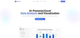
What if you could skip all the manual steps and just tell Excel what you want? That's the promise of an Excel AI Agent like Excelmatic. It transforms data analysis from a series of rigid procedures into a fluid, natural conversation.
The Overall Approach
With Excelmatic, the workflow is radically simplified:
- Upload: You upload your Excel or CSV file.
- Ask: You type your request in plain English, just as you would ask a colleague.
- Get: The AI analyzes the data and directly generates the requested table, pivot table, formula, chart, or report.
- Iterate: You can ask follow-up questions to refine the results, dig deeper, or visualize the data differently.
You no longer need to be an "Excel guru" who knows which button to click. You only need to know what business question you want to answer.
Step-by-Step: Analyzing Website Data with Excelmatic
Let's revisit the marketing analyst's tasks, but this time, using Excelmatic.
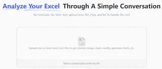
1. Upload Your Data File First, log in to Excelmatic and upload your website performance spreadsheet. The AI will instantly read the headers and understand the data structure.
2. Describe Your Desired Outcome in Natural Language Instead of clicking through menus, you simply type your requests into the chat interface. Here are some examples based on our scenario:
To sort the data:
Sort the table by 'Clicks' from highest to lowest.
To filter for specific conditions:
Show me only the rows where 'Views' are over 60 and 'Clicks' are less than 20.
To perform calculations:
Add a new column named 'Engagement Rate' by dividing 'Clicks' by 'Views'. Format it as a percentage with two decimal places.
To create a pivot table summary:
Create a pivot table that sums the 'Views' and 'Clicks' for each week. Also, show the average engagement rate per week.
To generate a chart:
Create a line chart that shows the trend of 'Views' and 'Clicks' over the entire date range.

3. View and Iterate on the Results Excelmatic will immediately display the result—a sorted table, a filtered view, a new column with the correct formula, a fully configured pivot table, or a chart.
The real power lies in iteration. You can continue the conversation:
Okay, for that weekly pivot table, can you highlight the top 3 weeks with the highest average engagement rate?
Or:
For the line chart, add a trendline for the 'Views' data.
This conversational approach makes data exploration fast and intuitive, encouraging a deeper level of analysis that is often too cumbersome to attempt manually.
4. Export Your Findings Once you're satisfied, you can download the results as a new, clean Excel file containing the generated tables, charts, and formulas. You can also copy the AI-generated formula or pivot table configuration to use in your existing workbooks.
Dialogue Example
Here’s how a typical conversation with Excelmatic might look:
User: I've uploaded my website traffic data for January. Can you give me a quick summary?
Excelmatic: Of course. For January, you had a total of 1,520 views and 385 clicks. I've created a pivot table summarizing the total views and clicks for each week. Would you like to see this data visualized?
User: Yes, please create a combination chart showing weekly views as columns and weekly clicks as a line on a secondary axis.
Excelmatic: Done. The combination chart has been generated. I've noticed that the third week of January had the highest views but only the second-highest clicks.
User: Interesting. Can you filter the original dataset to show me just the data for that third week and add a column for the daily 'Engagement Rate' (Clicks/Views)?
Excelmatic: No problem. Here is the filtered data for the third week of January, now with the 'Engagement Rate' column added. You can now download this new view as an Excel file.
Traditional vs. Excelmatic: A Quick Comparison
| Aspect | Traditional Excel | Excelmatic (Excel AI) |
|---|---|---|
| Time to Insight | Hours of clicking & formula writing | Minutes of typing & refining |
| Required Skill | Deep knowledge of functions, pivot tables, charts | Ability to describe your business need |
| Flexibility | Rigid; new questions require rework | Highly flexible; iterate with follow-up questions |
| Error Rate | High risk of manual formula/range errors | Low risk; AI handles complex generation |
| Learning Curve | Steep and continuous | Minimal; feels like talking to an assistant |
FAQ
Q1: Do I need to be an Excel expert to use Excelmatic? Not at all. The core idea behind Excelmatic is to eliminate the need for deep technical knowledge. If you can describe the report or analysis you want in plain language, you can use Excelmatic. It's perfect for both beginners who want to perform complex tasks and experts who want to save time.
Q2: Is my data safe when I upload it to Excelmatic? Data security is a top priority. Excelmatic uses industry-standard encryption for data in transit and at rest. Your files are processed securely and are not used for training models without your explicit consent. For detailed information, always refer to the official privacy policy on the website.
Q3: Can Excelmatic handle messy or poorly structured data? While cleaner data always yields better results, Excelmatic's AI can often interpret and work with common data inconsistencies. It can even help you with basic data cleaning tasks, such as removing duplicates or filling in missing values, just by asking.
Q4: What if the AI misunderstands my request? Just like with a human assistant, misunderstandings can occasionally happen. If the AI's output isn't what you expected, you can simply rephrase your request, provide more context, or correct it in a follow-up prompt. The conversational interface makes this correction process quick and easy.
Q5: Can I use the charts and pivot tables from Excelmatic in my own presentations? Absolutely. You can download the entire workbook with the generated outputs, or copy and paste specific elements like charts and tables directly into your own Excel files, PowerPoint presentations, or reports.
Take Action: Upgrade Your Excel Workflow with Excelmatic
Every hour you spend manually sorting, filtering, and building pivot tables is an hour you're not spending on strategic thinking and deriving valuable insights. The traditional way of working in Excel is powerful, but it's no longer the most efficient.
By embracing an Excel AI agent, you can reclaim that lost time, eliminate frustrating manual errors, and respond to data requests with unprecedented speed and agility. Imagine being able to answer any question your manager throws at you in seconds, not hours.
Ready to experience the future of data analysis?
Try Excelmatic for free today. Upload one of the spreadsheets you're working on right now and try asking one of the questions from this article. You'll be amazed at how much faster you can get to your answer.


