Key takeaways:
- Creating and customizing charts in Excel is a multi-step, manual process involving data selection, menu navigation, and tedious formatting, which is time-consuming and prone to errors.
- Excel AI tools like Excelmatic replace these manual steps. You can simply describe the chart you want in plain English (e.g., "create a bar chart showing sales by region"), and the AI generates it for you.
- Using Excelmatic for chart creation dramatically speeds up reporting, allows for rapid experimentation with different chart types, and makes data visualization accessible even to users unfamiliar with advanced Excel features.
The Problem: The Hidden Time Cost of "Simple" Excel Charts
You have the data. A spreadsheet filled with sales figures, project milestones, or marketing campaign results. Now, you need to present it. A wall of numbers won't cut it; you need a chart to tell the story.
In theory, creating a chart in Excel seems straightforward. But in practice, it's a frustrating cycle of clicks, adjustments, and re-dos.
Imagine you're a sales manager preparing for a weekly leadership meeting. You have a raw export of all transactions from the past quarter. Your task is to create a few simple visuals: a comparison of sales by region, a trend of weekly revenue, and a breakdown of which products are selling best.
The "simple" task quickly spirals:
- Data Wrangling: Your raw data isn't chart-ready. You first need to summarize it. This means building a PivotTable or writing
SUMIFSformulas to aggregate sales by region and product. - The Click Labyrinth: You select your summary table, navigate to
Insert > Charts, and pick a column chart. - The "Ugly Duckling" Phase: The default chart Excel produces is rarely presentation-ready. The title is generic, there are no data labels, the currency is missing from the axis, and the colors clash with your company's branding.
- Endless Tweaking: You spend the next 15 minutes clicking through menus.
Chart Design,Format, the little+icon... you add a title, format the axis, add data labels, and manually change the color of each bar. - The Inevitable "What If?": Just as you finish, your boss asks, "This is great, but can we see this as a trend over time?" You sigh. That means starting the entire process over with a line chart, complete with all the same tedious formatting steps.
This isn't a productive use of your time. You're an analyst, a manager, a professional—not a "chart formatter." The manual process is not just slow; it's a drain on your focus and creativity.
The Traditional Way: A Step-by-Step Manual Process
The conventional method for making a graph in Excel, while powerful, is fundamentally manual. It relies on your direct manipulation of the software's interface at every stage.
Here’s a breakdown of the typical workflow and its inherent limitations.
Standard Steps to Create an Excel Chart
Prepare and Summarize Data: Before you even think about a chart, you must transform your raw data (like a list of transactions) into an aggregated summary table. This often involves creating a PivotTable or using functions like
SUMIFSorCOUNTIFS. This step alone can be complex and time-consuming.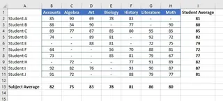
Select Data and Insert Chart: You must carefully highlight the correct range of cells in your summary table. Then, you navigate to the
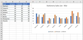
Inserttab in the ribbon and browse the chart gallery to find a suitable starting point.Choose a Chart Type: You'll select a chart based on the story you want to tell.
- Column/Bar Chart: For comparing values across different categories.
- Line Chart: For showing trends or changes over time.
- Pie Chart: For displaying parts of a whole.
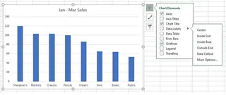
Customize and Format: This is where most of the time is spent. Using the
Chart DesignandFormattabs, you manually:- Add or edit the Chart Title and Axis Titles.
- Add Data Labels to show specific values.
- Adjust the Legend.
- Change colors, fonts, and line styles.
- Format the axis scale and number format (e.g., to show currency).
Refine and Adjust: If the initial chart isn't quite right, more manual work is needed. You might use the
Switch Row/Columnbutton to change the data orientation or use theFiltericon to exclude certain categories. Each change requires you to find the right button and re-evaluate the result.
The Limitations of the Manual Approach
While this method gives you granular control, it comes with significant drawbacks:
- Extremely Time-Consuming: The journey from raw data to a polished, presentation-ready chart can take 15-30 minutes, even for an experienced user. This time multiplies with each chart you need to create.
- Rigid and Inflexible: Ad-hoc analysis is painful. When a colleague asks, "Can you filter out the 'North' region and show me the top 5 products instead?" you can't just "ask" the chart to change. You have to go back to your data, apply filters, and potentially rebuild the chart.
- Requires Pre-Processing: The biggest hidden cost is that you can't just chart your raw data. The initial summarization step using PivotTables or formulas is a major hurdle, especially for less experienced users.
- High Risk of Human Error: A simple mistake—selecting the wrong data range, forgetting to refresh a PivotTable, or applying an incorrect filter—can lead to a misleading or completely inaccurate chart.
- Steep Learning Curve: Knowing which chart type to use, how to structure your data for it, and where to find all the formatting options is a skill that takes time and practice to develop.
The New Way: Create Charts Instantly with Excel AI (Excelmatic)
What if you could skip the manual labor entirely? Instead of clicking through menus, what if you could just describe the chart you want? That's the power of an Excel AI Agent like Excelmatic.

Excelmatic acts as your personal data analyst. You upload your raw data file, and then you use plain language to tell the AI what to do. It handles the data summarization, chart creation, and formatting for you in seconds.
Step-by-Step: From Raw Data to Chart in Under a Minute
Let's revisit the sales manager's task, but this time with Excelmatic.
1. Upload Your Raw Data File
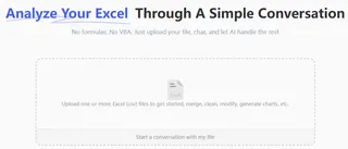
First, drag and drop your Excel or CSV file directly into Excelmatic. You don't need to clean it up or create a summary table first. Just upload the raw transaction log. Make sure your columns have clear headers like "Date," "Region," "Product," and "Sales Amount."
2. Ask for a Chart in Plain Language
Now, simply type your request into the chatbox. You can be as specific or as general as you like.
Here are a few examples of prompts you could use:
"Create a column chart comparing total sales for each region.""Show me the monthly sales trend for the last 6 months as a line chart.""Generate a pie chart showing the sales contribution of each product category.""Create a bar chart of the top 5 sales reps by total sales amount, sorted from highest to lowest."
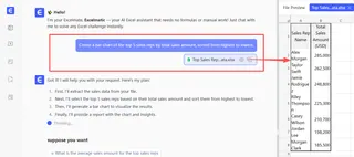
The AI understands your intent, automatically aggregates the data from your raw file, and generates the appropriate chart.
3. Review and Iterate with Follow-up Questions
The first chart appears instantly. But the real magic is in the conversation. You can now refine the chart just by asking.
"Okay, now change this to a bar chart.""Only include data from the 'East' and 'West' regions.""Add data labels in a currency format to each bar.""Change the chart title to 'Q3 Regional Sales Performance'.""Can you make the bar for the 'East' region blue?"
This conversational approach eliminates the need for manual adjustments and makes exploring your data incredibly fast and intuitive.
4. Export Your Presentation-Ready Chart
Once you're happy with the result, you can download a new Excel file containing the perfectly formatted chart and its underlying summary data. It's ready to be copied into your presentation or report.
Dialogue Example: A Real-World Conversation
Here's how a typical interaction with Excelmatic might look:
User: I uploaded my sales data. Can you create a column chart showing the total sales for each product category?
Excelmatic: Done. I've created a column chart summarizing sales by product category. The 'Electronics' category has the highest sales. Would you like to see this broken down by month?
User: Yes, show me that as a stacked column chart, with months on the x-axis and stacks representing the product categories.
Excelmatic: Here is the stacked column chart showing monthly sales broken down by product category. You can see a significant spike in 'Home Goods' sales in December. I've also added a legend for clarity. You can download the new Excel file containing this chart.
Traditional Excel vs. Excelmatic: A Quick Comparison
| Feature | Traditional Excel | Excelmatic (Excel AI) |
|---|---|---|
| Time to Create | 5-20 minutes per chart | < 1 minute per chart |
| Data Preparation | Manual (Formulas/PivotTables) | Automatic (AI handles summarization) |
| Flexibility | Low (Re-create for changes) | High (Iterate with chat commands) |
| Required Skill | Intermediate Excel knowledge | Basic conversational language |
| Error Risk | High (Manual selection/formatting) | Low (AI handles the process) |
FAQ
Here are some common questions about using an AI agent like Excelmatic for creating charts.
1. Do I need to know which chart type is best for my data? Not necessarily. You can describe your goal (e.g., "compare sales across regions") and let Excelmatic suggest a chart. You can also ask it to "change this to a line chart" or "try a bar chart" to quickly see which visual works best.
2. Is my data secure when I upload it to Excelmatic? Yes. Excelmatic is built with enterprise-grade security and data privacy in mind. Your files are encrypted and are not used to train models for other users. Always refer to the official privacy policy for detailed information.
3. Can I customize the charts generated by the AI? Absolutely. You can ask the AI to make specific formatting changes, such as "change the chart title," "add data labels," "make the bars green," or "format the y-axis as currency."
4. What if the AI misunderstands my request? Just like with a human assistant, you can clarify or rephrase your request. For example, if you ask for "top products" and it gives you 10, you can follow up with, "Sorry, I meant only the top 5."
5. Does Excelmatic work with large or messy data files? Excelmatic is designed to handle large datasets more efficiently than client-side Excel. While it can handle some data inconsistencies, for best results, ensure your data has clear column headers. You can even ask the AI to help with basic data cleaning tasks.
6. Can I use the charts or data from Excelmatic in my own Excel files? Yes. You can download a new Excel workbook containing the generated chart, the summary data table, and any formulas the AI used. You can then copy these elements into your existing reports.
Get Started: Automate Your Excel Charting Today
Stop letting the tedious process of creating charts slow you down. The time you spend clicking through menus, formatting axes, and re-doing work is time you could be spending on strategic analysis and uncovering key insights.
By embracing an Excel AI agent, you shift your role from a software operator to a data strategist. You focus on the "what" and the "why," while the AI handles the "how."
Ready to experience the future of Excel?
Try Excelmatic for free today. Upload one of your own reports and use a prompt from this article. See for yourself how quickly you can turn raw data into a beautiful, presentation-ready chart.

