Key takeaways:
- Creating and formatting various column charts (clustered, stacked) in Excel is a multi-step, time-consuming process that requires significant manual adjustments for each new view.
- Excel AI tools like Excelmatic eliminate these manual steps, allowing you to generate complex charts instantly using natural language prompts like "create a stacked column chart showing sales by store for each department."
- Using Excelmatic not only saves hours of tedious work but also provides unparalleled flexibility to explore your data, switch between chart types, and get presentation-ready visuals without ever touching the format pane.
Problem Background & Pain Points
Imagine you're a sales manager preparing for a monthly performance review. You have a simple spreadsheet with product sales data. Your goal is to present this data visually to quickly identify top-performing products and those that are lagging. A column chart is the perfect tool for this.
In theory, this is a straightforward task in Excel. But in reality, it's the start of a frustrating, click-heavy journey. You select your data, navigate the 'Insert' tab, choose the right chart type, and then the real work begins: tweaking the title, adjusting colors to match your company's branding, changing the gap width to make the columns look substantial, and deciding whether to use an axis or data labels.
The pain intensifies when your boss looks at the chart and says, "This is great, but can you also show me how sales for each department compare across our three different store locations? And maybe stack them to show total sales per department?" Each new request sends you back to the drawing board, manually reconfiguring your chart, or starting over from scratch. This process isn't just slow; it's a barrier to fluid data exploration and quick decision-making.
The Traditional Excel Solution: Steps and Limitations
The conventional way to create a column chart in Excel, while functional, is a rigid, step-by-step procedure that leaves little room for quick iteration.
Let's say you have sales data for different departments across three stores: Hammersmith, Green Park, and Stratford.
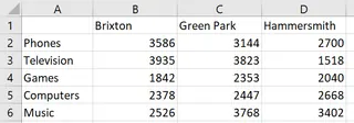
To create a comparative chart, your manual workflow would look something like this:
- Data Selection: Carefully select the entire data range, including headers (e.g.,
A1:D6). - Chart Insertion: Navigate to
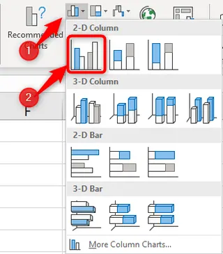
Insert>Charts>Insert Column or Bar Chart. - Choose Chart Type: You must decide upfront if you want a
Clustered Column,Stacked Column, or100% Stacked Columnchart. Let's start with Clustered.
This gives you a basic chart, but it's far from complete.
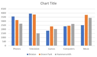
Now the "fun" part begins: formatting.
- You need to manually edit the chart title.
- You might want to change the default blue, orange, and gray colors. This requires right-clicking the data series, opening the
Format Data Seriespane, and individually selecting new fill colors. - To switch the perspective (e.g., show stores on the x-axis instead of departments), you need to find and click the
Switch Row/Columnbutton. - If you decide a
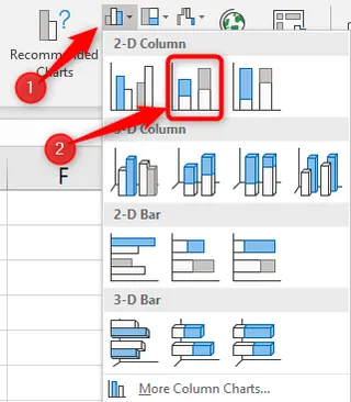
Stacked Columnchart would be better for showing totals, you have to go toDesign>Change Chart Typeand select the new option.
The Limitations of the Manual Method
This traditional approach is fraught with inefficiencies:
- Time-Consuming & Repetitive: Every chart, and every modification, requires a sequence of clicks through menus and formatting panes. This consumes valuable time that could be spent on analysis.
- Inflexible: It discourages data exploration. When a simple change of perspective requires several steps, you're less likely to experiment with different views to uncover deeper insights.
- High Learning Curve: Remembering where every formatting option is hidden (Gap Width, Data Labels, Axis Options) requires experience. New users can feel overwhelmed.
- Prone to Errors: Manually selecting data or changing settings can lead to mistakes, such as choosing the wrong data range or applying a format incorrectly.
- Difficult to Replicate: If you need to create the same report next month with new data, you have to repeat the entire process.
The New Solution: Using an Excel AI Agent (Excelmatic)
What if you could bypass this entire manual process? What if you could create the exact chart you need, perfectly formatted, just by describing it? This is exactly what Excel AI Agents like Excelmatic are designed to do.
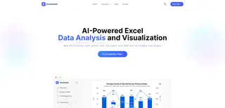
Excelmatic acts as your personal data analyst. You upload your Excel file, and then, using plain language, you tell the AI what you want to achieve. It handles the data selection, chart creation, and formatting for you, delivering a finished product in seconds.
Step-by-Step: Creating Column Charts with Excelmatic
Let's use the same sales data and solve the problem the AI way.
1. Upload Your Data
First, you simply upload your Excel or CSV file to Excelmatic. The AI will read your table and understand its structure, recognizing headers like "Department," "Hammersmith," and "Green Park."
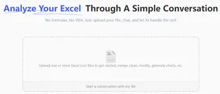
2. Describe the Chart You Want in Plain Language
Instead of clicking through menus, you just type your request. Here’s how you can create all the chart types from the original problem:
To create a simple clustered column chart (one data series):
Create a column chart to show the sales for each product.
To create a multi-series clustered column chart:
Generate a clustered column chart to compare sales for each department across the three store locations.
To create a stacked column chart:
Show me a stacked column chart of sales by department, where each stack segment represents a store's contribution.
To switch the perspective (like 'Switch Row/Column'):
Now, create a stacked column chart for each store, with the segments showing the sales from each department.
To create a 100% stacked column chart:
Create a 100% stacked column chart to visualize the percentage contribution of each store to every department's total sales.

3. View and Iterate on the Results
Excelmatic instantly generates the chart based on your prompt. But the magic doesn't stop there. You can continue the conversation to refine it.
- "Change the chart title to 'Quarterly Sales Performance by Store'."
- "Add data labels to the top of each column."
- "Make the columns for the Green Park store green."
- "Now show this as a bar chart instead."
This conversational approach makes data exploration fast and intuitive. You can test different visualizations in seconds, not minutes.
4. Export Your Finished Chart
Once you're happy with the result, you can download a new Excel file containing the chart and the underlying data, ready to be dropped into your presentation or report.
Dialogue Example with Excelmatic
Here’s how a typical interaction might look:
You: I've uploaded my sales data. Can you create a chart that compares the sales of each department across our three stores?
Excelmatic: Certainly. I have created a clustered column chart that shows the sales for each department, with separate columns for the Hammersmith, Green Park, and Stratford stores. Would you like any adjustments?
You: This is good. Can you change it to a stacked column chart so I can see the total sales for each department more easily? And add a title: 'Total Department Sales by Store'.
Excelmatic: Done. The chart is now a stacked column chart, and the title has been updated. The total height of each bar represents the total sales for a department, while the colored segments show the breakdown by store.
You: Perfect. One last thing, can you make the chart look more professional? Use a darker color palette and add data labels to the segments.
Excelmatic: Of course. I've applied a professional, high-contrast color palette and added data labels to each segment for clarity. You can now download the updated Excel file.
Traditional Excel vs. Excelmatic: A Quick Comparison
| Feature | Traditional Excel (Manual) | Excelmatic (AI-Powered) |
|---|---|---|
| Time to Create | 5-15 minutes per chart | < 30 seconds per chart |
| Flexibility | Low. Changes require re-doing steps. | High. Instantly iterate with new prompts. |
| Formatting | Manual, tedious, and click-intensive. | Conversational. Just ask for changes. |
| Skill Required | Intermediate Excel knowledge needed. | None. Just describe your goal. |
| Error Rate | Higher risk of manual error. | Low. AI handles data selection and logic. |
FAQ
1. Do I need to be an Excel expert to use Excelmatic? Not at all. Excelmatic is designed for everyone. If you can describe the report or chart you want in a sentence, you can use it. You don't need to know any formulas or chart-formatting tricks.
2. Is my data secure when I upload it to Excelmatic? Yes. Excelmatic prioritizes data security and privacy. Your files are processed securely, and the platform adheres to strict privacy policies. For specific details on data handling, always refer to the official website's privacy policy.
3. Will Excelmatic modify my original Excel file? No. Your original file remains untouched. Excelmatic works on a copy of your data in its secure environment and allows you to download the results (like new charts or tables) as a separate Excel file.
4. Can Excelmatic create charts other than column charts? Absolutely. You can ask for pie charts, line charts, bar charts, scatter plots, and more. You can even ask it to create complex visualizations like pivot charts or combination charts.
5. What if my data is messy or not perfectly structured? Excelmatic includes data cleaning capabilities. You can ask it to handle common issues like removing duplicates, filling in missing values, or splitting columns before you create your chart, all using natural language commands.
6. Can I copy the chart from Excelmatic back into my own workbook? Yes. The final output is a standard Excel file. You can open it, copy the chart, and paste it directly into your existing reports or dashboards, where it will remain a fully editable Excel chart.
Take Action: Upgrade Your Excel Workflow Today
Stop letting tedious, manual charting slow you down. Every minute you spend clicking through formatting panes is a minute you're not spending on strategic analysis. The traditional way of making charts in Excel is a relic of a pre-AI era.
With Excelmatic, you can transform your relationship with data. Turn complex datasets into clear, insightful visualizations in the time it takes to write a sentence. Answer follow-up questions from your team on the fly and become the go-to person for fast, accurate data insights.
Ready to experience the future of Excel? Try Excelmatic for free today and create your next column chart in seconds, not minutes. Just upload the spreadsheet you're working on right now and ask it for the chart you need. You'll be amazed at the difference.


