Key takeaways:
- Creating effective charts in Excel traditionally involves a manual, multi-step process of data selection, menu navigation, and tedious formatting that can take hours.
- Excel AI tools like Excelmatic revolutionize this workflow by allowing you to generate complex, presentation-ready charts and graphs simply by describing them in plain language.
- Using Excelmatic not only saves significant time but also enhances flexibility, allowing for rapid, conversational iteration on your data visualizations to uncover deeper insights.
Problem background & pain points
Picture this: it's the end of the month, and you need to prepare a performance report for your manager. You have a spreadsheet filled with valuable data—sales figures by region, marketing campaign results, or project milestones. You know that a wall of numbers won't cut it; you need charts to tell a compelling story.
This is where the frustration often begins for many Excel users. The goal is simple: turn raw data into clear, insightful visuals. But the path to get there is anything but. You start by asking yourself, "What's the best way to show this? A bar chart to compare regions? A line chart to show the trend over time? Or a pie chart for market share?"
Even after you've made a choice, the real work starts. You select your data, navigate to the Insert tab, and click a chart type. The default chart Excel produces is rarely what you need. The title is generic, the axes aren't scaled correctly, there are no data labels, and the colors are bland. Now begins the tedious "chart surgery"—a seemingly endless series of clicks to format every single element, from the legend to the gridlines, until it's finally presentable. If your boss asks for a small change, you might have to start the whole process over again.
The Traditional Excel Solution: Steps & Limitations
The classic method for creating charts in Excel has been the same for years. While powerful, it's a manual process that requires both technical knowledge and a good sense of design.
The typical workflow looks something like this:
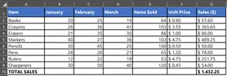
- Data Preparation: First, you must ensure your data is structured in a clean, tabular format with clear column headers. Any gaps or inconsistencies can break the chart.
- Data Selection: You carefully highlight the specific rows and columns you want to visualize. If the data isn't in a contiguous block, you have to hold down the
Ctrlkey to select multiple ranges—a small but often clumsy step. - Chart Insertion: You navigate to the
Inserttab, browse theChartsgroup, and select a type like Column, Line, or Pie. Excel's "Recommended Charts" feature can offer suggestions, but the final decision rests with you.
- Endless Customization: This is where most of the time is spent. Using the
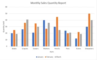
Chart DesignandFormattabs, or the small+icon next to the chart, you manually:- Add or edit the chart title and axis titles.
- Add data labels to show specific values.
- Adjust the axis scale (e.g., changing the minimum value to better show a trend).
- Format the colors, fonts, and styles to match your company's branding.
- Move or hide the legend.
- Switch rows and columns if the initial chart orientation is wrong.
The Limitations of the Manual Approach
While this process works, it's fraught with inefficiencies that professionals face daily:
- Time-Consuming: The cycle of creating and formatting a single chart can take anywhere from 15 minutes to an hour, especially for complex datasets or dashboards with multiple visuals.
- Rigid and Inflexible: Once a chart is created, it's static. If you want to filter the data to see only the top 5 products or a specific time frame, you must first manipulate the source data with filters or formulas and then often recreate the chart.
- High Cognitive Load: You have to remember where every formatting option is hidden across different menus and panels. Deciding on the "right" chart for your story requires knowledge of data visualization principles.
- Error-Prone: A wrong data selection or an incorrect axis setting can lead to a misleading chart, potentially causing poor business decisions.
- Poor for Exploration: The manual process discourages experimentation. You're less likely to try different chart types or explore various angles of your data because of the effort involved in starting over.
The New Solution: Using an Excel AI Agent (Excelmatic)
What if you could skip the tedious clicks and just tell Excel what you want? This is the promise of Excel AI agents like Excelmatic. Instead of being a manual tool, Excel becomes an intelligent assistant that understands your requests and does the heavy lifting for you.
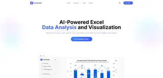
With Excelmatic, you simply upload your data and describe the chart you need in plain language. The AI handles the data selection, chart creation, and formatting, delivering a presentation-ready visual in seconds.
Step-by-Step: Creating Charts with Excelmatic
Let's revisit the scenario of creating a monthly sales report. Here’s how you would do it in Excelmatic:
1. Upload Your Data File
Drag and drop your Excel or CSV file containing the sales data into the Excelmatic interface. The AI will instantly read and understand the structure of your data, identifying the columns and data types.
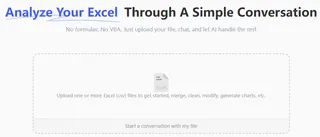
2. Describe the Chart You Want in Plain Language
Instead of clicking through menus, you just type your request into the chatbox. The key is to be descriptive. Here are a few examples:
- "Create a column chart comparing the total 'Sales' for each 'Region'. Sort the regions from highest to lowest sales."
- "Generate a line chart showing the trend of 'Revenue' and 'Units Sold' over the 'Month' column."
- "Make a pie chart that shows the percentage contribution of each 'Product Category' to the total sales."
- "I need a stacked bar chart showing the sales breakdown by 'Product' for each 'Sales Rep'."

3. Review and Iterate Conversationally
Excelmatic will generate the chart based on your prompt. But the real magic lies in the ability to refine it through conversation. This is where you save the most time compared to the manual method.
You can ask follow-up questions like:
- "Okay, that looks good. Now change the title of the line chart to 'Monthly Revenue Trend - 2024'."
- "On the column chart, add data labels to each bar."
- "Can you change the color of the 'North America' bar to blue?"
- "This is great, but can you switch the line chart to a stacked area chart instead?"
This conversational approach encourages data exploration. You can quickly view your data from multiple perspectives without the friction of manual rework.
4. Export Your Results
Once you're happy with the chart, you can download a new Excel file. The file will contain your original data plus a new sheet with the perfectly formatted chart you created, ready to be copied into your report or presentation.
Dialogue Example: User vs. Excelmatic
Here's how a typical conversation might unfold when creating a marketing report:
User: I've uploaded my marketing performance data. Please create a line chart to show the trend of 'Website Traffic' and 'Conversions' over time.
Excelmatic: Done. I've created a line chart showing Website Traffic and Conversions from January to June. Since the two metrics have very different scales, would you like me to add a secondary Y-axis for 'Conversions' to make its trend clearer?
User: Yes, please do that. And also create a bar chart comparing the total 'Conversions' for each 'Traffic Source', sorted from highest to lowest.
Excelmatic: I've updated the line chart with a secondary axis for better readability. I've also generated a new bar chart showing total conversions per traffic source, sorted in descending order. You can find both charts in the 'Visualizations' sheet of the downloadable Excel file.
Traditional Method vs. Excelmatic: A Quick Comparison
| Aspect | Traditional Excel Method | Excelmatic (Excel AI) Method |
|---|---|---|
| Time to Create | 15-60 minutes per chart | 1-2 minutes per chart |
| Flexibility | Low. Changes require manual rework. | High. Refine and change charts with simple follow-up commands. |
| Skill Required | Intermediate to advanced Excel skills needed for customization. | Basic conversational skills. You just need to describe your goal. |
| Error Rate | Higher, due to manual selection and formatting. | Lower, as the AI handles data mapping and best practices. |
| Exploration | Discouraged due to high effort. | Encouraged due to the ease of trying new visualizations. |
FAQ
1. Do I need to know which chart type is best for my data to use Excelmatic? Not necessarily. You can describe what you want to show (e.g., "compare sales across regions" or "show the trend over time"), and Excelmatic can suggest and create the most appropriate chart type for you. Alternatively, if you know what you want, you can ask for it directly (e.g., "create a bar chart").
2. Can Excelmatic create advanced charts like waterfall or funnel charts? Yes. You can describe these complex charts in your prompt, and Excelmatic will generate the necessary structure and visualization. For example, "Create a waterfall chart showing how our starting revenue of $50k was affected by new sales, refunds, and costs."
3. Is my data secure when I upload it to Excelmatic? Data privacy and security are top priorities. Excelmatic processes your file in a secure environment and does not store your data long-term. For specific details, always refer to the official privacy policy on the website.
4. Will Excelmatic modify my original Excel file? No. Excelmatic works on a copy of your data in its secure environment. Your original file remains untouched on your computer. You can download the results, including new charts and tables, as a brand-new Excel file.
5. Can I still customize the charts after they are generated by AI? Absolutely. You have two options: you can either ask the AI to make further customizations conversationally (e.g., "change the chart colors") or you can download the Excel file and perform any final, minor tweaks using Excel's traditional formatting tools.
6. Is Excelmatic suitable for complete beginners who don't know any Excel formulas? Yes, it's ideal for beginners. It bridges the skill gap by allowing users to accomplish complex tasks, like creating detailed charts and pivot tables, without needing to learn specific formulas or functions.
Take Action: Upgrade Your Excel Workflow Today
Every minute you spend manually wrestling with chart formatting is a minute you're not spending on analyzing data and deriving insights. The traditional way of creating charts in Excel is powerful but outdated and inefficient for the fast-paced demands of modern business.
By embracing an Excel AI agent like Excelmatic, you can transform your relationship with data. Turn hours of tedious clicking into minutes of simple conversation. Respond to ad-hoc requests from your team in real-time. Spend your energy on what truly matters: telling compelling stories with your data.
Ready to see the difference? Try Excelmatic for free. Upload one of the spreadsheets you're working on right now and try one of the prompts from this article. Experience firsthand how easy data visualization can be.

