Key takeaways:
- Creating charts with conditional formatting in Excel traditionally requires building complex helper columns with
IFformulas, a manual and error-prone process. - An Excel AI agent like Excelmatic eliminates these tedious steps. You can simply describe the chart you want, including the coloring rules, in plain language.
- Using Excelmatic not only saves significant time but also offers greater flexibility for on-the-fly analysis, allowing you to instantly modify your charts and ask follow-up questions about your data.
Problem Background & Pain Points
Imagine you're a sales manager, and it's the end of the month. You have a simple spreadsheet with monthly sales figures for your team. Your director wants a clear, visual report showing which months met the sales target and which fell short. A simple column chart won't cut it; you need the colors to tell the story instantly—green for success, red for underperformance.
This is a classic Excel challenge. While Excel's conditional formatting is powerful for cells, it doesn't directly apply to chart elements like columns or bars. So, you're left searching for a "workaround."
This seemingly simple request quickly spirals into a surprisingly manual and technical task. You find yourself:
- Wasting time on non-analytical work: Instead of analyzing sales performance, you're spending an hour or more just trying to get the chart colors right.
- Creating a "brittle" report: Your chart is now dependent on a series of hidden helper columns and complex formulas. If someone accidentally deletes a column or a new team member tries to update it, the whole thing can break.
- Lacking flexibility: What happens when your director asks, "Great, now can you highlight only the months that were more than 20% below target?" This simple question means you have to go back and completely rework your formulas and chart setup.
The core problem is that traditional Excel forces you to become a part-time programmer to achieve a simple visual goal. Your focus shifts from business insights to technical implementation.
The Traditional Excel Solution: Steps and Limitations
To create a conditionally formatted chart the "old way," you can't just click a button. You have to trick Excel into plotting different data series for each condition. It's a clever but cumbersome hack.
Here’s a summary of the manual process for visualizing monthly sales against a $2,000 target.
The Manual Steps
Let's assume your data is in a simple table: Month in Column A, Actual Sales in Column B, and the Sales Target ($2,000) is in cell C2.
Create Helper Columns: You need to create at least two new columns to separate the "Above Target" sales from the "Below Target" sales.
- Above Target Column: In a new column (e.g., Column C), you'd write a formula like:
=IF(B5>=$C$2, B5, NA()). - Below Target Column: In another new column (e.g., Column D), you'd write:
=IF(B5<$C$2, B5, NA()).
The
NA()function is crucial here. It returns a#N/Aerror, which Excel knows not to plot on a chart. This is how you create "gaps" in your data series.- Above Target Column: In a new column (e.g., Column C), you'd write a formula like:
Insert a Clustered Column Chart: Select your
Month,Above Target, andBelow Targetcolumns and insert a Clustered Column Chart. You'll see two sets of columns, one for each condition.Format the Chart Series:
- Right-click on one of the series and go to "Format Data Series."
- Set the "Series Overlap" to 100%. This makes the green and red bars appear in the same position, rather than side-by-side.
- Adjust the "Gap Width" as needed to make the columns thicker.
Add the Target Line:
- Copy your
Sales Targetdata. - Select the chart and use "Paste Special" to add the target data as a new series.
- Right-click the new series and select "Change Series Chart Type."
- Change the chart type for your target series to a "Line."
- Copy your
After all these steps, you'll finally have your desired chart.
The Limitations of This Method
While the end result looks good, this traditional approach is fraught with problems:
- It's Incredibly Inefficient: This process can take anywhere from 15 minutes to an hour, depending on your familiarity with the tricks involved. It's a time sink that pulls you away from more valuable work.
- High Complexity and Low Intuitiveness: The logic of using
NA()and overlapping series is not straightforward. A new user looking at your spreadsheet would have a hard time understanding how it works, making it difficult to maintain. - Prone to Errors: A small mistake in a formula, a forgotten
$for an absolute reference ($C$2), or an incorrect range selection can break the entire chart. - Rigid and Inflexible: If your boss wants to add a third condition (e.g., a yellow bar for "Close to Target"), you have to add another helper column, update all your chart ranges, and re-format everything. Quick analysis is out of the question.
- It Clutters Your Worksheet: You're forced to add extra columns that serve no purpose other than to make the chart work. Hiding them can sometimes cause the chart data to disappear if not done correctly.
The New Approach with Excel AI (feat. Excelmatic)
Instead of manually building this complex structure, what if you could just describe the chart you want? That's exactly what an Excel AI Agent like Excelmatic allows you to do.

Excelmatic is a tool where you upload your data file and then use a chat interface to ask for analysis, formulas, charts, and reports. The AI handles the complex steps in the background.
The Core Idea
The workflow is radically simple:
- Upload: Drag and drop your Excel or CSV file into Excelmatic.
- Ask: In plain language, describe the chart you need, including the conditional logic.
- Get: The AI generates the chart,pivot table, or formula for you instantly.
- Iterate: Continue the conversation to refine the chart or ask follow-up questions.
- Export: Download the results as a new Excel file.
Step-by-step with Excelmatic
Let's solve the same sales reporting problem using Excelmatic.
- Upload Your Data File
Start by uploading your spreadsheet containing the
MonthandActual Salesdata. Excelmatic will read the file and show you a preview.
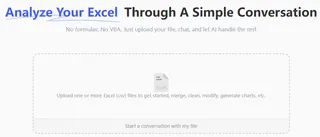
Describe Your Desired Chart in Plain Language Now, simply type your request into the chatbox. You can start simple and build up, or give a more detailed request at once.
Here are a few example prompts:
Create a column chart showing Actual Sales by Month. Add a horizontal line at $2000 for the sales target.
Excelmatic will instantly generate a combo chart. Now, let's add the conditional coloring.
On that chart, color the columns green if sales are >= 2000, and red if they are < 2000.

The AI will process this request and update the chart with the correct colors, without you ever having to write a formula.
Review and Iterate on the Result This is where the magic happens. The chart appears in the interface, and you can continue the conversation to make changes.
- Want to change the colors? Just ask: "Change the green to dark blue."
- Need to add data labels? "Add data labels to the top of each column."
- Want to explore further? "Which month had the highest sales?" or "What is the average sales amount for the months that missed the target?"
This conversational iteration is impossible with the manual method. You can explore your data and refine your visuals in real-time.
Export and Use Once you're happy with the chart, you can click a button to download a new Excel file. This file will contain a clean worksheet with your generated chart, ready to be copied into your presentation or report.
A Sample Conversation
Here’s what that entire process might look like in Excelmatic:
User: I've uploaded my monthly sales data. Can you create a column chart of Actual Sales by Month and add a line at $2000 for our target?
Excelmatic: Sure. I've created a combo chart with columns for sales and a horizontal line for the $2000 target. Here is a preview.
User: This is perfect. Now, can you apply conditional formatting to the columns? Make them green if they are at or above the target, and red if they are below.
Excelmatic: Done. The columns on the chart are now colored based on their performance against the $2000 target. Would you like to add data labels or change the chart title?
User: Yes, please add data labels to the columns that are below target. And title the chart "Monthly Sales Performance vs. Target".
Excelmatic: The chart has been updated with the new title and data labels on the underperforming months. You can download the updated Excel file now.
Traditional Method vs. Excelmatic: A Quick Comparison
| Aspect | Traditional Excel Method | Excelmatic (AI Method) |
|---|---|---|
| Time | 15–60 minutes | 1–2 minutes |
| Complexity | High (requires helper columns, IF/NA() formulas, series formatting) |
Low (describe what you want in plain language) |
| Flexibility | Low (changes require re-doing formulas and chart setup) | High (instantly modify via chat commands) |
| Learning Curve | Steep (need to learn non-obvious "tricks") | None (if you can ask a question, you can use it) |
| Error Rate | High (easy to make mistakes in formulas or chart settings) | Low (AI handles the technical execution) |
FAQ
1. Do I need to be an Excel expert to use Excelmatic? Not at all. Excelmatic is designed for users of all skill levels. If you can describe your business need (e.g., "I need a chart that shows..."), the AI can translate that into the correct technical execution.
2. Is my data safe when I upload it to Excelmatic? Yes. Excelmatic is built with data security as a priority. Your files are encrypted in transit and at rest, and are not used for training the AI models. For specific compliance needs, always refer to the official privacy policy.
3. Will Excelmatic change my original file? No. Excelmatic works on a copy of your data in a secure cloud environment. Your original file remains untouched on your local device. You can download the results as a new file.
4. What if the AI doesn't understand my request perfectly the first time? Just like talking to a human assistant, you can rephrase your question or break it down into smaller steps. For example, instead of a very complex single request, you can first ask for a basic chart, then ask for formatting, then add a filter.
5. Can I customize the charts Excelmatic creates? Absolutely. You can ask the AI to change colors, titles, labels, and chart types. You can also download the generated Excel file and make any final tweaks using Excel's standard formatting tools.
6. What if my data isn't perfectly clean? Excelmatic has data cleaning capabilities. You can ask it to do things like "remove duplicate rows," "fill in any blank cells in the Sales column with 0," or "format the Date column as MM/DD/YYYY."
Take Action: Upgrade Your Excel Workflow with Excelmatic
You no longer need to be an Excel guru to create powerful, insightful visualizations. The time you once spent fighting with helper columns and chart settings can now be dedicated to what truly matters: analyzing your data and making informed business decisions.
Stop letting tedious tasks dictate your workday. Embrace the new way of working with Excel.
Ready to see for yourself? Try Excelmatic for free today. Upload your own sales report and use the prompts from this article to create your first AI-powered chart in minutes.


