Key takeaways:
- Creating an Excel combination chart to visualize data with different scales (like total sales and percentage growth) is a multi-step, counter-intuitive manual process involving hidden menus and frustrated clicks.
- Excel AI tools like Excelmatic eliminate this complexity, allowing you to generate the exact same advanced chart by simply describing your needs in plain language, such as "show subscribers as columns and open rate as a line on a secondary axis."
- Using Excelmatic not only saves significant time but also makes chart iteration effortless, allowing you to instantly modify titles, add data labels, or incorporate new data series with simple follow-up commands.
Problem Background & Pain Points
Imagine you're a marketing manager reviewing your monthly email campaign performance. You have a simple spreadsheet with three columns: Month, Total Subscribers, and Average Open Rate. Your goal is to understand a critical relationship: as your subscriber list grows, what happens to your engagement? Does the open rate decline, stay stable, or even increase?
The most effective way to answer this is with a visual chart. You need to see the trend of subscriber growth alongside the trend of the open rate. This calls for a "combination chart"—one that displays the subscriber count (a large, whole number) as columns and the open rate (a small percentage) as a line.
This is where the classic Excel headache begins. If you simply highlight your data and insert a standard column chart, you'll get something like this:
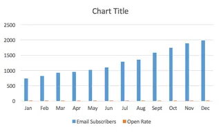
The Total Subscribers columns dominate the chart, while the Open Rate columns are so tiny they're practically invisible. The chart is useless. You know there's a way to fix this in Excel, but it involves a frustrating journey through a maze of right-clicks, obscure menus, and a feature called the "Secondary Axis." For many, this is where a quick analysis turns into a 20-minute battle with the software.
The Traditional Excel Solution: Steps and Limitations
To solve this problem manually, you need to create a combination chart by assigning the Open Rate data to a secondary vertical axis. This allows Excel to plot two different data scales on the same chart.
Here's a summary of the traditional, click-heavy process:
The Manual Workflow
Insert a Basic Chart: Highlight your data range and insert a 2D Column chart. As we saw, this results in the
Open Ratedata being unreadably small.Select the "Invisible" Data Series: Now comes the tricky part. You need to select those tiny orange bars representing the open rate. This often involves a lot of frustrated zooming and clicking. A "pro-tip" is to click the larger blue bars first, then navigate to the
Formattab and use a dropdown menu to switch your selection to theOpen Rateseries. This workaround itself shows how unintuitive the process is.Assign to Secondary Axis: Once the correct series is selected, you right-click, find
Format Data Series..., and in the panel that appears, check the box forSecondary Axis. This makes the orange bars big, but now they completely cover the original blue bars. Don't panic, this is (unfortunately) part of the process.Change the Chart Type: With the new, oversized orange bars still selected, you go to the
Chart Designtab, clickChange Chart Type, and in the dialog box, find theOpen Rateseries and change its type fromColumntoLine.Final Touches: Finally, you have the basic structure. You can now manually add a chart title, axis titles (crucial for a secondary axis chart!), and adjust colors to get your finished product.
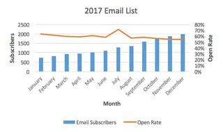
Limitations of the Manual Method
While the end result is correct, this process is far from ideal. The key limitations are:
- Counter-intuitive and Time-Consuming: The workflow is not a natural thought process. It requires memorizing a specific sequence of clicks across different menus. What should take 30 seconds can easily stretch to 5-10 minutes of hunting for the right option.
- High "Click Fatigue": The number of clicks, right-clicks, and menu navigations is significant, leading to frustration and a high chance of mis-clicking.
- Poor for Iteration: What if your manager asks, "Great, now can you add the click-through rate as another line?" or "Can you filter this for just Q3 and Q4?" You have to dive back into the
Select DataandFormatmenus, repeating much of the cumbersome process. - High Learning Curve: This isn't a technique most Excel users can discover on their own. It requires being taught the specific "trick," making it difficult for new team members to pick up.
The New Way: Using Excel AI (with Excelmatic)
Instead of fighting with menus, what if you could just tell Excel what you want? This is exactly what Excel AI Agents like Excelmatic are designed for. You provide the data, describe the end result in plain language, and the AI does the heavy lifting.
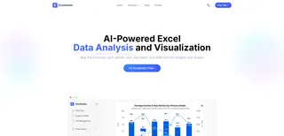
Let's solve the exact same problem using Excelmatic.
Step 1: Upload Your Data
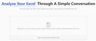
First, simply drag and drop your Excel or CSV file containing the Month, Total Subscribers, and Average Open Rate data into the Excelmatic chat interface. The AI will instantly parse the file and show you a preview.
Step 2: Describe the Chart You Want
Now, instead of clicking through menus, you just type your request. You can be as specific or as general as you like.
Here are a few examples of prompts that would work:
Create a combination chart. Show 'Total Subscribers' as columns and 'Average Open Rate' as a line.Plot subscribers and open rate by month. The open rate should be a line on a secondary axis.I need a chart to see the relationship between subscriber growth and open rate.(Excelmatic is smart enough to infer the best chart type).

The AI understands terms like "combination chart," "secondary axis," and the intent behind your analysis.
Step 3: Review and Iterate with Conversation
Within seconds, Excelmatic will generate the chart, complete with the secondary axis configured correctly. But the real power lies in the conversational iteration.
You can now refine the chart with simple follow-up questions:
Change the chart title to "Monthly Subscriber Growth vs. Engagement Rate".Add data labels to the line.Now, add the 'Click-Through Rate' column from my data as a second line on the chart.Make the columns blue and the line orange.
Each command is executed instantly, transforming a tedious editing process into a fluid conversation.
A Sample Excelmatic Dialogue
Here’s what that entire workflow might look like in a real conversation with Excelmatic:
User: I've uploaded my email marketing data. Create a combination chart showing 'Total Subscribers' as a column chart and 'Average Open Rate' as a line chart on a secondary axis.
Excelmatic: Done. I've created a combination chart with 'Total Subscribers' on the primary axis and 'Average Open Rate' on the secondary axis. The chart is ready for you to view. Would you like to make any adjustments?
User: Yes, add the title "Subscriber Growth vs. Open Rate" and add data labels to the line.
Excelmatic: The chart has been updated with the title and data labels. You can download the new Excel file containing this chart, or we can continue refining it.
Traditional Method vs. Excelmatic: A Quick Comparison
| Aspect | Traditional Excel | Excelmatic (Excel AI) |
|---|---|---|
| Method | Manual clicks, right-clicks, navigating hidden menus | Simple, natural language prompts |
| Time to Create | 5-15 minutes, depending on familiarity | Under 30 seconds |
| Flexibility | Rigid. Changes require repeating the complex process. | Highly flexible. Iterate with simple follow-up questions. |
| Learning Curve | High. Requires memorizing non-obvious steps. | Virtually zero. If you can ask a question, you can use it. |
| Error Rate | High. Easy to mis-click or select the wrong option. | Low. The AI handles the technical execution. |
FAQ
Q: Do I need to know terms like "combination chart" or "secondary axis" to use Excelmatic?
A: No, you don't. While using technical terms helps the AI be more precise, you can also describe your goal in plain terms, like "I want to see how subscribers and open rate trend together on one chart," and Excelmatic will often infer the best visualization.
Q: Will Excelmatic modify my original Excel file?
A: No. Excelmatic works on a copy of your data in a secure cloud environment. Your original file remains untouched. You can download the results, including the new chart, as a brand new Excel file.
Q: Can Excelmatic create other advanced chart types?
A: Yes. Excelmatic can generate a wide variety of charts, including stacked charts, pie charts, scatter plots, and more. You can also ask it to create Pivot Tables and Pivot Charts based on your data.
Q: Is my company's data safe when I upload it to Excelmatic?
A: Excelmatic is built with data security as a priority. Data is encrypted in transit and at rest, and is not used for training models. For specific compliance and security details, always refer to the official privacy policy.
Q: Can I customize the colors and styles of the chart with Excelmatic?
A: Yes. You can ask the AI to change colors, update titles, add or remove the legend, and adjust labels, just as you would in a conversation. For highly specific, pixel-perfect formatting, you can always download the AI-generated chart and make final tweaks in Excel.
Take Action: Upgrade Your Excel Workflow Today
Every minute you spend wrestling with Excel's clunky chart interface is a minute you're not spending on actual analysis. The manual process of creating a combination chart is a perfect example of a task that is unnecessarily complex and ripe for automation.
By embracing an Excel AI agent like Excelmatic, you shift your focus from "How do I make Excel do this?" to "What question do I want to answer?" You can build complex visualizations, iterate on them instantly, and get to insights faster than ever before.
Ready to stop clicking and start analyzing? Try Excelmatic for free and upload the very spreadsheet you're working on now. Use one of the prompts from this article and watch your advanced chart appear in seconds.


