Key takeaways:
- Advanced Pivot Table features like slicers, calculated fields, and report filters are powerful but require numerous manual steps, making them rigid and time-consuming to manage.
- An Excel AI agent like Excelmatic automates these complex tasks by allowing you to use simple, natural language prompts to generate analyses, calculations, and visualizations.
- By switching to an AI-driven workflow, you can drastically reduce report creation time, eliminate manual errors, and instantly adapt your analysis to answer new questions on the fly.
Problem Background & Pain Points
You've mastered the basics of Excel Pivot Tables. You can drag and drop fields to summarize thousands of rows of data in seconds. But soon, the basic summaries aren't enough. Your boss wants more—more detail, more interactivity, more custom calculations.
Imagine you run a craft brewery. Your sales data is a growing spreadsheet listing every transaction: Date, Beer Type (IPA, Stout, Pilsner), Size (Growler, Half-barrel), Sales Amount, and Unit Cost.
A basic pivot table can show you total sales by beer type. But now you need to:
- Calculate the profit for each beer type, which isn't a column in your source data.
- Create an interactive dashboard where you can filter sales by year for multiple charts and tables at once.
- Generate a separate report sheet for each beer type to send to individual brand managers.
- Quickly drill down into the specific transactions that make up a single, large number in your summary.
Suddenly, you're no longer in the simple drag-and-drop world. You're navigating a maze of hidden menus: "Calculated Fields," "Slicers," "Report Connections," and "Show Report Filter Pages." Each task requires a different, non-intuitive workflow. Your once-agile report becomes a brittle, complex machine that's hard to update and even harder for a colleague to understand.
Traditional Excel Solutions: Steps & Limitations
To achieve these advanced analyses, Excel experts traditionally rely on a set of powerful but cumbersome features. While effective, they each come with their own learning curve and set of frustrations.
The Manual Approach: Slicers, Calculated Fields, and More
Here’s a glimpse into the manual labor required for what should be simple analytical questions.
1. Creating Interactive Filters with Slicers:
To filter multiple pivot tables and charts simultaneously (e.g., by year), you need a Slicer.
- Steps:
- Click inside one pivot table.
- Go to the
PivotTable Analyzetab and clickInsert Slicer. - Select the field you want to filter by, like
Year. - Now, the slicer only controls one pivot table. To link it to others, you must right-click the slicer, select
Report Connections, and manually check the box for every other pivot table you want it to control.
2. Adding Custom Calculations with Calculated Fields:
To calculate profit, you can't just add a formula next to the pivot table, as it won't adjust when the table layout changes. You need a Calculated Field.
- Steps:
- Click inside the pivot table.
- Navigate to
PivotTable Analyze>Fields, Items, & Sets>Calculated Field.... - In the dialog box, invent a name for your new field (e.g., "Profit").
- In the formula box, you must type the formula by selecting fields from a list and inserting them, like
= Sales - Cost. The syntax must be perfect.
The Limitations of the Traditional Way
This approach, while functional, is far from efficient. The key limitations are:
- High Cognitive Load: You have to remember where each specific feature is hidden in Excel's ribbon menus. Slicers, Calculated Fields, and Report Filters are all in different places with different interfaces.
- Rigid and Inflexible: Your report is built for a specific set of questions. If your manager asks a follow-up like, "Great, now can you show me profit margin instead of total profit, but only for Q3?" you often have to go back and rebuild your calculated fields or restructure the entire pivot table.
- Prone to Silent Errors: Did you forget to click "Refresh All" after updating your source data? Your entire analysis could be wrong. Did you forget to link a new chart to your slicer? Your dashboard will show conflicting information. These errors are easy to make and hard to spot.
- Time-Consuming: Each step—inserting, configuring, connecting, formatting—is a series of clicks. Building a comprehensive dashboard can take hours of tedious, repetitive work instead of minutes of strategic thinking.
Using Excel AI (with Excelmatic) for a New Solution
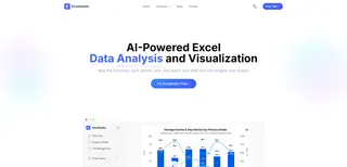
What if you could skip all those manual steps and just tell Excel what you want? That's the promise of an Excel AI agent like Excelmatic. Instead of hunting through menus, you have a conversation with your data.
The Overall Idea
With Excelmatic, the workflow is transformed:
- Upload: You upload your raw data file (Excel, CSV, etc.).
- Ask: You type your request in plain language, just as you would ask a human analyst.
- Get: Excelmatic processes your request and instantly generates the result—a table, a pivot table, a formula, or a chart.
- Iterate: You can continue the conversation, asking follow-up questions to refine the analysis until it's perfect.
Let's solve the brewery's analysis challenges using this new approach.
Step-by-Step: From Raw Data to Insights in Seconds
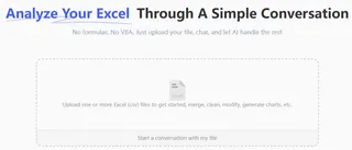
1. Upload Your Sales Data
First, simply drag and drop your brewery's sales data file into Excelmatic. The AI will automatically parse the columns and understand the data structure. Ensure your columns have clear headers like Beer Type, Sales, Cost, and Date.
2. Ask for What You Want in Plain Language
Instead of clicking through menus, you just type your questions. Here are the prompts you could use to replace the complex traditional methods:
To create a profit calculation (replaces Calculated Fields):
Create a pivot table showing the total Sales and Cost for each Beer Type. Add a new column named 'Profit' that is Sales minus Cost.
To filter by year (replaces Slicers):
Summarize my sales by Beer Type and Quarter for 2023. Now, show me the same for 2024.
To create reports for each beer type (replaces "Show Report Filter Pages"):
For each Beer Type, generate a summary of total sales by month.
To drill down into data (replaces double-clicking):
In the last table, show me the original sales records that make up the total for 'IPA' in 'Q1'.

3. Review and Iterate with Follow-up Questions
Excelmatic will display the result. But the real power is in the conversational follow-up. You can continue to refine your analysis without starting over.
- "Sort the table by the 'Profit' column in descending order."
- "Now, add another column for 'Profit Margin' calculated as (Profit / Sales)."
- "Create a bar chart visualizing the profit for each beer type."
4. Export Your Final Report
Once you are satisfied with the analysis, you can download the results as a new, clean Excel file containing all the generated tables, charts, and data. You can also copy the formulas or pivot table configurations Excelmatic created and paste them into your own workbooks.
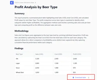
Dialogue Example
Here’s how a typical conversation with Excelmatic might look for our brewery owner:
User: I've uploaded my sales data. Can you create a pivot table that shows my total sales by Beer Type and by Quarter for the year 2023?
Excelmatic: Sure. I have created a pivot table summarizing the 2023 sales by Beer Type and Quarter. The rows represent the Beer Type, and the columns represent the quarters.
| Beer Type | Q1 Sales | Q2 Sales | Q3 Sales | Q4 Sales |
|---|---|---|---|---|
| Amber | $12,500 | $14,200 | $15,100 | $13,800 |
| IPA | $25,600 | $28,900 | $32,500 | $30,100 |
| Pilsner | $18,300 | $19,500 | $21,000 | $20,500 |
| Stout | $22,000 | $21,100 | $19,800 | $25,400 |
User: This is great. Now, can you add a calculated column to show the profit for each beer type? The formula is Sales - Cost. Also, please add a grand total for profit.
Excelmatic: I have updated the analysis. The new table includes a 'Total Profit' column for each beer type and a grand total at the bottom.
User: Perfect. Now generate a bar chart comparing the Total Profit for each beer type. And only show me the top 3 most profitable beers.
Excelmatic: Done. Here is a bar chart displaying the total profit for the top 3 beers: IPA, Stout, and Pilsner. You can download the new Excel file containing this chart and the data table.
Traditional Pivot Tables vs. Excelmatic
| Aspect | Traditional Pivot Tables | Excelmatic (Excel AI) |
|---|---|---|
| Time to Insight | Hours of clicking and configuration | Minutes of conversation |
| Flexibility | Rigid; new questions require rebuilding | Highly flexible; adapt with follow-up questions |
| Learning Curve | High; requires learning many separate features | Low; requires only knowing your business question |
| Error Rate | High; manual refresh and linking are prone to error | Low; AI handles calculations and connections consistently |
| Collaboration | Difficult; complex setups are hard to hand over | Easy; share the chat history or the final clean report |
FAQ
Q: Do I need to be an Excel expert to use Excelmatic? A: Not at all. If you can describe the business result you want in plain language (e.g., "show me sales by region"), you can use Excelmatic. It's designed for both beginners who want to perform complex analysis and for experts who want to save time.
Q: Is my data safe when I upload it to Excelmatic? A: Data security is a top priority. Excelmatic uses secure protocols for data transfer and storage, and your files are treated as confidential. For specific details, always refer to the official privacy policy on the website.
Q: Will Excelmatic modify my original Excel file? A: No. Excelmatic works on a copy of your data in a secure environment. Your original file remains untouched on your computer. You can then download the new analysis as a separate Excel file.
Q: What if my data is messy or not perfectly structured? A: While cleaner data yields better results, you can also use Excelmatic to help clean your data. You can ask it to "remove duplicate rows," "find and replace all instances of 'grolwer' with 'growler'," or "split the 'Full Name' column into 'First Name' and 'Last Name'."
Q: Can I use the formulas or pivot tables generated by Excelmatic in my own spreadsheets? A: Yes. Excelmatic can provide you with the exact formulas or show you how it configured a pivot table. You can copy these and use them in your own workbooks, making it a great tool for learning as well.
Q: How does Excelmatic handle data refreshes? A: If your source data changes, you can simply upload the new file and ask Excelmatic to run the same analysis. Since your instructions are saved in the chat history, you can re-generate a complex report with a single click.
Take Action: Upgrade Your Excel Workflow with Excelmatic
Every hour you spend wrestling with slicer connections, debugging calculated fields, or manually refreshing reports is an hour you're not spending on strategic analysis. The traditional way of doing advanced analysis in Excel is powerful, but it's a bottleneck.
With an Excel AI agent like Excelmatic, you can shift your focus from how to get the data to what the data means. You can answer complex business questions as fast as you can type them, build interactive dashboards in minutes, and finally make your data work for you, not the other way around.
Ready to leave the manual clicks behind? Try Excelmatic today. Upload one of your own reports and try asking one of the questions from this article. Experience the future of spreadsheet analysis for yourself.

