Key takeaways:
- Adding error bars in Excel is a crucial but tedious manual process, involving navigating multiple menus and panes to represent data variability.
- Excel AI tools like Excelmatic transform this task by allowing you to generate charts with precise error bars simply by describing your requirements in natural language.
- Using Excelmatic not only saves significant time but also eliminates errors from incorrect menu selections and makes it effortless to experiment with different visualization styles, such as percentage, standard deviation, or custom error values.
The Challenge: Why Visualizing Data Uncertainty in Excel is So Tedious
Whether you're a scientist presenting experimental results, a financial analyst forecasting stock performance, or a sales manager reporting on target variance, your data is rarely a single, absolute number. There's always a degree of variability, uncertainty, or potential error. Error bars are the perfect visual tool to communicate this range of confidence, showing how much a data point might fluctuate.
They are essential for honest and accurate data storytelling. An average sales figure of $50,000 looks great, but an error bar showing it could range from $30,000 to $70,000 provides critical context for decision-making.
The problem? While essential, adding error bars in Excel is a surprisingly cumbersome and non-intuitive task. You know you need them, but then comes the frustrating journey of clicks: select the chart, find the tiny "+" icon, hover over "Error Bars," click the side arrow, navigate to "More Options…," and then grapple with a separate formatting pane. It feels like a maze designed to slow you down.
This complexity is amplified when you need specific types of error bars, like a custom range based on another column in your data. This requires even more manual steps, increasing the chance of linking the wrong cells and compromising your entire chart's integrity.
The Manual Method: A Step-by-Step Guide to Adding Error Bars in Excel
For those committed to the traditional approach, let's walk through the manual process. The core idea is to first create your chart and then add the error bars as an additional "Chart Element."
Imagine you have a dataset of average monthly temperatures and you want to add error bars to represent the typical temperature fluctuation.
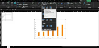
Here’s the typical workflow:
- Create Your Chart: Select your data and go to the
Inserttab to create a 2-D column, bar, line, or scatter chart. - Find Chart Elements: Click on your newly created chart. A small plus sign (
+) icon, known as Chart Elements, will appear in the top-right corner (on Windows). - Navigate to Error Bars: Click the
+icon. In the dropdown menu, hover your mouse over Error Bars, and then click the small black triangle that appears to its right. - Choose an Error Type: You'll see options like
Standard Error,Percentage, andStandard Deviation. For more control, you must selectMore Options....
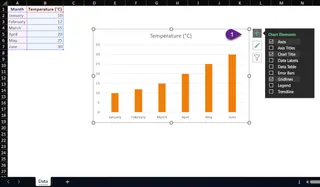
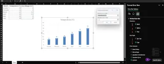
- Configure in the Format Pane: This opens the Format Error Bars pane. Here, you can define the direction (Both, Plus, Minus), the end style (Cap or No Cap), and the error amount. If you need custom values, you have to select
Customand click theSpecify Valuebutton.
Limitations of the Manual Approach
While functional, this process is far from efficient and is riddled with potential frustrations:
- Time-Consuming & Repetitive: Every time you create a new chart or need to adjust an existing one, you have to repeat this multi-step, click-intensive process.
- Not Intuitive: The options are buried. You have to remember the exact sequence of clicks, which can differ slightly between Excel for Windows and Mac, adding another layer of confusion.
- Error-Prone: When specifying custom error bars, it's incredibly easy to select the wrong cell range for the "Positive Error Value" or "Negative Error Value," leading to incorrect and misleading visualizations.
- Rigid and Inflexible: What if your manager asks to see the variability as a 10% percentage instead of a fixed value? You have to go all the way back into the menus and reconfigure everything. There's no room for quick, conversational "what-if" analysis.
A Smarter Way: Creating Charts with Error Bars Using Excelmatic
What if you could bypass the menus entirely? Instead of clicking through a maze, what if you could simply tell Excel what you want your chart to look like? This is exactly what Excel AI agents like Excelmatic are designed for.

Excelmatic allows you to upload your data and use plain language to request analyses, charts, and formulas. Adding error bars becomes a simple instruction, not a complex procedure.
Step-by-Step: Adding Error Bars with Excelmatic
Let's revisit the same task—creating a chart with error bars—but this time, using a conversation-based approach.
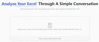
1. Upload Your Data
First, simply drag and drop your Excel or CSV file containing your data (e.g., monthly sales, experimental results, temperature readings) into the Excelmatic chat interface.
2. Ask in Plain Language
Instead of clicking, you type. Describe the chart you want, including the error bars. Excelmatic understands the context and different types of error bars.
Here are a few examples of prompts you could use:
"Create a column chart showing the average sales per month. Add standard error bars to each column.""Plot the quarterly revenue as a bar chart and include a 10% percentage error bar.""I have a 'Sales' column and an 'Error Margin' column. Generate a line chart of the sales and use the 'Error Margin' column for custom error bars.""For the attached data, make a scatter plot of 'Test Score' vs 'Study Hours' and add horizontal error bars based on the 'Time Variance' column."

3. Review and Refine Instantly
Excelmatic will generate the chart with the specified error bars in seconds. But the real power lies in iteration. You can continue the conversation to fine-tune the result.
"Okay, that looks good. Now change the error bars to show the standard deviation instead.""Make the error bars red and a bit thicker.""Can you remove the end caps from the error bars?""Actually, only show the positive error bar, not the negative one."
This conversational refinement is impossible with the traditional method, where each change requires diving back into the formatting panes.
4. Export Your Finished Chart
Once you're satisfied, you can download a new Excel file containing the perfectly formatted chart, ready to be dropped into your presentation or report.
Dialogue Example
Here’s how a typical conversation with Excelmatic might go:
User: I have a file with monthly sales and a pre-calculated standard deviation for each month. Can you create a column chart of the sales and add custom error bars using the 'Standard Deviation' column?
Excelmatic: Absolutely. I've generated a column chart displaying your monthly sales. The error bars have been added using the values from your 'Standard Deviation' column. Would you like to adjust the color or style of the error bars?
User: Yes, make them dark grey and remove the end caps.
Excelmatic: Done. The error bars are now dark grey and have no end caps. The updated chart is ready for you to view or download.
Traditional vs. Excelmatic: A Quick Comparison
| Aspect | Traditional Excel | Excelmatic (Excel AI) |
|---|---|---|
| Time | 5-10 minutes of clicking and formatting | Seconds of typing a prompt |
| Complexity | High; requires navigating multiple menus & panes | Low; uses natural language |
| Flexibility | Rigid; changes require repeating the process | High; easily iterate with follow-up prompts |
| Expertise | Requires specific Excel chart knowledge | Requires knowing what you want to see |
FAQ
Q: Can Excelmatic add different types of error bars like 'Percentage' or 'Standard Deviation'?
A: Yes. Simply specify the type you want in your prompt, such as "add a 5% percentage error bar" or "show the standard deviation error bars". Excelmatic will calculate and apply it automatically.
Q: What if my data for custom error bars is in a separate column?
A: That's the ideal way to use it. Just tell Excelmatic which column to use. For example: "Use the 'Confidence Interval' column to create custom error bars for my line chart."
Q: Can I format the error bars (color, thickness, direction) with Excelmatic?
A: Yes. After the initial chart is created, you can ask for formatting changes in follow-up prompts like "Make the error bars blue and thinner" or "Only show the 'plus' direction for the error bars."
Q: Does Excelmatic work if I have multiple data series in one chart?
A: Yes. You can be specific in your request. For instance: "In my combo chart, add error bars only to the '2024 Forecast' line, not the '2023 Actuals' columns."
Q: Is my data safe when I upload it to Excelmatic? A: Excelmatic is designed with data security as a priority. Your files are processed for analysis and are not stored long-term or shared. For detailed information, always refer to the official privacy policy on the website.
Q: Do I need to create the chart first before asking for error bars? A: No, and that's a major advantage. You can ask Excelmatic to create the chart and add the error bars in a single step, directly from your raw data.
Ready to Ditch the Clicks? Visualize Your Data's Variability with Excelmatic
Stop wasting valuable time hunting through Excel's menus for a feature as critical as error bars. Your energy should be spent on interpreting data, not wrestling with software. By embracing an Excel AI agent, you can transform a tedious, error-prone task into a fast, intuitive, and even enjoyable conversation with your data.
Get presentation-ready charts with accurate, perfectly formatted error bars in seconds. Focus on the insights, not the clicks.
Try Excelmatic for free today. Upload a dataset you're working on and use one of the prompts from this article. Discover for yourself how easy and powerful data visualization can be.


