Key takeaways:
- A Customer Retention Dashboard turns raw data into actionable insights for SaaS growth.
- Early-stage, cohort-based, and revenue retention views reveal why customers stay or leave.
- Key metrics include activation rates, churn, Net Revenue Retention, and feature engagement.
- Tools like Excelmatic simplify dashboard creation, making data analysis fast and interactive.
- Retention dashboards shift teams from reactive fixes to proactive growth strategies
Let's be honest. You're tracking new sign-ups, monitoring monthly revenue, and celebrating feature launches. But then, at the end of the quarter, growth is slower than expected. The problem often isn't acquisition — it's retention. Customers are leaving, and you might not see it clearly until it's too late.
A Customer Retention Dashboard is your solution. It's the single place where you see if your customers stay, why they might leave, and how healthy your business truly is. Without it, you're making decisions in the dark.
What Is a Customer Retention Dashboard?
A Customer Retention Dashboard is a live reporting tool. It aggregates data from across your product, finance, and support systems to show the health of your existing customers. Its main job is to replace guesses with facts. It moves you from asking "Are we doing okay?" to knowing exactly which customer groups are thriving and which are at risk.
Think of it as your central source of truth for customer loyalty. It's not just one number. It's a collection of metrics and charts that tell the ongoing story of your customer relationships. A well-built customer retention analytics dashboard helps you predict problems before they cause churn.
Three Key Types of Customer Retention Dashboards
Most teams don't need just one dashboard. They need a few focused views. Here are the three core types of dashboards that answer different questions.
1. The Early-Stage Retention Dashboard
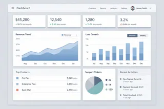
This dashboard focuses on the first critical days after sign-up. Its main question is: "Do new users find value quickly?"
It tracks initial activation and early drop-off. You'll see metrics like Day 1 Retention and Activation Rate. If users don't complete key setup steps early on, they likely won't stay long. This dashboard helps product and onboarding teams fix first impressions.
2. The Cohort-Based Retention Dashboard
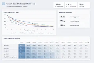
This view is about long-term behavior. It groups customers by the month they signed up and tracks how engaged they remain over time. The classic Cohort Retention Curve shows what percentage of each group is still active in subsequent months. It answers: "Are our product updates making customers stickier over time?" This is essential for understanding the long-term impact of your work.
3. The Revenue Retention Dashboard
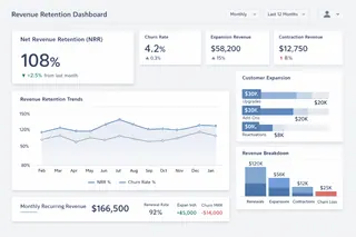
This is the financial view. It shows how much money you keep and grow from your current customer base.
The star metric here is Net Revenue Retention. It calculates revenue changes from existing customers, factoring in churn, downgrades, expansions, and upgrades. An NRR over 100% is the ultimate sign of a healthy SaaS business. This dashboard is crucial for leadership and investors.
Essential Metrics for Your Dashboard
What should you actually put on these screens? Here's a practical table of metrics to consider.
| Dashboard Focus | Key Metrics | What It Tells You |
|---|---|---|
| Overall Health | Customer Churn Rate, Revenue Churn Rate | The basic rate of customer and revenue loss. |
| Net Revenue Retention, Gross Revenue Retention | Whether your existing customer base is growing in value. | |
| User Engagement | Daily/Weekly Active Users, User Activity Level | How many users are truly engaged with your product. |
| Feature Adoption & Usage Depth | Whether users are scratching the surface or using power features. | |
| Risk & Forecasting | Customer Health Score | A predictive score combining usage, support tickets, and payment history. |
| Upcoming Renewals List & Risk Flag | Which contracts are due soon and which customers might not renew. | |
| Deep Analysis | Cohort Retention Tables & Curves | How retention differs for users who signed up in different periods. |
| Churn Reason Breakdown | The tagged reasons customers give when canceling (price, feature missing, etc.). |
How to Build Your Dashboard: A Realistic Approach with Excelmatic
Creating a functional Customer Success Dashboard for SaaS often involves three challenging, manual steps. Most teams find this process more complex than it seems. But what if you could bypass the coding and complex configuration entirely?
With an AI-powered tool like Excelmatic, the entire workflow shifts from a technical project to a conversational process. Here's how it simplifies each step:

Step 1: Uploading and Describing Your File
Traditional Challenge: Your data lives in different places: product analytics tools, your billing system, your CRM, and your support software. Pulling this data together into one warehouse is the first major hurdle. It requires significant time and engineering help.
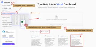
With Excelmatic: You don't need to connect APIs or build data pipelines. Simply upload your core data files — like Excel or CSV exports containing customer activity, payment status, and support logs — directly into the chat interface. The AI instantly reads the data and provides a preview, making it ready for analysis in moments.
Step 2: Asking Directly in Natural Language
Traditional Challenge: Agreement is key. What specific action defines an "activated" user? How do you calculate the "health score"? Different teams might have different answers. You need clear, company-wide definitions before building any charts.
With Excelmatic: You skip the formula and metric definition phase. You directly describe your goal in plain language. For example, you could type: "As a product manager, I need to create a user onboarding effectiveness dashboard based on this data, focusing on Onboarding Completiong, Revenue generated, and Churned users to assess the impact of onboarding onretention." The AI parses your intent and handles the underlying data logic to begin the analysis.
Step 3: Generating Instant Insights and Charts
Traditional Challenge: Now you can build charts in a BI tool. But a static dashboard isn't enough. You need to configure alerts for activity drops or when key accounts become inactive. The goal is for the dashboard to notify you of problems.
With Excelmatic: Charts and core insights are generated instantly within the conversation. Following the request above, the AI would typically produce some clear charts. You can then drill deeper by asking follow-ups like: "Flag customers with a health score below 60 and list the most common support issues they reported last week." This enables dynamic, interactive data exploration, turning each prompt into a step toward deeper insight without manual dashboard construction.
A conversational AI tool like Excelmatic fundamentally allows you to start exploring core retention questions and get visual answers in minutes, shifting your team's focus from building the tool to understanding the data and taking action.
Stop Guessing About Retention
Customer churn is rarely a surprise. It's usually the end result of visible signals: declining usage, unanswered tickets, or a missed renewal check-in. A Customer Retention Dashboard makes these signals impossible to ignore.
It shifts your team's work from reactive to proactive. You move from wondering why customers left to knowing which customers need attention now.
Your product delivers value. Make sure you have the clear view needed to ensure customers experience it long-term. Start by reviewing your data today. Build your first cohort chart. You might be surprised by what you see — and the growth you can unlock.
Stop guessing about retention — start exploring your data and building your first cohort chart instantly with Excelmatic.
Frequently Asked Questions (FAQ)
Q1: What is a Customer Retention Dashboard?
A: A Customer Retention Dashboard is a live reporting tool that shows how customers engage with your product, why they might leave, and your overall retention health.
Q2: Why is customer retention important for SaaS?
A: Retention drives recurring revenue. Keeping customers costs less than acquiring new ones and improves long-term business sustainability.
Q3: What metrics should be included in a retention dashboard?
A: Core metrics include Day 1/7 retention, Net Revenue Retention (NRR), churn rates, user engagement, feature adoption, and cohort retention curves.
Q4: How can SaaS teams build a dashboard efficiently?
A: AI-powered tools like Excelmatic allow teams to upload raw data, define events in plain language, and instantly generate charts without complex coding.
Q5: How does a retention dashboard improve business decisions?
A: It transforms guesswork into actionable insight, highlighting at-risk customers, engagement trends, and revenue opportunities to act proactively.


