Key takeaways:
- Creating waterfall charts in Excel, even with the modern built-in feature, involves tedious manual steps like setting totals, removing cluttered labels, and constant re-formatting.
- Excel AI tools like Excelmatic automate this entire workflow. You can generate a complete, accurate waterfall chart simply by describing your goal in plain language, such as "create a waterfall chart from my transaction data."
- Using an Excel AI agent not only saves significant time but also offers unparalleled flexibility, allowing for instant modifications and deeper analysis through a simple conversational interface.
Problem Background & Pain Points
Imagine you're a financial analyst or a small business owner wrapping up the monthly accounts. You have a simple table of transactions: an opening cash balance, followed by a series of revenue inflows and expense outflows. Your goal is to visually explain to stakeholders how you got from the starting balance to the closing balance.
A standard bar or line chart won't cut it. They show the final values but fail to illustrate the story of the journey—the individual positive and negative contributions that built the final result. This is where a waterfall chart (also known as a bridge chart) shines. It visualizes a running total, showing how each sequential value adds to or subtracts from the previous one.
The problem? Building one in Excel is a surprisingly frustrating experience. Even with the "native" waterfall chart type introduced in Excel 2016, the process is far from intuitive. You spend more time fighting with chart settings and formatting than you do analyzing the data itself. Every time you create one, you find yourself asking: "Why do I have to manually tell Excel that the first and last bars are totals? Shouldn't it know that?" This repetitive, manual process is not just time-consuming; it's a bottleneck in your reporting workflow.
The Traditional Excel Method: Steps and Limitations
While a massive improvement over the pre-2016 era (which required complex workarounds with stacked column charts), the modern built-in waterfall chart feature still leaves much to be desired. It gets you 80% of the way there, but the last 20% involves a series of non-obvious manual fixes.
Let's say you have a simple dataset of monthly bank transactions.
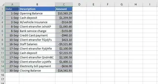
Here's the typical manual workflow in Excel:
- Select Data: Highlight the range containing your categories (e.g., "Opening Balance," "Deposit," "Rent") and their corresponding values.
- Insert Chart: Navigate to the
Inserttab, click theChartsgroup, and selectWaterfall. - Initial (Incorrect) Chart: Excel generates a chart, but it almost always gets the totals wrong. It treats your "Opening Balance" and "Closing Balance" as just another increase or decrease, which completely misrepresents the data.
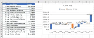
This is where the manual "fixing" begins.
The Manual Adjustment Gauntlet
To make the chart usable, you must perform several tedious steps:
- Set the Totals: You have to double-click the first bar ("Opening Balance"), which opens the "Format Data Point" pane. Here, you must find and check the "Set as total" box. Then, you have to repeat this exact process for the last bar ("Closing Balance"). This is the single most common point of failure.
- Clean Up Clutter: The default chart often includes data labels that overlap or make the chart unreadable. You'll likely need to select them and delete them.
- Add Context: The chart is inserted without a meaningful title. You must click the placeholder and manually type a descriptive title like "September Cash Flow Analysis." You may also need to add axis titles for clarity.
- Resize and Refine: The default size often squishes the category labels on the x-axis, forcing you to manually resize the chart to make it legible.
Limitations of the Manual Approach
This traditional method is plagued with inefficiencies:
- Non-Intuitive Logic: The requirement to manually "Set as total" is a hidden feature. It's not discoverable, and users often forget it, leading to incorrect charts.
- Time-Consuming: What should be a 10-second task turns into a 5-minute formatting exercise for every single chart.
- Rigid and Inflexible: What if your manager asks, "Can you show me this but only for the first two weeks?" You essentially have to start over: filter your data, create a new chart, and repeat all the manual formatting steps.
- High Error Potential: Forgetting to set a total, selecting the wrong data range, or a formatting slip can lead to a misleading visualization.
The Modern Solution: Using an Excel AI like Excelmatic
Instead of being a "chart operator" who clicks through menus, what if you could simply be an analyst who asks for what they need? This is the promise of Excel AI Agents like Excelmatic. It transforms the entire process from a series of manual steps into a simple conversation.

A New Paradigm: Conversational Data Analysis
Excelmatic works as your personal data analyst. You upload your spreadsheet, and then you use a chat interface to ask for analysis, formulas, or visualizations. Instead of you needing to know how to create a waterfall chart in Excel, you only need to know what you want to see. The AI handles the "how."
For our cash flow problem, you can forget about the "Insert" tab and the "Format Data Point" pane entirely.
Step-by-Step: Creating a Waterfall Chart with Excelmatic
The process is refreshingly simple and intuitive.
- Upload Your Data File: Start by uploading your Excel or CSV file containing the transaction data to the Excelmatic platform. The AI will instantly read and understand the structure of your table.
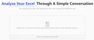
- Ask in Plain Language:
Now, simply type your request in the chatbox. The key is to describe the end result you want. Here are a few examples:
- "Create a waterfall chart showing the change in cash from the opening balance to the closing balance."
- "Using the transaction data, build a waterfall chart for September's cash flow. Make sure the start and end values are totals."
- "Visualize how the initial value is affected by the subsequent positive and negative transactions with a waterfall chart."

Review and Refine Instantly: Excelmatic will generate a complete and properly formatted waterfall chart in seconds. Crucially, its AI is trained to recognize common patterns, so it automatically identifies the first and last entries as totals and formats them correctly.
But the real power lies in iteration. You can continue the conversation to refine the chart:
- "Great. Now change the chart title to 'Q3 Cash Flow Bridge'."
- "Can you highlight the largest expense?"
- "Filter out any transactions less than $100 and regenerate the chart."
Export Your Results: Once you're happy with the result, you can download the new Excel file containing the perfectly formatted chart and the underlying data. You're ready to copy and paste it into your presentation or report.
A Sample Conversation
Here’s how that workflow might look in practice:
User: I've uploaded my September bank statement. Can you create a waterfall chart to show how my balance changed from the start of the month to the end?
Excelmatic: Of course. I have created a waterfall chart based on your transaction data. I've automatically set the starting balance on Sep 1st and the ending balance on Sep 30th as totals. Would you like to add data labels to each change?
User: No, that's too cluttered. But can you highlight the largest withdrawal in red?
Excelmatic: Done. The largest withdrawal, 'Office Rent,' is now highlighted in red on the chart. The updated chart is ready for you to download.
Traditional Excel vs. Excelmatic: A Quick Comparison
| Aspect | Traditional Excel Method | Excelmatic AI Method |
|---|---|---|
| Time to Create | 5-10 minutes per chart | Under 30 seconds |
| Complexity | Requires knowing hidden features like "Set as total" | Requires only plain language |
| Flexibility | Rigid; changes require rebuilding the chart | Highly flexible; changes are made via conversation |
| Error Rate | High; easy to forget steps or misconfigure | Low; AI ensures consistency and correctness |
| Focus | On manual clicks and formatting | On data insights and analysis |
FAQ
Do I need to know how to make a waterfall chart in Excel to use Excelmatic? No, not at all. You only need to be able to describe the chart you want to see. Excelmatic handles the technical execution.
Will Excelmatic modify my original Excel file? No. Your original file is never modified. Excelmatic operates on a secure copy of your data, and you can download the results as a new file.
Is my financial data safe when I upload it to Excelmatic? Data security is a top priority. Excelmatic is designed with strict privacy and security protocols to ensure your data remains confidential. For detailed information, please refer to the official privacy policy on the website.
What if my data isn't perfectly formatted? While clear headers (like "Date," "Category," "Amount") are helpful, Excelmatic's AI is adept at understanding and parsing data that isn't perfectly clean. It can often infer the structure even with minor inconsistencies.
Can Excelmatic create other types of charts? Yes. You can ask for bar charts, pie charts, line graphs, scatter plots, and more. Just describe the visualization you need, and the AI will build it.
What happens if the AI doesn't understand my request correctly? Just like talking to a human assistant, you can rephrase your question, provide more context, or give a more specific instruction. The conversational interface makes it easy to clarify your needs until the result is perfect.
Take Action: Upgrade Your Excel Workflow with Excelmatic
Stop wasting valuable time wrestling with chart settings. Every minute you spend manually formatting a waterfall chart is a minute you're not spending on strategic analysis and finding key insights in your data. The manual process is not just a minor inconvenience; it's a significant drag on your productivity.
By embracing an Excel AI solution, you can reclaim that time and focus on what truly matters. Let the AI handle the tedious mechanics of chart creation while you drive the analysis.
Ready to see the difference? Try Excelmatic today. Upload the transaction spreadsheet you're working on right now and use one of the prompts from this article. Experience firsthand how simple financial reporting can be.


