Key takeaways:
- Manually creating scatter plots in Excel involves multiple steps through menus, and adding multiple data series or a trendline is often cumbersome and time-consuming.
- Excel AI tools like Excelmatic let you generate insightful scatter plots by simply describing the relationship you want to visualize in plain English, such as "plot advertising spend against revenue".
- Using Excelmatic dramatically reduces creation time, simplifies complex charts with multiple series, and allows for instant iteration and analysis through conversational follow-up questions.
Problem Background & Pain Points
Imagine you're a marketing analyst staring at a spreadsheet. You have columns for daily ad spend, website clicks, and sales revenue. Your manager wants to know: "Is our increased ad spend actually driving more sales? Show me the data."
This is a classic business question about correlation. To answer it, you need to visualize the relationship between two numerical variables: Ad Spend and Revenue. A scatter plot is the perfect tool for this job. It can quickly reveal if the two variables move together (positive correlation), in opposite directions (negative correlation), or have no relationship at all.
But in Excel, getting from raw data to a clear, insightful scatter plot isn't always a straight line. First, you have to remember that a scatter plot, not a line chart, is the right choice—a common point of confusion. Then, you begin the manual process of selecting data, navigating the Insert > Chart menu, and choosing the right icon.
The real headache begins when the questions get more complex. What if you need to plot two relationships on the same chart, like "Ad Spend vs. Revenue" and "Ad Spend vs. Website Clicks"? Or what if you need to add a trendline to quantify the relationship? Each of these tasks sends you back into confusing dialog boxes, manually adding data series and formatting elements. This manual process is slow, prone to errors, and stifles the natural flow of analysis.
The Traditional Excel Solution: Steps and Limitations
In the traditional Excel workflow, creating a scatter plot requires a series of precise, manual steps. While effective, this process highlights several limitations, especially as your analytical needs grow more complex.
First, let's understand the basics. A scatter plot (or XY chart) uses dots to represent the values for two different numeric variables. The position of each dot on the horizontal (X-axis) and vertical (Y-axis) axes indicates values for an individual data point. By looking at the pattern of the dots, you can infer the relationship between the variables.
Steps to Create a Scatter Plot Manually
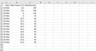
Organize Your Data: Ensure you have two columns of numerical data you want to compare. For instance, one column for "Daily Temperature" and another for "Daily Rainfall". The independent variable (the one you believe might cause a change) typically goes on the X-axis, and the dependent variable goes on the Y-axis.
Select the Data: Highlight the two columns of data, including the headers.
Insert the Chart: Navigate to the
Inserttab on the Excel ribbon. In theChartsgroup, click the small icon that looks like a set of scattered dots. This opens the scatter chart options.
Choose a Type: Select the basic scatter plot. You now have a visual representation of your data.
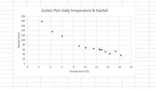
Customize and Add a Trendline: To make the correlation clearer, you can add a trendline. Click on the chart, then click the
+icon (Chart Elements) that appears on the right. Check the box forTrendline. You can also add axis titles and a chart title here.
The Limitations of the Manual Approach
While the basic process is manageable, its limitations become obvious quickly:
- Adding Multiple Series is Clunky: What if you want to compare two different years of rainfall data against temperature on the same chart? You have to right-click the chart, choose
Select Data, and manually clickAddto define the Series Name, X values, and Y values for the new dataset. This dialog box is notoriously unintuitive and prone to selection errors. - Slow Iteration: Every change or new question requires another round of clicks. Want to see the correlation without a specific outlier? You have to manually filter your source data and refresh the chart. Want to switch variables? You often have to start over. This breaks your analytical momentum.
- High Cognitive Load: You have to remember the "right" sequence of clicks. For less frequent Excel users, this means re-learning the process every time. For experts, it's just tedious repetition.
- Not Conversation-Friendly: You can't just "ask" your chart a follow-up question like, "What's the correlation for just the first quarter?" You have to translate that business question into a series of manual data manipulations and chart settings.
The New Way: Using an Excel AI Agent (Excelmatic)
Instead of being an expert in Excel's menus, what if you could just be an expert in your own data? This is the promise of Excel AI Agents like Excelmatic. You upload your file and use natural language to ask for the analysis or visualization you need. The AI handles the clicks, formulas, and chart setup for you.

Let's revisit our marketing analyst's problem and solve it with Excelmatic.
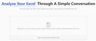
Step 1: Upload Your Data
First, you drag and drop your Excel or CSV file containing the ad spend, clicks, and revenue data into Excelmatic. The AI instantly reads your headers and data structure, preparing it for analysis.
Step 2: Describe the Chart You Want in Plain Language
Instead of navigating menus, you simply type your request into the chat prompt.
Here are a few examples of prompts you could use:
Create a scatter plot with 'Ad Spend' on the x-axis and 'Revenue' on the y-axis.Show me the relationship between Daily Temperature and Daily Rainfall as a scatter chart.Plot Ad Spend vs Revenue. Add a linear trendline and show the R-squared value on the chart.

Step 3: View and Iterate on the Result
Excelmatic immediately generates the scatter plot based on your request. But the real power lies in the ability to continue the conversation. You can refine the chart with simple follow-up prompts:
Now, add another series to this chart showing 'Ad Spend' vs 'Website Clicks'.Change the color of the 'Revenue' data points to green.Filter out any data points where Ad Spend was less than $100.Can you label the top 5 revenue points with their corresponding date?
This conversational approach transforms data analysis from a rigid, step-by-step procedure into a fluid, interactive exploration.
Step 4: Export Your Finished Work
Once you're satisfied with the chart, you can download a new Excel file containing the fully formatted and editable scatter plot. You can copy it directly into your presentation or share the file with colleagues, who can then interact with it just like any other Excel chart.
Example Conversation with Excelmatic
Here’s how a typical workflow might look in a dialogue format:
User: I've uploaded my weather data. Can you create a scatter plot to see if there's a relationship between Daily Temperature and Daily Rainfall?
Excelmatic: Certainly. I have created a scatter plot with 'Daily Temperature' on the X-axis and 'Daily Rainfall' on the Y-axis. It appears there may be a slight negative correlation.
User: Interesting. Please add a linear trendline to make the pattern clearer.
Excelmatic: The trendline has been added to the chart. It visually confirms the weak negative correlation. Would you like me to calculate the correlation coefficient for you?
User: Yes, please. And also change the chart title to "Temperature vs. Rainfall Analysis".
Excelmatic: The correlation coefficient (Pearson's r) is -0.48. I have also updated the chart title as requested. You can now download the updated Excel file.
Traditional Method vs. Excelmatic: A Quick Comparison
| Aspect | Traditional Excel | Excelmatic (Excel AI) |
|---|---|---|
| Time to Create | 2-10 minutes, depending on complexity | 15-30 seconds per request |
| Adding a 2nd Series | Manual, complex Select Data dialog |
Simple prompt: "Add another series for..." |
| Adding a Trendline | Click through Chart Elements menu |
Simple prompt: "Add a trendline." |
| Flexibility | Rigid; changes require re-doing steps | Highly flexible; iterate with follow-up questions |
| Required Skill | Knowledge of chart types & menus | Ability to describe your business question |
FAQ
Do I need to know which chart type is best for my data? Not necessarily. While you can specifically ask for a "scatter plot," you can also describe your goal, like "Show me the correlation between X and Y." Excelmatic is often smart enough to choose the appropriate chart type for you.
Is my data secure when I upload it to Excelmatic? Data privacy and security are paramount. Excelmatic is designed with security in mind, using secure connections and infrastructure. For specific details on data handling and privacy policies, it's always best to consult the official website. Your original file is not modified.
Can Excelmatic handle complex requests, like adding multiple trendlines or data series? Yes. This is where AI shines. You can conversationally ask to add multiple data series, apply different trendlines (linear, logarithmic, etc.) to each, and customize colors or markers, all without touching a complex settings menu.
Can I customize the charts that Excelmatic creates? Absolutely. You can ask the AI to change titles, axis labels, colors, and other formatting elements. Furthermore, since you can download the result as a standard Excel file, you can perform any final, fine-grained adjustments directly in Excel if needed.
Is Excelmatic suitable for beginners who don't know Excel well? Yes, it's ideal for beginners. It removes the barrier of needing to learn Excel's interface. If you can ask a question, you can analyze data. It empowers team members of all skill levels to get insights from their data without extensive training.
Take Action Now: Upgrade Your Excel Workflow
Stop wasting valuable time clicking through endless menus and wrestling with chart settings. The minutes you spend manually creating and tweaking a single scatter plot add up to hours of lost productivity each month—hours that could be spent on deeper analysis and strategic thinking.
With an Excel AI Agent like Excelmatic, you can transform your relationship with data. Instead of being a tedious taskmaster, Excel becomes a responsive analytical partner.
Try Excelmatic for free today. Upload the very spreadsheet you're working on right now and ask it the question you're trying to answer. Start with a simple prompt from this article, like "Create a scatter plot of column C versus column F," and see how quickly you get a result. It's time to let AI handle the "how" so you can focus on the "why."


