Key Takeaways
- The Challenge: Submitting research papers with poorly formatted charts can lead to journal rejections, even with significant findings.
- The Best Tool: Professionally formatted charts with proper statistical annotations are essential for journal acceptance and clear scientific communication.
- The Old Way: Manually calculating error bars, formatting axes, and adding statistical markers in Excel consumes hours of valuable research time.
- The AI Way: Upload your experimental data and use simple English commands to generate publication-ready charts that meet journal standards instantly.
"My findings are statistically significant, but the journal keeps requesting figure revisions for formatting issues."
This is the frustrating reality for researchers racing against paper deadlines. You could spend hours manually adding error bars, adjusting font sizes, and ensuring statistical annotations meet specific journal requirements. Now, imagine if you could instantly generate perfectly formatted charts that comply with Nature, Science, or any journal's guidelines—all while maintaining statistical rigor. The acceptance probability of your paper would increase dramatically.
These are publication-ready charts—they communicate your scientific story with clarity, precision, and professionalism that reviewers expect.
The Traditional Bottleneck: Endless Manual Formatting
In theory, creating a basic chart in Excel isn't difficult. The problem emerges when you need to meet specific publication standards across multiple figures in your paper.
The traditional manual workflow looks like this:
- Calculate statistical measures like standard error, confidence intervals, and p-values using complex Excel formulas.
- Manually format chart axes, labels, and fonts to match journal requirements.
- Add error bars and significance markers through multiple dialog boxes and settings.
- Adjust colors, sizes, and layouts while ensuring consistency across all figures.
- Repeat this tedious, error-prone process for every singledata visualizationin your manuscript.
This isn't just time-consuming—it actively distracts from the actual science and introduces potential calculation errors that could compromise your research integrity.
From Hours to Minutes: Excelmatic Solution
Excelmatic eliminates this formatting nightmare by serving as your AI research assistant. Instead of wrestling with complex software, you simply describe what you need in plain English and get publication-ready charts instantly.

Create Your Chart in 3 Simple Steps
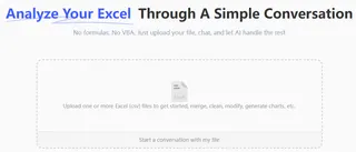
Step 1: Upload Your Raw Data Sheet
Simply drag and drop your Excel file containing experimental data. No pre-formatting or data cleaning required—the AI handles messy research data with ease.
Step 2: State Your Goal in One Sentence
Tell the AI exactly what visualization you need using natural scientific language. For example:

Step 3: Get Your Chart Instantly
Download your publication-ready figure with proper statistical annotations, journal-compliant formatting, and high-resolution export options—all automatically generated.
Why Researchers Choose Excelmatic
- Time Savings: Reduce chart preparation time from hours to minutes
- Statistical Accuracy: Automatic calculation of error bars, p-values, and confidence intervals
- Journal Compliance: Format charts to meet specific journal requirements
- No Learning Curve: Use plain English instead of complex software commands
- Data Security: Enterprise-grade encryption protects your unpublished research
Frequently Asked Questions (FAQ)
1. Q: Can I customize charts to meet specific journal formatting requirements?
A: Absolutely. You can specify exact journal guidelines: "Format this chart to meet Nature journal standards with 8pt Arial font and 300 DPI resolution." The AI will apply all specific formatting requirements automatically, saving you from manually adjusting every element.
2. Q: What statistical tests and error bars does Excelmatic support?
A: Excelmatic handles common statistical needs including: "standard deviation, standard error, confidence intervals, t-tests, ANOVA annotations, correlation coefficients, and regression analysis." You can specify exactly which statistical measures you need displayed on your charts.
3. Q: Is my unpublished research data secure when using this tool?
A: Yes. Excelmatic uses enterprise-grade encryption and strict data privacy protocols. Your research data is processed only for the visualizations you request and is not stored long-term or used for training models, ensuring complete confidentiality for your unpublished work and protecting your intellectual property.
Go From Raw Data to Publication-Ready Figures
Stop wasting precious research time on manual formatting and statistical calculations.Discover more ways to enhance your productivity with AI-powered research tools.
Professionally formatted, statistically accurate charts are no longer a luxury—they're an expectation in academic publishing. With Excelmatic.ai, you can meet these standards effortlessly while focusing on what truly matters: your scientific discovery and manuscript preparation.
Start your free trial of Excelmatic today and create your first publication-ready chart in minutes—not hours.

