Key takeaways:
- Manually formatting raw Excel data into professional-looking reports is a time-consuming and repetitive task, involving dozens of clicks for fonts, colors, charts, and tables.
- Excel AI tools like Excelmatic eliminate this manual labor by allowing you to use natural language prompts to automatically generate perfectly formatted summaries, charts, and tables.
- By using Excelmatic, you can create consistent, error-free, and visually appealing reports in a fraction of the time, freeing you to focus on analyzing insights rather than wrestling with formatting options.
Problem background & pain points
You've just finished compiling the monthly sales data. The numbers are all there, sitting in a massive, intimidating spreadsheet with thousands of rows. Your data is accurate, the calculations are correct, but the file itself is a visual nightmare. It's a wall of text and numbers that's impossible to present to your manager or team.
Now, the "real" work begins: the tedious, soul-crushing process of making it look professional. You need to create summary tables, visualize trends with charts, and ensure everything aligns with your company's branding. You find yourself asking:
- Which font and size should I use for the headers versus the data?
- How do I make the rows easier to read without manually coloring every other line?
- What's the best way to create a chart that clearly shows regional performance?
- How can I make sure this report looks exactly like the one I made last month?
This process can easily consume hours. You're a data professional, not a graphic designer, yet you're forced to spend a significant chunk of your time on cosmetic tweaks. Worse, after all that effort, your manager asks for a small change—like viewing the data quarterly instead of monthly—and you have to start the formatting process all over again.
The Traditional Excel Solution: Steps and Limitations
To transform that raw data into a presentable report, the traditional approach in Excel involves a long sequence of manual steps. While powerful, this method is fraught with inefficiency and potential for error.
The typical workflow looks something like this:
Prepare the Canvas: You might start by deleting gridlines to create a cleaner look (
View > Show > Uncheck Gridlines). You might also leave the first row and column empty to create "breathing room," a common design trick.Format Headers and Titles: You'll select the header row, make the text bold, increase the font size, perhaps change the font color, and center-align the text. This has to be done for every title and sub-header.

Apply "Zebra Stripes" for Readability: To make long tables easier to read, you apply alternating colors to the rows. This is often done by converting the range to an Excel Table (
Ctrl + T) and choosing a style, or by setting up a complex conditional formatting rule using a formula like=MOD(ROW(),2)=0.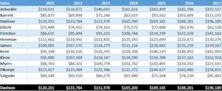
Create Summaries and Visuals: This is the most critical part. You'll likely build a PivotTable to summarize sales by region, product, or time period. Then, you'll insert a PivotChart based on that table. You'll spend more time customizing the chart—adjusting axis labels, adding a title, changing colors, and removing unnecessary elements.
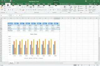
Ensure Consistency: You try to remember the exact font sizes, color codes, and chart styles you used last time to maintain consistency, often referring back to old files.
The Limitations of the Manual Method
While this process eventually gets you a decent-looking report, it's far from ideal. The key limitations are:
- Extremely Time-Consuming: Each step requires multiple clicks, and the entire process can take hours, especially for complex reports. This is time that could be spent on actual analysis.
- Prone to Errors and Inconsistency: It's easy to apply a formatting rule to the wrong range or forget a step. Maintaining a consistent look and feel across different reports is a constant challenge.
- Rigid and Hard to Adapt: What if your boss wants to see the top 3 products instead of all of them? Or filter by a specific sales rep? Each new request often means rebuilding the PivotTable or reconfiguring the chart from scratch.
- Requires Design Skills: Not everyone has an eye for design. Choosing the right colors, fonts, and chart types to effectively communicate data is a skill in itself. A poorly designed report can obscure key insights.
The New Solution: Using an Excel AI Agent (Excelmatic)
Instead of being an "Excel decorator," what if you could just tell Excel what you want and have it build the entire presentation-ready report for you? That's exactly what an Excel AI Agent like Excelmatic does. It automates the entire process of analysis, summarization, and visualization, turning hours of manual work into seconds of conversation.
How it Works
The workflow is radically simple. You upload your raw data file and use plain language to describe the report you need. The AI handles the rest.
Step-by-Step: Creating a Report with Excelmatic
Let's take the same monthly sales data and build a professional report in a fraction of the time.
1. Upload Your Data File
First, log in to Excelmatic and upload your raw data file. This can be an Excel workbook (.xlsx) or a CSV file. Excelmatic reads your data without modifying your original file. For best results, ensure your columns have clear headers (e.g., "Sale Date," "Region," "Sales Rep," "Amount").
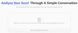
2. Describe the Report You Want in Plain Language
This is where the magic happens. Instead of clicking through menus, you simply type your request. Here are a few examples based on our sales reporting scenario:
- "Create a summary table showing total sales amount by Region. Sort the regions from highest to lowest sales."
- "Generate a PivotTable that breaks down sales by Product Category and by month."
- "Create a bar chart comparing the performance of the top 5 sales reps. Make the chart title 'Top 5 Sales Reps this Quarter' and use a professional blue color theme."
- "Format the main data table with alternating row colors (zebra stripes) and bold headers."

3. Review and Iterate with AI
Excelmatic will instantly generate the requested table, chart, or formatted view. But what truly sets it apart is the ability to iterate. Your initial request is just the start of a conversation.
You can continue to refine the results with follow-up prompts:
- "Great. Now, can you add a column that calculates the percentage of total sales for each region?"
- "Filter this chart to only show data for the 'North' and 'West' regions."
- "Change this from a bar chart to a line chart to show the trend over time."
- "Remove the gridlines from the chart background."
This conversational approach makes it incredibly fast to explore your data and adapt your report to any ad-hoc questions from your team.
4. Export Your Finished Report
Once you're happy with the result, you can download the work. Excelmatic allows you to export the newly created charts, tables, and formatted data into a clean Excel file. You can then copy-paste these elements into your PowerPoint presentation or share the Excel file directly.

Dialogue Example: User vs. Excelmatic
Here’s how a typical conversation might look when building a sales report:
User: I've uploaded my sales data for the last quarter. Can you create a summary table of total sales by sales rep, sorted from highest to lowest? Please format the table with bold headers and alternating row colors.
Excelmatic: Done. I have created a summary table of sales by rep, sorted in descending order. The table is formatted as requested. I've also highlighted the top 3 performers. Would you like me to visualize this?
User: Yes, please create a horizontal bar chart for the top 10 reps. Title it "Q3 Top 10 Sales Performers" and remove the background gridlines.
Excelmatic: I have generated the horizontal bar chart for the top 10 reps with the specified title and a clean background. The chart is ready for you to download. Is there anything else you'd like to add to this report?
Traditional Method vs. Excelmatic: A Quick Comparison
| Aspect | Traditional Manual Method | Excelmatic AI Method |
|---|---|---|
| Time | 30-90 minutes per report | 2-5 minutes per report |
| Effort | High; dozens of manual clicks | Low; type a few sentences |
| Flexibility | Low; changes require redoing work | High; iterate with follow-up prompts |
| Consistency | Hard to maintain; relies on memory | High; AI applies consistent logic |
| Skill Required | Intermediate-Advanced Excel + design sense | Basic ability to describe business needs |
| Error Rate | Higher; manual selections and formulas | Lower; automated and validated by AI |
FAQ
1. Do I need to be an Excel expert to use Excelmatic? No, not at all. The entire point of Excelmatic is to empower users who don't know complex formulas or PivotTable configurations. If you can describe the report you need in words, you can use Excelmatic.
2. Is my data secure when I upload it to Excelmatic? Yes. Excelmatic is designed with data security in mind. It operates on a temporary copy of your data for the duration of your session and adheres to strict privacy policies. Your original file is never modified. For specific enterprise security requirements, always refer to the official website's policies.
3. Can Excelmatic handle messy data? Excelmatic can handle many common data inconsistencies. However, for the best results, it's always good practice to have clean, well-structured data with clear column headers. The AI uses these headers to understand your requests.
4. Can I use the charts and tables generated by Excelmatic in my own presentations? Absolutely. You can download the results as a new Excel file. From there, you can copy the charts, tables, and formatted data and paste them directly into PowerPoint, Word, or Google Slides.
5. Does Excelmatic just create visuals, or can it also do formatting like "zebra stripes"? It does both. You can ask it to perform analytical tasks (like summarizing and calculating) and formatting tasks (like applying colors, bolding text, or creating tables) in the same prompt.
Take Action: Upgrade Your Excel Workflow Today
Every hour you spend manually formatting an Excel sheet is an hour you're not spending on strategic analysis. The traditional way of creating reports is not only slow but also a barrier to agile, data-driven decision-making.
By embracing an Excel AI agent, you can reclaim that time and focus on what truly matters: the insights hidden within your data. Stop being a pixel-pusher and become the data storyteller your organization needs.
Ready to see it in action? Try Excelmatic today. Upload one of the reports you're currently working on and use one of the prompts from this article. You'll be amazed at how quickly you can create a polished, presentation-ready report.


