Key takeaways:
- Creating a histogram in Excel traditionally involves cumbersome steps like enabling the Data Analysis ToolPak, manually defining bin ranges, or using the complex
FREQUENCYarray formula. - An Excel AI tool like Excelmatic eliminates these manual processes. You can simply upload your data and ask in plain English, "Create a histogram of the test scores," and the AI handles the binning and chart creation automatically.
- Using Excelmatic not only generates a professional histogram in seconds but also allows for effortless customization through conversation, such as "change the bin size to 10" or "show scores between 50 and 90," offering unparalleled flexibility.
Problem background & pain points
Imagine you're a teacher with a list of student test scores, a researcher analyzing survey responses, or a quality manager inspecting product measurements. You have a column of numbers, and you need to understand its distribution. How many students scored in the 90s? What is the most common age range in your survey? Are most of your products clustered around the target specification?
A histogram is the perfect tool for this job. Unlike a simple bar chart that compares distinct categories, a histogram groups numerical data into intervals, or "bins," and shows the frequency of values falling into each bin. It gives you an immediate visual sense of the data's shape, central tendency, and spread.
However, creating a histogram in Excel is surprisingly unintuitive. It's not a straightforward "Insert Chart" operation. You quickly run into concepts like "bins," "add-ins," and "array formulas," which can be confusing and time-consuming for even experienced Excel users. You spend more time fighting with the software than you do analyzing your data, a frustration that keeps many from using this powerful visualization tool effectively.
Traditional Excel Solutions: Steps & Limitations
If you've ever tried to create a histogram in Excel, you've likely encountered one of three manual methods. Each comes with its own set of steps and significant drawbacks.
Let's use a simple dataset of student test scores to illustrate.
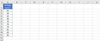
Method 1: The Data Analysis ToolPak
This is the classic method, but it feels like a hidden feature.
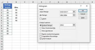
- Enable the Add-in: First, you have to check if the "Data Analysis ToolPak" is even enabled. If not, you must navigate through
File > Options > Add-ins > Excel Add-ins > Goand check the box to install it. Many users don't even know this tool exists. - Define Bins: You must manually create a separate column in your worksheet to define the upper limit for each interval (bin). For scores, this might be 50, 60, 70, 80, 90. This requires you to pre-plan your intervals.
- Run the Tool: Go to the
Datatab, clickData Analysis, selectHistogram, and fill out a dialog box, specifying your input data range and your manually created bin range. - Generate Chart: Excel creates a new frequency table and a static chart.
Limitations:
- Static Output: The biggest issue is that the chart is not linked to your original data. If you correct a score or add a new student, the histogram will not update. You have to delete the old output and repeat the entire process.
- Clunky Setup: The need to enable an add-in and manually define a bin range makes the process slow and cumbersome.
Method 2: The Built-in Histogram Chart (Excel 2016 and later)
Newer Excel versions introduced a dedicated histogram chart type, which is a significant improvement.
- Select Data: Highlight your column of scores.
- Insert Chart: Go to
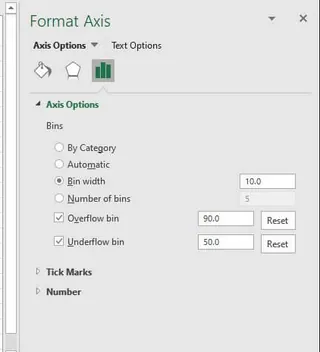
Insert > Insert Statistic Chart > Histogram. - Customize (The Hard Part): Excel creates a chart with automatic bins, which are rarely what you want. To change them, you must right-click the horizontal axis, select
Format Axis, and navigate a complex pane to adjust "Bin Width" or "Number of Bins". The terminology ("Overflow Bin," "Underflow Bin") can be confusing.
Limitations:
- Complex Customization: While the chart is dynamic (it updates with data changes), customizing the bins is not intuitive and requires digging into formatting panes.
- Limited Flexibility: Quickly testing different bin sizes to find the best view of your data is a repetitive cycle of right-clicking and typing numbers.
Method 3: The FREQUENCY Function
For formula experts, the FREQUENCY function offers a dynamic way to calculate the data for a histogram.
=FREQUENCY(data_array, bins_array)
- Define Bins: Like the ToolPak method, you still need to manually create a
bins_array. - Enter Formula: You use the
FREQUENCYfunction to calculate how many data points fall into each bin. In older Excel versions, this was a complicated array formula that required selecting the output range and pressingCTRL+SHIFT+ENTER. In modern Excel, it's a simpler dynamic array formula, but it still requires formula knowledge. - Create a Column Chart: After getting the frequency numbers, you then have to manually create a standard Column Chart using your bins and the frequency results as the source data.
Limitations:
- High Skill Requirement: This method is the least user-friendly and is prone to errors for anyone not comfortable with array formulas.
- Multi-Step Process: It doesn't create the chart directly; it only calculates the data. You still have to build and format the chart yourself.
The New Way: Using an Excel AI like Excelmatic
Instead of wrestling with add-ins, formatting panes, and complex formulas, what if you could just ask for a histogram? This is exactly what Excel AI Agents like Excelmatic are designed for. You can describe your goal in plain language, and the AI does all the heavy lifting.
The Excelmatic Approach
The process is simple and conversational. You upload your file and start a chat with the AI.
- Upload Your Data File: Simply drag and drop your Excel or CSV file containing the student scores into Excelmatic. The AI will read your data and show you a preview. For best results, make sure your data has a clear header, like "Test Scores".
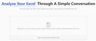
Describe the Histogram You Want: There's no need to define bins or find the right menu. Just type your request in the chat. Here are a few examples:
- To get a quick overview:
Create a histogram for the 'Test Scores' column.
- To specify the bin size:
Show the distribution of test scores using a bin width of 10.
- To define a specific range and number of bins:
Generate a histogram for scores from 40 to 100, divided into 6 bins.
- To get a quick overview:

Review and Refine Through Conversation: Excelmatic will instantly generate the histogram and display it for you. But the real power lies in iteration. You can continue the conversation to fine-tune the chart until it's perfect.
- Want to change the binning? Just ask:
Okay, try it with 8 bins instead.
- Need to adjust the appearance?
Change the chart title to 'Biology Mid-Term Score Distribution'.
- Want to ask a follow-up analytical question?
What percentage of students scored 80 or above?
- Want to change the binning? Just ask:
Export Your Results: Once you're happy with the chart, you can download a new Excel file. This file will contain a clean data table and the fully formatted histogram chart, ready to be used in your report or presentation.
Dialogue Example: Creating a Histogram with Excelmatic
Here's how a typical conversation might look:
You: I've uploaded an Excel file with student biology scores. Can you create a histogram to show the distribution?
Excelmatic: Certainly. I've created a histogram for the 'Biology Scores' column using automatically determined bins. The scores range from 45 to 98. Would you like to adjust the bin width or number of bins?
You: Yes, please set the bin width to 10, starting from a score of 40.
Excelmatic: Done. The histogram now uses a bin width of 10, with bins for 41-50, 51-60, and so on. I've also updated the chart. Is there anything else you'd like to change?
You: Perfect. Can you add a title 'Biology Score Distribution' and label the axes 'Score Range' and 'Number of Students'?
Excelmatic: The chart has been updated with the new title and axis labels. You can download the Excel file containing this chart now.
Traditional Methods vs. Excelmatic: A Quick Comparison
| Feature | Traditional Excel Methods | Excelmatic (Excel AI) |
|---|---|---|
| Time to Create | 5-15 minutes | < 1 minute |
| Skill Level | Intermediate to Advanced | Beginner (just describe your goal) |
| Flexibility | Low; requires manual rework for changes | High; adjust with simple chat commands |
| Bin Management | Manual, confusing, requires pre-planning | Automatic, or easily specified in plain language |
| Data Updates | Often static; requires full redo | Fast; re-upload and repeat the prompt in seconds |
FAQ
Q1: Do I need to understand concepts like "bins" or "intervals" to use Excelmatic for histograms?
No, you don't. You can simply ask, "create a histogram of my data," and Excelmatic's AI will choose a sensible default binning for you. If you do have a specific interval in mind, you can easily state it in your prompt, like "use a bin size of 100."
Q2: Is the histogram generated by Excelmatic static like the one from the Data Analysis ToolPak?
The final exported Excel file contains a standard, editable Excel chart. The "dynamic" nature of Excelmatic lies in the creation process. If your source data changes, you simply re-upload the file and ask the same question again—a process that takes seconds, compared to manually rebuilding the chart and its data source in Excel.
Q3: Can Excelmatic create other types of statistical charts?
Yes. Beyond histograms, you can ask Excelmatic to create box plots, scatter plots, Pareto charts, and more, all using the same conversational interface.
Q4: Can I customize the look of the histogram, like colors and titles?
Absolutely. You can ask Excelmatic to change the chart title, axis labels, or even color schemes directly in the chat. For very detailed formatting, you can always make final tweaks in the exported Excel file.
Q5: Is it safe to upload my company's or students' data to Excelmatic?
Data security is a top priority. Excelmatic uses industry-standard encryption for data in transit and at rest. For detailed information, always refer to the official privacy policy and security documentation on the website. The platform is designed for professional use with security in mind.
Take Action: Upgrade Your Excel Workflow Today
Stop wasting valuable time navigating confusing menus and debugging formulas just to create a simple histogram. The manual methods of the past are not only slow but also rigid, making it difficult to explore your data effectively.
With an Excel AI assistant like Excelmatic, you can transform a tedious 15-minute task into a 30-second conversation. Gain deeper insights faster, respond to questions with quick visual analysis, and spend your time interpreting data, not fighting with your tools.
Ready to see the difference? Try Excelmatic for free and upload your data. Use one of the prompts from this article and watch your histogram appear in seconds.


