Key takeaways:
- Manually creating line graphs in Excel involves tedious data selection, menu navigation, and element formatting, especially when comparing multiple trends over time.
- Excel AI tools like Excelmatic automate this entire process, allowing you to generate insightful line charts by simply describing your data visualization needs in plain language.
- Using Excelmatic not only saves hours on reporting but also makes it effortless to iterate, customize, and explore your data for deeper trend analysis without touching a single chart formatting menu.
The Challenge: Visualizing Trends in a Sea of Data
Imagine you're a sales manager at the end of a busy quarter. You have a spreadsheet overflowing with data: weekly sales figures for different products, broken down by region. Your task is to present a clear summary of performance trends in the upcoming leadership meeting. You need to show which products are growing, which are stagnating, and how different regions compare.
The most effective way to tell this story is with a line graph. It's the perfect tool for showing changes over a continuous period. But creating it in Excel feels like a chore. You find yourself manually selecting columns, navigating through the Insert > Chart menu, and then spending another 20 minutes wrestling with chart titles, axis labels, legends, and colors to make it look professional.
What if your director suddenly asks, "Can you show me just the East region's performance against the West, and add a trendline?" You're back to square one, re-selecting data and re-formatting the chart, all while the pressure mounts. This manual process is not just slow; it's rigid, error-prone, and a major bottleneck in your workflow.
The Traditional Way: Building Line Graphs in Excel Manually
Creating a line graph in Excel is a fundamental skill, but the traditional method is a multi-step, click-intensive process. Let's break down the typical workflow and its inherent limitations.
The Manual Steps to Create a Multi-Line Graph
Let's say you have data structured like this, with dates in the first column and sales figures for different products in the subsequent columns.
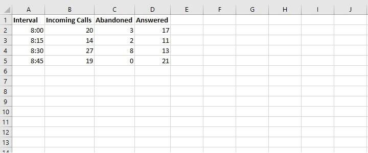
- Select Your Data: You start by highlighting the entire data range, including the headers and the time-series column (e.g.,
A1:D8). - Insert the Chart: Navigate to the
Inserttab on the ribbon. In theChartsgroup, you click on the "Insert Line or Area Chart" icon. You then choose a type, like "Line with Markers." - Initial Chart Generation: Excel places a basic, unformatted line graph on your worksheet. Each product gets its own colored line, and a legend is automatically created.
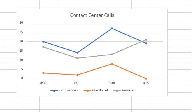
- The Formatting Gauntlet: This is where the real work begins.
- Chart Title: You have to manually click the default "Chart Title" and type in something meaningful, like "Quarterly Product Sales Trends."
- Axis Titles: To add clarity, you click the
+icon next to the chart, check "Axis Titles," and then manually edit the text for both the horizontal (X-axis) and vertical (Y-axis). - Data Labels: Want to show the exact value at a specific peak? You right-click the line, select "Add Data Labels," and then format them so they don't clutter the chart.
- Colors and Styles: Don't like the default blue and orange? You can go to the
Chart Designtab to pick a new style or manually right-click each line to change its color and thickness.
Limitations of the Manual Approach
While this process works, it's far from efficient, especially in a dynamic business environment.
- Time-Consuming: Each chart can take 10-30 minutes to create and perfect. This time adds up, especially if you're creating weekly or monthly reports.
- Rigid and Hard to Update: Adding a new product line or removing one means you often have to adjust the data source range manually. Answering ad-hoc questions requires creating new charts from scratch.
- High cognitive load: You have to remember where every formatting option is hidden. Is it in the
Designtab, theFormattab, or the right-click context menu? This constant menu-hunting distracts you from the actual data analysis. - Prone to Errors: Accidentally selecting the wrong cell range or applying a format incorrectly can lead to misleading visualizations that take time to debug.
The New Way: Creating Line Graphs with an Excel AI Agent (Excelmatic)
Instead of a series of clicks, what if you could create the exact chart you need by simply describing it? That's the power of an Excel AI Agent like Excelmatic. It transforms the tedious task of chart creation into a simple, conversational workflow.

Excelmatic acts as your data analyst assistant. You upload your Excel or CSV file, and then you can chat with the AI in plain language to analyze data, generate formulas, create pivot tables, and, of course, build charts.
Step-by-Step: From Raw Data to Insightful Chart in Seconds
Let's revisit the sales manager scenario. Here’s how you'd create the same multi-line graph using Excelmatic.
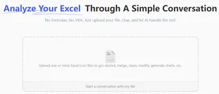
1. Upload Your Data File
First, you simply drag and drop your quarterly-sales.xlsx file into Excelmatic. The AI instantly reads your headers and data structure, preparing it for analysis. No pre-formatting is necessary.
2. Describe the Chart You Want
Instead of clicking through menus, you just type your request into the chatbox.
Here are a few examples of prompts you could use:
- "Create a line chart to show the sales trend for Product A, Product B, and Product C over time."
- "Generate a multiple line graph comparing the sales of all products month by month."
- "Plot the sales for each product on a line graph, with the date on the x-axis."

Excelmatic immediately understands your intent and generates a clean, well-structured line graph.
3. Refine and Iterate with Follow-up Questions
This is where the magic happens. The first chart is just the beginning. You can now refine it conversationally, without ever touching a formatting panel.
- User: "Change the chart title to 'Q1 2025 Product Sales Performance'."
- User: "Add data labels to the highest point of each line."
- User: "Make the line for Product A thicker and change its color to green."
- User: "Can you add a linear trendline for Product C?"
Each command is executed instantly, allowing you to experiment and perfect your visualization in a fraction of the time.
4. Export Your Results
Once you're satisfied with the chart, you can download a new Excel file containing the chart and the source data. You can paste it directly into your presentation or share it with your team.
Dialogue Example: A Real-World Conversation with Excelmatic
Here's how a typical interaction might look:
User: I've uploaded my sales data. Can you create a line graph comparing the sales of the "East" and "West" regions for 2025?
Excelmatic: Absolutely. I have created a line graph showing the monthly sales trends for the East and West regions in 2025. The East region is represented by a blue line, and the West region by an orange line.
User: Great. Can you make the West region's line red and add a title that says "2025 Regional Sales Comparison"?
Excelmatic: Done. I've updated the chart. The West region's line is now red, and the title has been changed. Is there anything else you'd like to adjust?
User: Yes, please show the exact sales value for the peak month for each region.
Excelmatic: I have added data labels to the peak sales months for both the East and West regions. You can now download the updated Excel file.
Traditional Method vs. Excelmatic: A Quick Comparison
| Aspect | Manual Excel Method | Excelmatic AI Method |
|---|---|---|
| Time to Create | 10-30 minutes | Under 1 minute |
| Flexibility | Rigid. Changes require manual rework. | Highly flexible. Iterate with simple chat commands. |
| Skill Required | Knowledge of Excel chart menus and options. | Ability to describe your goal in simple language. |
| Error Rate | Higher risk of selection or formatting errors. | Low. AI handles data selection and generation. |
| Focus | On the process of creating the chart. | On the insights from the data. |
FAQ
Q1: Does Excelmatic automatically choose the best chart for my data? Yes, it can. If you're unsure, you can ask a general question like "Visualize the monthly trend in my sales data," and Excelmatic will often recommend and create a line chart as the most suitable option for time-series data.
Q2: Is it safe to upload sensitive company data to Excelmatic? Excelmatic is built with security in mind, using industry-standard practices like data encryption. For specific details on data handling and privacy, it's always best to consult the official privacy policy on the website. Your data is not used to train models.
Q3: Can I customize the charts Excelmatic creates? Absolutely. You can request customizations conversationally, such as changing colors, titles, labels, or adding trendlines. For highly specific, fine-grained tweaks, you can always export the AI-generated chart to Excel and make final adjustments there.
Q4: What if my date column isn't in a standard format? Excelmatic's AI is designed to recognize and interpret many common date formats (e.g., "Jan-24", "2024/01/15", "15 January 2024"). If it has trouble, you can even ask it to clean up or reformat the date column for you first.
Q5: Is this tool only useful for creating line graphs?
Not at all. Excelmatic is a comprehensive Excel AI agent. You can use it to create bar charts, pie charts, scatter plots, complex pivot tables, and even generate intricate formulas like VLOOKUP or SUMIFS—all using natural language.
Get Started: Revolutionize Your Excel Workflow Today
Stop letting tedious chart creation slow you down. The time you spend clicking through menus is time you could be spending on strategic analysis and decision-making. By embracing an Excel AI agent, you shift your focus from "how to build it" to "what questions to ask."
Ready to experience the difference? Upload your spreadsheet and see how quickly you can turn your data into a compelling story.
Try Excelmatic for free and create your next line graph in seconds, not minutes.


