Key takeaways:
- Manually building Excel dashboards involves complex steps like creating multiple pivot tables, linking slicers, and formatting charts, which is a time-consuming and error-prone process.
- Excel AI tools like Excelmatic let you describe your desired dashboard in plain English, and the AI automatically generates the necessary KPI cards, charts, and interactive filters for you.
- Using Excelmatic drastically cuts down dashboard creation time from hours to minutes, allows for instant modifications through conversation, and makes sophisticated data visualization accessible to all Excel users, regardless of skill level.
The Goal and The Grind of Building Excel Dashboards
Dashboards are the heartbeat of data-driven decision-making. Whether you're tracking sales performance, monitoring project milestones, or analyzing marketing campaign results, a good dashboard tells a clear story. It transforms rows and columns of raw data into a visual summary of key performance indicators (KPIs), trends, and actionable insights.
The goal is simple: present the most critical information in a way that's easy to understand at a glance. But for most Excel users, the process of getting there is anything but simple.
Imagine this: your manager asks for a weekly sales dashboard. You have a large dataset with sales records, including date, region, salesperson, product, and revenue. You know you need to show:
- Total revenue for the period.
- A breakdown of sales by region.
- A trend line of sales over time.
- The top-performing salespeople.
- An interactive filter so your manager can slice the data by region or product.
Suddenly, your afternoon is booked. You're facing a mountain of manual tasks: creating multiple pivot tables for each metric, carefully inserting different chart types, wrestling with chart formatting to make them look consistent, and then the dreaded task of adding slicers and ensuring they correctly filter all the different elements on your dashboard. One wrong click, and a chart is disconnected. A new data import, and you have to manually refresh everything and pray no formulas break.
This manual process is not just slow; it's rigid and fragile. What happens when your manager sees the dashboard and asks, "This is great, but can we see it by product category instead of salesperson? And can you highlight the regions that missed their target?" You're back to the drawing board, spending another hour re-configuring pivots and charts.
The Traditional Way: A Maze of Pivots, Charts, and Slicers
Building a dashboard manually in Excel is a testament to a user's patience and technical skill. It's a powerful capability, but it requires a deep understanding of multiple Excel features and how they interact.
Let's break down the typical workflow for creating a sales dashboard.
Step 1: The Foundation of PivotTables
You can't just create charts from your raw data table. First, you need to summarize the data. This means creating a separate PivotTable for almost every visual element on your dashboard.
- One PivotTable to calculate total revenue.
- A second PivotTable to summarize sales by region.
- A third to group sales by month for your trend chart.
- A fourth to rank salespeople by their sales total.
You end up with a hidden "calculation" sheet cluttered with multiple PivotTables, all feeding your main dashboard.
Step 2: Assembling the Visuals
With your PivotTables ready, you start inserting charts.
- A Card or textbox to display the total revenue (often linked to a cell with a
GETPIVOTDATAformula). - A Bar Chart or Pie Chart for the regional sales breakdown. You have to decide which chart tells the story best. A pie chart is good for parts of a whole, but a bar chart is better for comparing values.
- A Line Chart for the monthly sales trend.
- A Table or another bar chart for the top salespeople.
Each chart needs to be individually formatted: titles, labels, colors, and fonts must be adjusted to create a cohesive look.
Step 3: Making It Interactive with Slicers
A static dashboard is of limited use. To make it interactive, you add Slicers. A slicer for "Region" and another for "Product Category" would be typical.
Here's the tricky part: by default, a slicer only connects to the PivotTable it was created from. To make it control the entire dashboard, you must manually go into the "Report Connections" for each slicer and tick the box for every other PivotTable you want it to filter. If you forget to connect a slicer to one of your PivotTables, your dashboard will show inconsistent data, a mistake that's easy to make and hard to spot.
The Limitations of the Manual Approach
This traditional method, while effective, is fraught with challenges:
- Time-Consuming: The initial setup can take hours, even for experienced users.
- Error-Prone: Manually linking slicers, managing multiple PivotTables, and writing formulas like
GETPIVOTDATAleaves a lot of room for human error. - Hard to Maintain: When new data is added, you have to remember to refresh all data sources and PivotTables. If the structure of your source data changes, your dashboard can break entirely.
- Inflexible: Responding to follow-up questions or requests for changes often requires a significant rework of the underlying structure. It kills the flow of a data-driven conversation.
- High Skill Barrier: This process requires intermediate-to-advanced Excel skills, making it inaccessible for many team members who just want to get quick insights from their data.
The New Way: Building Dashboards with Excel AI (Excelmatic)
What if you could skip the entire manual process? What if you could simply describe the dashboard you want, and have it built for you in minutes? That's exactly what Excel AI agents like Excelmatic are designed to do.
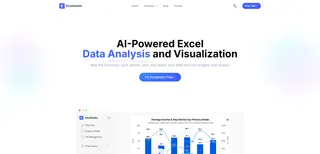
Excelmatic acts as your personal data analyst. You upload your data, and then you use a chat interface to tell the AI what you want to see. It handles the data aggregation, chart creation, and interactivity for you.
Let's rebuild the same sales dashboard using Excelmatic.
Step-by-Step: From Raw Data to Interactive Dashboard in Minutes
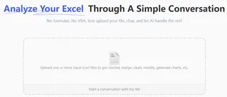
1. Upload Your Data
First, you upload your Excel or CSV file containing the raw sales data to Excelmatic. The AI will instantly read your file and show you a preview, understanding the different columns like 'Date', 'Region', and 'Revenue'.
2. Describe Your Dashboard in Plain English
Instead of building PivotTables, you just ask. You can start with a broad request and then add more elements.
For example, you could type a single, comprehensive prompt:
Create a dashboard for me. At the top, show me a KPI card with the total revenue. Below that, add a bar chart showing total sales by region, sorted high to low. Also include a line chart showing the monthly sales trend for this year. Finally, add a table with the top 5 salespeople by revenue.

Or, you can build it piece by piece:
- User: "Show me the total revenue."
- Excelmatic: Generates a KPI card showing the total revenue figure.
- User: "Now, create a bar chart of sales by region."
- Excelmatic: Adds a bar chart visualizing sales for each region.
- User: "Change that to a map chart and color-code the regions based on sales volume."
- Excelmatic: Instantly replaces the bar chart with a geographic map chart, with darker shades for higher-sales regions.
3. Iterate and Refine with Conversation
This is where the magic happens. The dashboard creation process becomes a conversation. Remember the follow-up questions from your manager? With Excelmatic, they are no longer a chore.
User: I have my sales data loaded. Please create a dashboard showing total sales by region and a monthly sales trend line. Also add a slicer for 'Product Category'.
Excelmatic: Done. I've created a dashboard with a regional sales bar chart and a monthly trend line. A slicer for 'Product Category' is on the left and is connected to both charts. The current total revenue is $1,245,670.
User: This is perfect. Now, can you add a KPI card at the top that shows the average sale amount and the total number of unique customers?
Excelmatic: I've added two KPI cards at the top for 'Average Sale Amount' and 'Unique Customer Count'. The layout has been adjusted to accommodate them.
User: Great. For the regional sales chart, please highlight any region with sales below $150,000 in red.
Excelmatic: I have applied conditional formatting to the regional sales chart. The bars for regions with sales under $150,000 are now colored red.
This conversational approach makes data exploration fluid and intuitive. You can test ideas, change visuals, and drill down into details without ever touching a PivotTable or a chart formatting menu.
4. Export Your Results
Once you're happy with your dashboard, you can download the entire report as a new Excel file. The file will contain the generated charts, tables, and even the underlying PivotTables that the AI created, all perfectly configured and ready to be shared. You can also copy individual formulas or chart configurations to use in your existing workbooks.
Traditional Method vs. Excelmatic: A Quick Comparison
| Aspect | Traditional Excel Method | Excelmatic AI Method |
|---|---|---|
| Time | Hours of setup and configuration | Minutes, via natural language prompts |
| Flexibility | Rigid; changes require manual rework | Highly flexible; iterate and modify via chat |
| Skill Level | Intermediate to Advanced Excel skills needed | Basic ability to describe your goal in simple language |
| Error Rate | High risk of manual errors (e.g., slicer connections) | Low; AI handles the technical configuration |
| Maintenance | Manual refresh and potential rework for new data | Simply re-upload new data or re-run the analysis |
FAQ
1. Do I need to be an Excel expert to use Excelmatic for dashboards? No. That's the primary benefit. If you can describe what you want to see in your data (e.g., "show me sales by month"), you can use Excelmatic to create sophisticated dashboards. You don't need to know how to create PivotTables, use VLOOKUP, or connect slicers.
2. Will Excelmatic change my original Excel file? No. Excelmatic works on a copy of the data you upload. Your original file remains untouched and secure on your local computer.
3. Can Excelmatic suggest the best chart type for my data? Yes. If you simply ask to "visualize sales by region," the AI will choose a suitable chart, like a bar chart. You can also specifically request a chart type (e.g., "show it as a pie chart") or ask the AI to change the one it generated.
4. How does Excelmatic handle interactivity like slicers and filters? You just have to ask for it. For example, say "add a filter for the year" or "add a slicer for salesperson." The AI will create the interactive control and ensure it's connected to all relevant elements on the dashboard automatically.
5. Is my company's data safe when I upload it to Excelmatic? Excelmatic is built with data security as a top priority, employing industry-standard encryption for data in transit and at rest. For specific details on security protocols and data handling policies, always refer to the official privacy policy on the website.
6. Can I export the dashboard back into a standard Excel file?
Absolutely. You can download your entire AI-generated dashboard as a new .xlsx file. This file contains the charts, tables, and data, which you can then share with colleagues or integrate into other reports.
Get Started: Elevate Your Excel Workflow with AI
Stop letting the tedious mechanics of Excel get in the way of your data's story. The hours spent wrestling with PivotTables and chart settings are hours you could be spending on strategic analysis and making informed decisions.
By embracing an Excel AI agent like Excelmatic, you're not just saving time—you're transforming your relationship with data. You can finally build the dynamic, insightful dashboards you need, as fast as you can think of the questions to ask.
Ready to see it in action? Try Excelmatic for free today. Upload one of your own datasets and try one of the prompts from this article. Your first AI-powered dashboard is just a few minutes away.


