Key takeaways:
- Manually creating charts in Excel is tedious, requiring you to select data, choose chart types, and format countless elements, making it difficult to respond to quick analysis requests.
- Excel AI tools like Excelmatic eliminate these manual steps. You can simply upload your data and ask for a specific chart—like "create a bar chart of sales by region"—using natural language.
- Using Excelmatic saves hours, reduces formatting errors, and makes data visualization accessible to anyone, allowing you to generate insightful charts and dashboards in minutes, not hours.
Problem background & pain points
In any business, data is king. But raw data in a spreadsheet—endless rows and columns of numbers—is rarely insightful on its own. To make sense of it, you need to visualize it. Whether you're a sales manager tracking regional performance, a marketer analyzing campaign ROI, or a project manager monitoring deadlines, charts are the universal language for turning data into decisions.
Imagine this scenario: it's Tuesday afternoon, and your manager asks for a visual report on quarterly sales performance for an executive meeting tomorrow morning. You have a massive Excel file with thousands of rows of transaction data, including dates, regions, sales reps, and revenue.
Your immediate challenge isn't a lack of data; it's the manual labor required to transform it:
- Data Preparation: First, you need to aggregate the raw data. This often means creating a pivot table or writing complex
SUMIFSformulas to group sales by region and quarter. - Chart Selection: Which chart tells the best story? A column chart for regional comparison? A line chart to show trends over time? A pie chart for market share? Choosing the wrong one can obscure the message.
- Formatting Hell: Once you insert a chart, the real "fun" begins. You spend ages adjusting titles, formatting axes, adding data labels, changing colors to match your company's branding, and ensuring the legend is readable.
- The Inevitable "One More Thing": Just as you finish, your manager follows up: "Great! Can you also show the top 3 sales reps within each region? And maybe filter out returns?" Now you have to go back, adjust your pivot table, and potentially rebuild the entire chart.
This process is slow, frustrating, and prone to error. A single mistake in a formula or data range can render the entire chart incorrect.
Traditional Excel solutions: Steps & limitations
For decades, Excel users have relied on two primary methods to create charts, each with its own set of frustrations.
Method 1: The Manual Chart Wizard
This is the classic approach taught in every beginner Excel course.
- Select Your Data: You highlight the specific cells, rows, or columns you want to visualize.
- Insert Chart: You navigate to the
Inserttab and browse the chart library to pick a type (e.g., Column, Bar, Line, Pie). - Format and Customize: You click on every element of the chart—the title, axes, gridlines, data series—to manually adjust its appearance and properties.
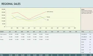
Method 2: Using Chart Templates
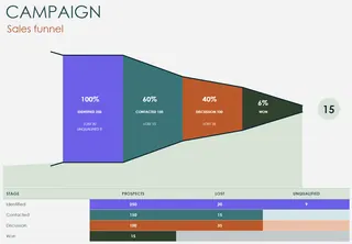
To save time on formatting, many users turn to pre-built Excel chart templates. The idea is to download a .xlsx file that already contains a beautifully formatted chart.
- Find a Template: You search online for a template that matches your needs (e.g., "sales pipeline template," "project budget template").
- Replace Dummy Data: You open the template and carefully replace the placeholder data with your own, hoping your data structure matches the template's design.
- Adjust and Tweak: You make minor adjustments to fit your specific requirements.
The Limitations of Traditional Methods
While functional, both approaches are fundamentally inefficient in the modern, data-driven workplace.
- Time-Consuming: Whether you build from scratch or adapt a template, you're still investing significant time in manual setup and formatting.
- Rigid and Inflexible: A manually created chart is static. A template is even more rigid; it forces you to fit your data into its predefined structure. Answering a simple follow-up question often means starting over.
- High Skill Barrier: Creating effective, multi-layered charts often requires intermediate-to-advanced Excel skills, including proficiency with PivotTables, complex formulas, and data structuring.
- Error-Prone: The more manual steps involved, the higher the chance of errors—selecting the wrong data range, a typo in a formula, or an incorrect pivot table filter.
You end up spending more time building the report than analyzing the insights within it.
Using Excel AI (with Excelmatic) for a New Solution
What if you could skip the manual steps entirely? What if you could simply tell Excel what chart you want, and it would appear, perfectly formatted, in seconds? That's the promise of Excel AI Agents like Excelmatic.
Excelmatic acts as your personal data analyst. You upload your raw data file, and then, using plain language, you instruct the AI on how to analyze, summarize, and visualize it. It handles the data aggregation, chart creation, and formatting for you.
Step-by-Step: Creating a Chart with Excelmatic
Let's revisit the scenario of creating a quarterly sales report. Here's how you'd do it in Excelmatic:
1. Upload Your Data
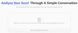
Simply drag and drop your Excel or CSV file containing the raw sales data onto the Excelmatic platform. The AI will instantly read and understand your data's structure, identifying columns like 'Date', 'Region', 'Sales Rep', and 'Revenue'.
2. Describe the Chart You Want in Natural Language
Instead of clicking through menus, you just type your request. Here are a few examples of prompts you could use:
- "Create a column chart showing total revenue by region."
- "Generate a line chart that tracks our monthly sales revenue for the entire year."
- "Make a pie chart showing the percentage of total sales contributed by each product category."
- "I need a stacked bar chart that breaks down sales by region and by sales rep."

3. Review and Iterate with Conversation
Excelmatic will generate the chart instantly. But the real power lies in the ability to refine it through conversation. You can continue the dialogue to make changes or dig deeper.
- "Okay, now filter this chart to only show data for Q3 and Q4."
- "Change the chart type to a horizontal bar chart and sort it from highest to lowest sales."
- "For the 'North' region, create a separate pie chart breaking down sales by rep."
- "Add data labels to all the bars."
This conversational approach makes ad-hoc analysis effortless. You can explore your data from multiple angles without ever touching a formula or a formatting menu.
4. Export Your Results
Once you're satisfied, you can download the results as a new, clean Excel file. The file will contain the generated charts, the underlying summary data, and even the pivot tables the AI used to create them. You can use this file directly in your presentation or copy the elements into your existing dashboards.
Dialogue Example: From Raw Data to Insight
Here’s what a typical conversation with Excelmatic might look like:
User: I've uploaded my sales data for the year. Can you create a column chart comparing the total sales for each region?
Excelmatic: Done. Here is a column chart showing total sales by region. The 'East' region had the highest sales at $450,000. Would you like to see a trend-line or a breakdown by quarter?
User: A breakdown by quarter would be great. Make it a stacked column chart.
Excelmatic: Okay, I've updated the visual to a stacked column chart, with each column representing a region and the stacks representing sales per quarter. I've also added a legend.
User: Perfect. Now create a separate pie chart just for the 'East' region's Q4 sales, broken down by sales rep. And add percentage labels.
Excelmatic: No problem. I have generated a pie chart for 'East' region's Q4 sales, showing the contribution of each sales representative with percentage labels. You can view it below.
Traditional Way vs. Excelmatic: A Quick Comparison
| Aspect | Traditional Excel (Manual/Templates) | Excelmatic (AI-Powered) |
|---|---|---|
| Time to Create | 30 minutes to 2+ hours | 1-2 minutes |
| Flexibility | Low. Changes require manual rework. | High. Instantly adapt with new prompts. |
| Skill Required | Intermediate to Advanced Excel | Basic conversational language skills. |
| Error Rate | High risk of manual formula/selection errors. | Low. AI handles aggregation consistently. |
| Focus | On the process of building the chart. | On the insights from the data. |
FAQ
Q1: Do I need to know which chart type is best for my data?
No, not necessarily. You can describe what you want to compare, and Excelmatic can suggest an appropriate chart. For example, you could say, "Show me how sales have changed over time," and it would likely generate a line chart.
Q2: Will Excelmatic modify my original Excel file?
No. Your original file is never modified. Excelmatic works on a copy of your data in a secure environment and allows you to download a new Excel file with the results.
Q3: Can Excelmatic handle messy or unstructured data?
Excelmatic includes data cleaning capabilities. You can ask it to perform tasks like "remove duplicate rows," "fill in empty cells in the 'Revenue' column with 0," or "split the 'Full Name' column into 'First Name' and 'Last Name'." For best results, starting with clearly labeled columns is recommended.
Q4: Is it safe to upload sensitive company data to Excelmatic?
Excelmatic is designed with data security as a top priority, using industry-standard encryption for data in transit and at rest. For specific details on enterprise-level security and compliance, it's always best to consult the official privacy policy and security documentation.
Q5: Can I customize the charts Excelmatic creates?
Absolutely. You can ask the AI to change colors, update titles, add or remove labels, and more. For highly specific, pixel-perfect formatting, you can always export the AI-generated chart to Excel and make final manual tweaks there.
Take Action: Upgrade Your Excel Workflow Today
Every hour you spend wrestling with Excel's chart wizard is an hour you're not spending on strategic analysis. The manual process of creating business reports is not just slow—it's a bottleneck that limits your ability to make fast, data-informed decisions.
By embracing an Excel AI tool like Excelmatic, you shift your focus from tedious mechanics to valuable insights. Imagine being able to answer any question about your data in seconds and generate a presentation-ready visual in minutes. That's the power of having an AI data analyst at your fingertips.
Stop the cycle of manual data wrangling. It's time to have a conversation with your data.
Try Excelmatic for free and upload your first spreadsheet to see how quickly you can turn raw numbers into powerful stories.

