With a meeting just around the corner, your manager asks you to create a chart to visualize the latest sales performance by product line. You stare at the spreadsheet, knowing that transforming that wall of data into a presentation-ready chart is a time-consuming manual process.
Key Takeaways:
- The Pain Point: Converting data tables into visual charts in Excel involves a series of tedious manual steps like selecting, inserting, and formatting, which is slow and prone to error.
- The Old Way: Painstakingly selecting data ranges, guessing which chart type works best, and then spending far too long tweaking titles, colors, and axes.
- The AI Way: Describe your analytical goal in one plain-English sentence. The AI automatically handles data aggregation and chart creation, delivering a presentation-ready visual instantly.
Your Time Is Too Valuable to Waste on Formatting
Think about this scenario that plays out in offices every day: you have a detailed sales transaction log and you need to compare sales totals by product category.
In Excel, your workflow is:
- Pivot or Summarize: First, you have to create a PivotTable to aggregate the thousands of rows of sales data by product category.
- Select and Insert: Next, you select the results from your PivotTable, click the "Insert" tab, and hunt for the right bar chart in the menu.
- Tweak and Beautify: The default chart Excel generates is basic. You have to manually edit the title to "Sales by Product Category," double-check that the X and Y axes are labeled correctly, and maybe even change the default blue to match your company's branding.
A single chart can easily eat up 10 minutes of your valuable time. If your manager then asks for a pie chart of sales by region, you have to repeat the entire process. Your focus is forced to shift from analyzing data to decorating charts.
The Role Shift: From Chart Builder to Data Storyteller
In the past, you were a chart builder, manually crafting every visual detail. Now, you can be a data storyteller, simply giving the command and letting the data present itself.
Excelmatic upgrades chart creation from a manual chore to an intelligent service.
| Comparison | Traditional Excel Charting | Excelmatic |
|---|---|---|
| Workflow | Aggregate → Select → Insert → Tweak (Multi-step) | Ask a Question (One Step) |
| Core Ability | Mechanically executes your clicks | Intelligently understands your intent |
| Time Cost | Minutes or longer | Seconds |
| Your Focus | "Does the chart look good?" (Lost in details) | "What does the chart mean?" (Focused on insight) |
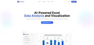
Excelmatic frees you from tedious clicks, allowing you to invest your full energy into the business insights the charts reveal.
Get a Presentation-Ready Chart in Three Steps
Let's return to our original scenario and see how Excelmatic visualizes data in seconds.
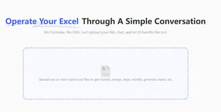
Step 1: Upload Your Raw Data Sheet
Simply upload the original, unprocessed sales transaction log. No need to summarize the data first.
Step 2: State Your Goal in One Sentence
In the chat box, describe what you want to see. You can combine the "aggregation" and "charting" steps into a single request:
“Summarize sales by product category and generate a bar chart for comparison.”

Step 3: Get Your Chart Instantly
Without any further action required, Excelmatic immediately returns a chart that perfectly matches your request.
It has automatically aggregated the data and generated a clean bar chart with clear axes and a complete set of information.
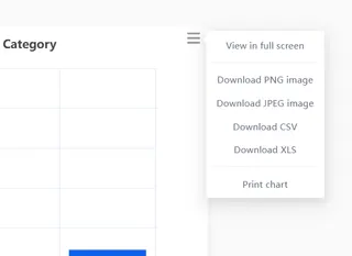
This chart is ready to be downloaded and dropped directly into your PowerPoint slides or reports.
Frequently Asked Questions (FAQ)
1. What types of charts can I create?
Virtually all common chart types. Just specify it in your command: "Generate a pie chart," "Show the monthly trend with a line chart," "Create a horizontal bar chart," or "Make a scatter plot of cost vs. profit."
2. How complex can my commands be?
You can include multiple conditions. For example: "Filter for the 'North America' region, then summarize sales by product category and create a pie chart" The AI can accurately parse and execute your multi-step logic.
3. Can I modify a chart after it's been created?
Absolutely. You can ask follow-up questions just like you would with a colleague: "Change the chart title to '2023 Annual Performance Review'" or "Make the chart color green."The AI understands the context and will iterate on the existing visual.
Your Value Is in Insight, Not in Clicks
Stop letting your charting tool slow down your discovery process. You should be spending your time thinking, "Why is Product A outperforming the others?" not "How do I stop these axis labels from overlapping?"
Let AI be your dedicated data visualization expert.
Try Excelmatic now and bring your data's story to life with a single sentence!

