Key takeaways:
- Creating a bar graph in Excel traditionally involves a multi-step, click-heavy process of selecting data, inserting a chart, and manually formatting every element, which is time-consuming and rigid.
- An Excel AI agent like Excelmatic revolutionizes this by allowing you to generate, customize, and iterate on bar charts simply by describing what you want in plain language.
- Using Excelmatic drastically reduces the time to create presentation-ready charts from minutes to seconds, eliminates manual errors, and provides the flexibility to instantly modify your visualization with follow-up requests.
The Challenge: Visualizing Data Without the Headache
Imagine you're a sales manager preparing for a weekly team meeting. You have a spreadsheet with the latest sales figures for each product line. To make your point effectively, you need a simple bar graph to visually compare performance. Which product is leading? Which one is lagging?
This should be a quick task, but in Excel, it often spirals into a frustrating time sink. You find yourself thinking: "Okay, I need to select the right data range... now where is the chart menu again? Insert... Charts... Bar... which one? Clustered? Stacked? Okay, it's inserted. Now I have to change the generic title, resize it, maybe add data labels so people can see the numbers. The colors are off-brand, so I need to format the data series. Oh, and I wish the bars were sorted from highest to lowest. Now I have to go back to the data, sort the table, and hope the chart updates correctly."
This scenario is all too common. What starts as a five-minute task can easily stretch to 20 or 30 minutes of tedious clicking and formatting. When you have multiple data series—for instance, comparing sales across different regions or over several months—the complexity and potential for error multiply.
The Traditional Way: Manual Steps and Frustrations
The classic method for creating a bar graph in Excel is a well-trodden path, but it's paved with repetitive manual steps. Let's break down the typical workflow.
First, you need to prepare your data in a clean table format with clear headings. For example, a list of albums and their corresponding sales figures.
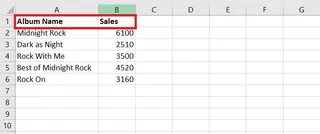
The manual process generally looks like this:
Select Data Range: Carefully click and drag to highlight the cells containing your data, including the headers (e.g., A1:B8). If your data isn't in adjacent columns, you have to hold down the
Ctrlkey while making multiple selections.Insert Chart: Navigate to the
Inserttab on the ribbon, find theChartsgroup, click theInsert Column or Bar Charticon, and select one of the 2-D or 3-D bar chart options.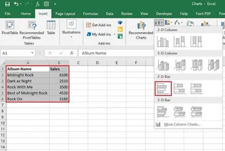
Basic Customization: Excel inserts a generic chart onto your worksheet. You then begin the manual tweaks:
- Click the chart title to rename it.
- Click the green
+icon to add or remove chart elements like Data Labels, Axis Titles, or a Legend. - Right-click on the bars to change their fill color.
Handling Complexity: If you have multiple data series (e.g., sales across several decades), the chart can become confusing. You might need to use the
Switch Row/Columnbutton to change the grouping, which can be a trial-and-error process to get the view you want.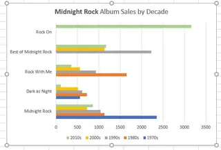
The Limitations of the Manual Approach
While functional, this method is far from efficient. The key problems are:
- It's Click-Heavy and Repetitive: Creating and formatting a single chart can require dozens of clicks across various menus and format panes.
- It's Inflexible: Want to see only the top 5 performers? You have to manually filter your source data or the chart itself. Want to change from a clustered bar to a stacked bar? You have to go back into the
Change Chart Typemenu. - It's Not Intuitive: You must remember where Excel hides each specific command. You can't simply state your goal; you have to execute a precise sequence of actions.
- Sorting is a Hassle: To sort the bars in your chart by value, you can't just right-click the axis and click "Sort." You must go back to your source data, apply a sort to the table, and ensure the chart updates. This is a major workflow disruption.
The New Way: Using an Excel AI Agent (Excelmatic)
What if you could skip all the clicking and just tell Excel what you want? That's the power of an Excel AI agent like Excelmatic. It transforms data analysis and visualization from a manual chore into a simple conversation.

Excelmatic works as your personal data analyst. You upload your spreadsheet, and then you use natural language to ask for analysis, formulas, or, in this case, charts. The AI handles all the backend steps instantly.
Step-by-Step: Creating a Bar Graph with Excelmatic
Let's revisit our album sales example. Here’s how you'd create the same bar chart in a fraction of the time.
1. Upload Your Data File
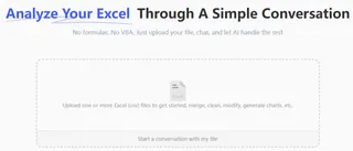
First, open Excelmatic and drag-and-drop your Excel or CSV file onto the platform. The AI will read and understand the structure of your data.
2. Describe the Chart You Want
Instead of searching through menus, you simply type your request into the chatbox. Here are a few examples of prompts you could use:
- For a simple chart: "Create a bar chart showing the sales for each album."
- To add sorting: "Make a bar chart comparing the sales for each album, and sort the bars from highest to lowest."
- For a multi-series chart: "Using the data with sales by decade, create a clustered bar chart to show sales for each album over the decades."
- To change the perspective: "Now, remake that chart but group it by album instead of by decade."

3. Review and Iterate Instantly
Excelmatic generates the chart immediately based on your prompt. But the real magic lies in the ability to iterate. The chart isn't final; it's the start of a conversation. You can refine it with simple follow-up commands:
- "Change this to a stacked bar chart."
- "Add data labels to each bar."
- "Only show albums with sales over 50 million."
- "Change the chart title to 'All-Time Best-Selling Albums'."
- "Make the color of the bars dark blue."
This conversational approach eliminates the need to undo, start over, or hunt for formatting options.
4. Export Your Finished Chart
Once you're happy with the result, you can download a new Excel file containing your perfectly formatted chart. It's ready to be copied into your presentation or report.
Dialogue Example
Here’s how a typical conversation with Excelmatic might look:
User: I've uploaded my album sales data. Please create a bar chart to compare the sales for each album.
Excelmatic: Done. I've created a bar chart displaying the sales for each album. For better readability, would you like me to sort the bars from highest to lowest sales?
User: Yes, please sort them. Also, change the chart title to "Top Selling Albums by Units Sold".
Excelmatic: The chart is now sorted with the highest-selling album at the top, and the title has been updated. Is there anything else you'd like to adjust?
User: Add data labels to the end of each bar.
Excelmatic: Data labels have been added. You can now download the Excel file with the updated chart.
Traditional vs. Excelmatic: A Quick Comparison
| Feature | Traditional Excel | Excelmatic (Excel AI) |
|---|---|---|
| Time to Create | 5-15 minutes of clicking | 30 seconds of typing |
| Flexibility | Rigid; changes require re-navigating menus | Highly flexible; iterate with conversational prompts |
| Sorting | Requires manually sorting the source data | Simple command: "sort the bars" |
| Skill Level | Requires knowledge of Excel's UI and chart options | Requires only the ability to describe your goal |
| Error Rate | High potential for manual errors in selection/formatting | Low; AI handles the mechanics consistently |
FAQ
Q: Do I need to be an Excel expert to use Excelmatic for charts?
A: Absolutely not. If you can describe the chart you want to see in a sentence, you can use Excelmatic. It's designed for everyone, from beginners to advanced users who want to work faster.
Q: Can Excelmatic create different types of bar charts, like stacked or 100% stacked?
A: Yes. You can simply ask for them. For example, "Create a stacked bar chart showing sales by region and quarter" or "Show the contribution of each product as a 100% stacked bar chart."
Q: Does Excelmatic change my original Excel file?
A: No. Your original file is never modified. Excelmatic works on a secure copy of your data in its environment, and you can download the results as a new file.
Q: Is my data safe when I upload it to Excelmatic?
A: Yes. Excelmatic is built with data security as a priority, using industry-standard encryption for data in transit and at rest. For detailed information, always refer to the official privacy policy on the website.
Q: What if my data isn't perfectly clean?
A: Excelmatic can often handle minor inconsistencies. You can even ask it to perform data cleaning steps first, such as "remove any rows where the sales column is empty" before you ask it to create a chart.
Q: Can I still customize the charts Excelmatic creates?
A: Yes. You can ask the AI to change colors, update titles, add labels, and more. Once you download the Excel file, the chart is a standard Excel object that you can fine-tune further if needed.
Get Started: Create Your Next Excel Chart in Seconds
Stop wasting valuable time clicking through endless menus and formatting options. Your energy should be spent on interpreting the insights from your data, not on the mechanical process of creating visualizations.
By leveraging an Excel AI agent, you can transform your workflow, produce reports faster, and respond to ad-hoc data requests in real-time. Imagine your manager asking for a different view of the data during a meeting, and being able to generate it in seconds.
Ready to build your next bar chart in under a minute? Try Excelmatic today. Upload your spreadsheet, use one of the prompts from this article, and see how quickly you can turn raw data into a clear, compelling visual story.

