As an Excel user, have you ever felt overwhelmed by complex formulas and time-consuming data analysis? Well, with Excelmatic, you can now simplify your Excel tasks just by chatting in natural language!
How to Use Excelmatic for Data Analysis
Upload Your Excel File
Visit the Excelmatic website and upload your Excel file (.xlsx, .xls, and .csv).

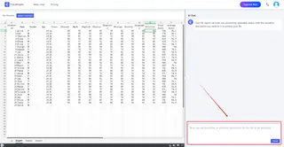
Ask Questions in Natural Language
No need to write complicated formulas; just type your questions or commands in everyday language. For example, you can ask What is the total sales for this month?or Generate a sales trend chart.
Get Instant Results and Insights
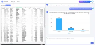
Excelmatic will analyze your data and provide instant results, including visualizations like Bar Charts, line graphs, and pie charts. It also generates detailed analysis reports that highlight key metrics and insights.
Practical Applications
1. Chat Your Way to Results: Making Data Analysis Easy
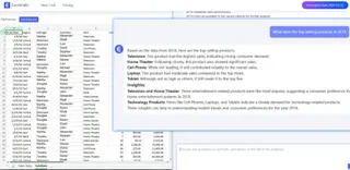
With natural language interaction, users can simply describe their needs in plain language, and Excelmatic will quickly provide answers without the hassle of complex formulas or tedious operations.
Examples:
What is the highest-selling product this month?
How has the sales trend been over the past three months?
Compare the sales of products in different regions.
2. Data Processing and Analysis: Simplifying Complex Tasks
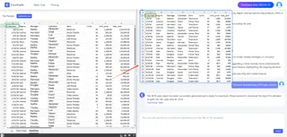
Whether it’s basic tasks like sorting, filtering, finding, and replacing, or advanced data pivot table analysis, Excelmatic can handle it all with ease. It quickly organizes data, fixes errors, and generates dynamic reports to meet various user needs.
Examples:
Fix the date formats in my data.
Remove duplicate entries.
Generate the sales report for this month.
3. Charts and Visualization: Making Data Insights Clear
Excelmatic comes with a rich set of charting tools that can create intuitive visualizations based on your data, such as Bar Charts, pie charts, and line graphs. These charts are not only visually appealing but also update dynamically, reflecting changes in data trends and distributions in real-time, helping users conduct visual analysis quickly.
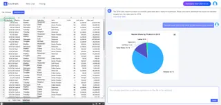
Examples:
- Generate a sales trend chart for each product across different quarters.
- Create a pie chart showing the market share of each product.
- Set up a real-time sales dashboard.
Tips for Effective Use
Be Specific in Your Questions: Clear and specific questions will yield more accurate results.
Try Different Commands: Experiment with various commands to explore the full potential of Excelmatic.
Keep Your Data Organized: Well-structured data leads to better insights and performance.
Conclusion
With Excelmatic, data analysis has never been easier. Whether you’re a data analyst, a business manager, or just a regular user, you can quickly get the information you need just by chatting. Excelmatic not only saves you time but also boosts your productivity, making data analysis a breeze!


