In the field of e-commerce, data is like a mine of treasures, but at the same time, it is also a big mountain of headaches. Massive piles of sales data, customer information, operational indicators, etc., how to dig out valuable information for the store's operational decision-making to provide strong support for the challenge that every e-commerce businessman is facing. Don't worry, Excelmatic is here to help you solve this challenge!
The Bitter of E-commerce Data Analysis
In e-commerce operations, promotional activities are an important means to increase sales. However, after the campaign is over, facing the messy data fed back from various sales channels, such as order details, payment records, refund information, etc. from different platforms, it is simply devastating to integrate them and analyze them in depth. Traditional Excel operations require a lot of time for data cleaning, organizing and calculating, as well as manually drawing charts to present data trends, which is not only inefficient but also prone to errors.
The Wonder of Excelmatic
Excelmatic, as a powerful Excel data analysis tool, can come in handy in this scenario. It has convenient chart visualization features that allow you to easily cope with e-commerce data analysis challenges.
Powerful table generation and calculation functions
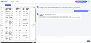
Importing sales data from various channels during promotional campaigns into Excelmatic quickly generates clear tables with just a few clicks without complicated formulas and tedious operations. For example, you can quickly calculate key metrics such as total product sales, average order value, and customer purchase frequency. The results of these calculations will be displayed directly in the table, making it easy for you to make further analysis and decisions.

Generate Sales Charts with One Click
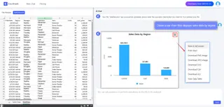
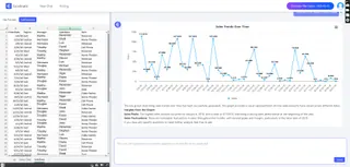
With Excelmatic's charting features, you can easily create various types of charts, such as Bar Charts, line charts, pie charts, and so on. For example, you can create a Bar Chart to compare sales in different regions, or a line chart to show the trend of sales over time. These charts will help you visualize the distribution and changes in your sales data.

Sales Trend Analysis
Sales trend analysis is an essential skill for every salesperson, which can help us better understand the market situation and formulate more effective sales strategies. For example, you can use trend line graphs to analyze the long-term growth trend of sales, or use predictive modeling to forecast the sales of the next promotional campaign. The results of these trend analyses will provide strong support for your decision-making and help you better plan your inventory, marketing activities and budget.

conclusion
E-merchants, don't let data analysis be your nightmare anymore. With Excelmatic's chart visualization feature, complex data can be made easy to understand, allowing you to sail from the ocean of data to the other shore of success with ease. Try Excelmatic and start the journey of efficient e-commerce data analysis!


