Ever stared at your spreadsheet wondering which product category outperforms the others? Or which department is giving you better ROI across campaigns?
That’s where category comparison charts step in — think sales by region, cost by department, or engagement by content type. But as straightforward as the goal sounds, the traditional route to building these insights in Excel is anything but.
The Traditional Way: Formulas, Filters, and Frustration
Let’s say you have 30 rows of sales data, grouped by product categories: Electronics, Apparel, Home & Kitchen, and Sports. You want to compare the average revenue, units sold, and returns per category.
Here’s the typical route:
Create a pivot table to group the data by Category.
Summarize metrics: SUM for revenue, AVERAGE for units, maybe COUNTIF or custom formulas for returns.
Manually build a clustered Bar Chart or stacked column chart.
Add slicers for months, clean labels, adjust axes, tweak colors…
If you’re handy in Excel, maybe 10–15 minutes. If not, you might spend an hour just formatting the chart.
Want to compare Sales vs. Returns ratio across categories? That’s a separate calculation.
Want to filter to a specific region or quarter? You’re now deep into nested filters and helper columns.
And don’t even get me started on when the data updates.
What If You Could Just Ask?
With Excelmatic, the process flips. You don’t start with charts or formulas — you start with a question:
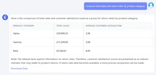
Compare total sales and return rates by product category.
Boom. You get a table summary, and a quick narrative highlighting anomalies or patterns.

Let’s look at two more questions you could ask Excelmatic using our dataset:
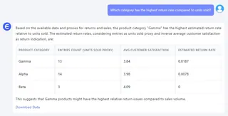
Which category has the highest return rate compared to units sold?
Result: A visual ranking of categories by return ratio, with insights like: “Apparel has a 12% return rate, nearly twice the average.”

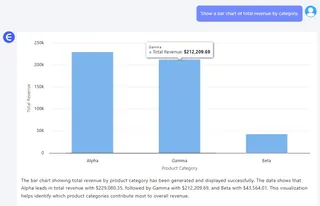
Show a Bar Chart of total revenue by category.
Result: A clean column chart, auto-colored, with annotations like: “Electronics accounts for 38% of total revenue.”

Traditional vs. Excelmatic: A 1-Minute Summary
| Task | Traditional Excel | Excelmatic |
|---|---|---|
| Compare metrics across categories | Manual pivot tables + charts | Just ask |
| Create visuals | Insert + format + label | Auto-generated |
| Adjust by time/region | Manual filters | Built-in options |
Conclusion: Stop Wrestling with Data. Start Talking to It.
Category comparison charts are among the most requested visualizations in business — whether for finance, product, marketing, or ops. But they shouldn’t require a spreadsheet degree to build.
Excelmatic helps you turn your table into answers, instantly. No formulas. No charts to tweak. Just clear results, when you need them.
Click on the links below to see past highlights:
Compare Ad Channel Sales with a Bar Chart in Excel AI
Excel Data Cleanup Made Simple: Unifying Formats with Excelmatic
KPI Metric Analysis Made Easy with Excelmatic: From Chaos to Clarity


