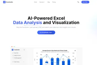
In today's data-driven business environment, the ability to quickly transform raw numbers into compelling visualizations is no longer optional—it's essential. As a User Growth Manager at Excelmatic, I've seen firsthand how AI-powered tools are revolutionizing data visualization for professionals across industries.
ChatGPT has emerged as a versatile assistant that can guide users through the graph creation process. While it doesn't directly render visualizations within its interface, it offers several powerful approaches to help you create charts and graphs. However, for business professionals seeking a more streamlined solution, Excelmatic provides an AI-powered spreadsheet experience that eliminates the need for coding or complex workarounds.
Understanding ChatGPT's Visualization Capabilities
ChatGPT's strength in data visualization lies in its deep understanding of programming languages and data visualization principles. The AI can:

- Generate code for various programming languages and libraries
- Provide step-by-step guidance on using visualization tools
- Assist with data preprocessing and formatting
- Offer integration suggestions with external platforms
While these capabilities are impressive, they often require technical knowledge or additional tools to implement. This is where Excelmatic shines—offering these same visualization capabilities in a no-code, spreadsheet-native environment that business professionals already know how to use.
Types of Graphs You Can Create (With Both Tools)
Basic Business Visualizations
For common business needs like sales tracking or performance metrics, both ChatGPT and Excelmatic can help create:
- Line charts for trend analysis
- Bar/column charts for comparisons
- Pie charts for proportional data
Pro Tip: While ChatGPT can generate the code for these charts, Excelmatic lets you create them instantly by simply describing what you need in natural language—no coding required.
Advanced Visualizations
For more complex data stories, you might need:
- Heat maps for pattern recognition
- Scatter plots for correlation analysis
- Tree maps for hierarchical data
While ChatGPT can guide you through creating these, Excelmatic makes it as easy as clicking a button, with built-in AI that suggests the best chart type for your specific dataset.
Practical Methods to Create Graphs
1. Python Code Generation (ChatGPT Method)
ChatGPT can generate visualization code using libraries like Matplotlib and Seaborn:
import seaborn as sns
import matplotlib.pyplot as plt

data = {'Month': ['Jan', 'Feb', 'Mar'],
        'Sales': [1000, 1200, 900]}
sns.barplot(x='Month', y='Sales', data=data)
plt.show()
The Challenge: This requires Python knowledge and setup—barriers for many business users.
2. R Code Generation (ChatGPT Method)
Similarly for R users:
ggplot(data, aes(x=Month, y=Sales)) + geom_bar(stat="identity")
The Limitation: Again, this assumes R expertise and environment setup.
3. The Excelmatic Solution: No-Code Visualization
With Excelmatic, you simply:
- Upload your spreadsheet
- Describe what you want to visualize
- Let AI suggest and generate the perfect chart

No coding, no complex setup—just instant, professional visualizations directly in your spreadsheet.
Why Excelmatic Is the Superior Choice for Business Users
While ChatGPT provides valuable guidance, Excelmatic offers distinct advantages:
- No Coding Required: Create complex visualizations without writing a single line of code
- Native Spreadsheet Integration: Works directly in your existing Excel files
- AI-Powered Suggestions: Recommends the best chart types for your specific data
- Real-Time Collaboration: Share and edit visualizations with team members
- One-Click Export: Easily add charts to presentations or reports
For business professionals who need to move quickly without technical hurdles, Excelmatic provides the perfect balance of power and simplicity.
Best Practices for Effective Data Visualization
Whether using ChatGPT or Excelmatic, keep these principles in mind:
- Know Your Audience: Tailor complexity to viewer expertise
- Simplify When Possible: Sometimes a basic bar chart communicates better than a complex visualization
- Focus on Storytelling: Every chart should convey a clear message
- Maintain Consistency: Use uniform colors and styles across related visualizations
- Prioritize Clarity: Avoid clutter that obscures your data's story
The Future of AI-Powered Visualization
As AI continues to evolve, we're seeing a shift from manual chart creation to intelligent, automated visualization. Tools like Excelmatic are at the forefront of this revolution, making professional-grade data storytelling accessible to everyone in an organization—not just the data team.
While ChatGPT serves as a helpful guide for those comfortable with coding, Excelmatic represents the next generation of data visualization tools: intuitive, powerful, and designed specifically for business users who need results without the technical overhead.
Ready to transform your data into compelling visual stories? Try Excelmatic free today and experience the future of AI-powered data visualization.


