
AI-Powered Excel Data Analysis and Visualization

Overwhelmed by Complex Excel Spreadsheets
Excel files can be complex, with multiple sheets, formulas, and data types. It can be difficult to understand what the data means and how to use it effectively.

Can't Make Sense of Statistical Metrics
Statistical metrics can be confusing, with different formulas and calculations. It can be difficult to understand what the data means and how to use it effectively.

Spending Hours Creating Charts and Reports
It can be time-consuming to create charts and reports, especially if you're not comfortable with Excel.

Worried About Missing Critical Insights
It can be difficult to identify the most important data and insights, especially if you're not an expert in the field.
Overwhelmed by Complex Excel Spreadsheets
Excel files can be complex, with multiple sheets, formulas, and data types. It can be difficult to understand what the data means and how to use it effectively.
Can't Make Sense of Statistical Metrics
Statistical metrics can be confusing, with different formulas and calculations. It can be difficult to understand what the data means and how to use it effectively.
Spending Hours Creating Charts and Reports
It can be time-consuming to create charts and reports, especially if you're not comfortable with Excel.
Worried About Missing Critical Insights
It can be difficult to identify the most important data and insights, especially if you're not an expert in the field.
Break data barriers, reach your goal.
Turn every Excel row into an intelligent engine for your goals.
Our Core Features
Our Core Features
Automate Tedious Repetitive Tasks
Say goodbye to manual copy-pasting. Clean complex data with a single click, saving time and effort.
Intelligent Recognition
Automatically identify data types to avoid formatting errors.
Customizable Rules
Flexibly set cleaning rules according to business requirements.
Batch Processing
Process multiple tables at once to significantly improve efficiency.
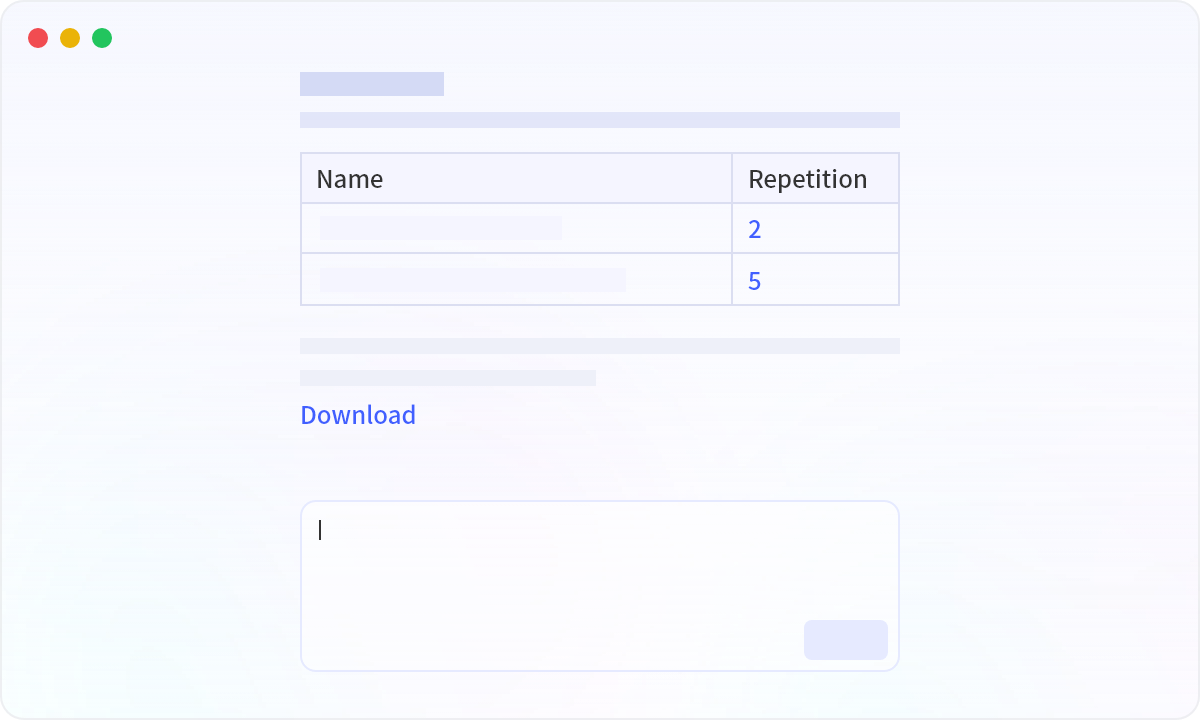
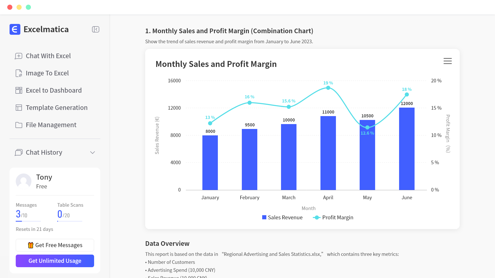
One-Click Chart Generation
Generate professional charts such as bar charts, pie charts, and line charts through conversational interaction.
Chart Recommendation
Intelligently recommend suitable chart types based on data types.
Style Customization
Freely adjust chart styles, including colors, fonts, and labels.
Dynamic Update
Charts automatically refresh when data is updated, providing real-time business insights.

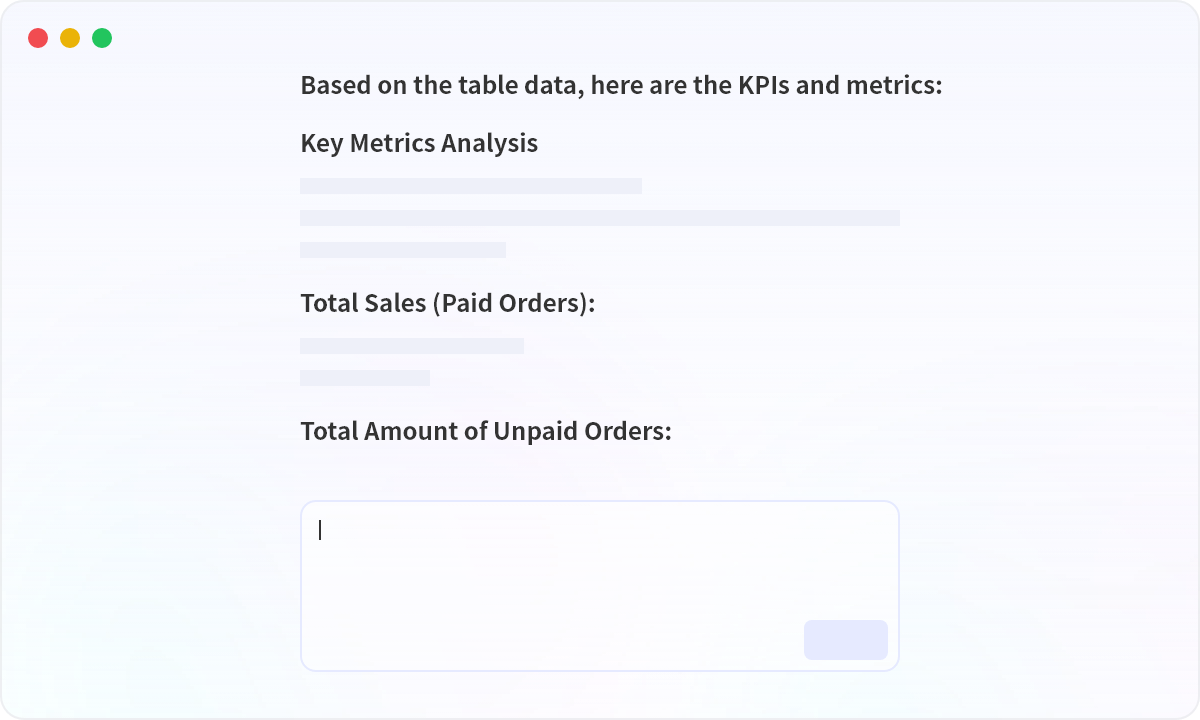
Instant Data Insights
Intelligently extract KPIs, indicators, and key data summaries to quickly grasp business dynamics!
Trend Analysis
Automatically analyze data trends to understand business development directions.
Anomaly Detection
Automatically detect abnormal data to identify potential risks in a timely manner.
Multi-Dimensional Analysis
Support data analysis from multiple dimensions to uncover deeper insights.
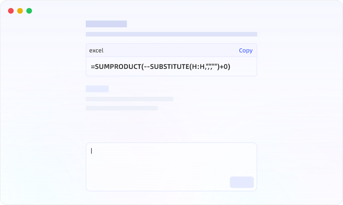
Intelligent Formula Assistant
Generate formulas automatically with natural language input, making it easy for beginners.
Extensive Function Library
Cover various industry needs, with formulas at your fingertips.
Intelligent Error Correction
Automatically detect formula errors and provide modification suggestions, eliminating basic mistakes.
Complex Scenario Support
Easily handle complex scenarios such as nested formulas and array formulas.
How Excelmatic works
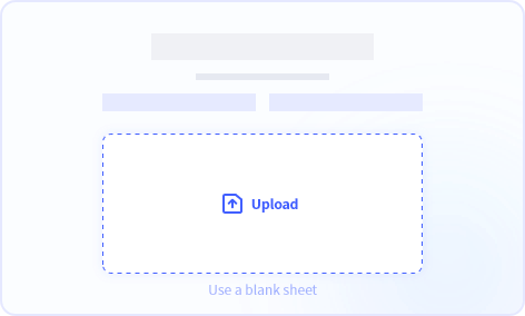
Upload Your Excel File
Upload your Excel file to Excelmatic. Supported file types: .xlsx, .csv
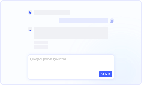
Ask Questions Naturally
Ask questions naturally, and get answers in seconds. No need to know the exact formula or function.
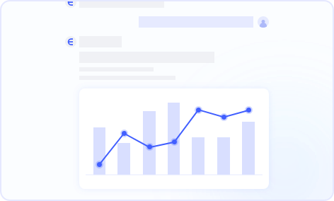
Get Instant Insights
Get instant insights into your data. No need to spend hours creating charts and reports.
How Excelmatic works
Upload Your Excel File
Upload your Excel file to Excelmatic. Supported file types: .xlsx, .csv
Ask Questions Naturally
Ask questions naturally, and get answers in seconds. No need to know the exact formula or function.
Get Instant Insights
Get instant insights into your data. No need to spend hours creating charts and reports.
Smart data ops & analytics
Instant Excel insights via natural language—no technical expertise required.
Trusted by data professionals worldwide
Pricing
Start free, upgrade anytime as your needs grow

Essential
Billed monthly.
- 150 chat messages / month
- 5 uploaded files / chat
- 50M file upload limit
- Chat history saved for 180 days
- 150 image to excel / month
- 10 excel to dashboard / month
- 20 editable blocks / dashboard
- Available dashboard themes: 4
- Basic analysis
- All Charts
- Template generation
- Storage Space: 500M
- Download excel
- Download charts
- Email support
Professional
Billed monthly.
- Everything in Essential, plus
- Unlimited chat messages
- 10 uploaded files / chat
- 100M file upload limit
- Chat history saved for 360 days
- Unlimited image to excel
- 30 excel to dashboard / month
- 30 editable blocks / dashboard
- Available dashboard themes: 6
- Model analysis & prediction
- All Charts + Custom theme
- Storage Space: 1GB
- Exclusive support

Premium
Billed monthly.
- Everything in Professional, plus
- 30 uploaded files / chat
- 300M file upload limit
- 100 excel to dashboard / month
- Unlimited editable blocks
- All dashboard themes available
- Storage Space: 10GB
FAQs
Your data security is our top priority. We use bank-level encryption for data transmission and storage, strictly adhering to international data protection standards. All your files are private and accessible only to you. Our infrastructure is hosted on industry-leading cloud services with reliable data storage and regular backups.
New users, first purchase: Get a full refund within 7 days (under 10 uses), no lengthy explanations needed. Reach out via email/chat for prompt processing (1-3 business days).
No, each account is for individual use only to ensure account security and data privacy. If you have team requirements, we recommend individual accounts for each user. We're developing a dedicated team version - stay tuned for updates!
Yes, we automatically send digital receipts for all purchases to your registered email address. For business users requiring formal invoices, please contact our customer support with your company details. We'll process your request within 7 business days.
Yes, we offer on-premises deployment solutions for businesses and organizations that require hosting our software within their own infrastructure. This allows for greater control over data security and compliance with internal policies. Please contact our enterprise team at [email protected] to discuss your specific requirements. We're happy to tailor a solution that meets your needs.
To cancel your plan, click the “Manage Subscription” button on your profile popup menu, you'll be taken to Stripe, where you can cancel your billing, you can also change your plan or payment method there.