Let’s Get Real…You ran a campaign, got the clicks, some users converted—awesome. But then someone on your team asks, "So, how did users behave before they purchased?"
Cue the panic.
If you've ever tried mapping out user purchase paths in Excel, you know how frustrating it can be. Messy sessions, unclear traffic sources, inconsistent timestamps. It's like trying to trace spaghetti with chopsticks.
But thanks to tools like Excelmatic, you can now answer these questions like a boss—with just a few smart prompts and no formulas.
Let’s walk through a simple example and see how it works.
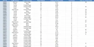
The Dataset: A Simple, Realistic User Path Table
We’re using a dataset with 30 users who came from various traffic sources, landed on different pages, clicked around, and some of them eventually converted.
Now let’s ask Excelmatic three simple, powerful questions.
First Question: How Do Users Behave by Traffic Source?
You want to know how engaged users are based on where they came from. So, you ask Excelmatic: “Can you summarize the average pages visited and session duration for each traffic source?”
Boom, you get a clear table:
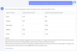
This shows you that users from social media tend to visit more pages and stick around longer. Cool, but are they actually buying? Let’s find out.
Second Question: Which Channels Are Driving Sales?
Next, you want to see which traffic sources are turning clicks into customers. You ask: “Show me the conversion rate for each traffic source, sorted from best to worst.”
Excelmatic delivers a tidy table:
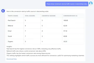
Turns out, referral traffic is killing it with the highest conversion rate, even though social media has those long sessions. Maybe that blog linking to your site is sending super-targeted visitors, or your referral partners are just that good. Either way, you’ve got a lead to chase.
Third Question: What Do Converting Users Do?
Now you’re curious about the users who actually buy. How long are they hanging out before they hit “purchase”? You ask Excelmatic: “Can you make a Bar Chart showing session duration for users who converted?”
Instantly, you get a clean chart:
Excelmatic instantly creates a clean Bar Chart showing which converted users had longer or shorter session durations.
You might notice a few patterns:
- Some users converted after just 3–4 minutes (impulse buyers?)
- Others took 20+ minutes (careful researchers?)
This gives you behavioral personas to work with. Pair it with first-touch pages or traffic source, and you’ve got a whole mini journey map.
What’s the Big Deal About Excelmatic?
Here’s the magic: you didn’t touch a formula.
No AVERAGEIF. No pivot tables. No charts from scratch.
You just asked three questions, and got the kind of insights you usually spend hours building.
Final Thoughts
Ready to stop fighting formulas and start finding insights?Try Excelmatic now >>


