Key takeaways:
- Analytical dashboards bridge the gap between raw data and business decisions, helping non-analysts gain insights.
- Excelmatic simplifies dashboard creation, handling Excel, PDF, and image data automatically.
- Effective dashboards rely on four pillars: multi-dimensional data models, interactive visualizations, drill-through, and prescriptive insights.
- No-code, AI-powered dashboards accelerate analysis and decision-making without requiring technical expertise.
- Practical workflows allow teams to connect data, ask questions, and publish insights within minutes.
Many business managers understand their problems but struggle to translate them into actionable insights. Data often lives scattered across Excel sheets, CRM systems, and marketing platforms. Traditional BI tools promise answers but require SQL, complex formulas, or extensive setup. The result is wasted time, frustration, and delayed decisions. In 2026, speed matters more than data volume. Teams need dashboards that deliver insights without demanding deep analytics expertise. This is where Excelmatic stands out, bridging business knowledge and AI-powered analysis.
What Is a True Analytical Dashboard?
An analytical dashboard is designed not just to display metrics but to help teams explore, explain, and act on data. Unlike operational dashboards that track day-to-day KPIs, or strategic dashboards that summarize high-level performance for executives, analytical dashboards enable dynamic exploration and real-time insight.
| Dashboard Type | Purpose | Audience | Key Features | Example |
|---|---|---|---|---|
| Operational | Monitor daily metrics | Teams, Operators | Standard KPIs, automated updates | Sales tracking, inventory levels |
| Strategic | Summarize performance | Executives | High-level trends, forecasts | Annual revenue, market share |
| Analytical | Explore and explain data | Managers, Analysts | Multi-dimensional views, interactive charts, drill-down & slices | Customer segmentation, campaign performance |
In short: Analytical dashboards transform data into actionable insight, letting teams answer questions rather than just observe numbers.
The Four Pillars of Analytical Dashboards
A strong analytical dashboard rests on four pillars, each turning data into actionable insight.
1. Multi-Dimensional Data Models
Metrics are organized across time, regions, products, and segments. Managers can quickly answer questions like, "Which product line drove growth in the Northeast this quarter?" without juggling multiple spreadsheets.
2. Interactive and Contextual Visualizations
Charts do more than show numbers. With filters, highlights, and dynamic labels, key trends and anomalies stand out. Excelmatic automatically emphasizes underperforming areas, letting users focus on what matters.
3. Drill-Through and Slicing
Dashboards allow exploration from summary metrics down to detailed records. A high-level ROI can be sliced by campaign, region, or customer segment, helping teams discover root causes instead of just observing results.
4. Prescriptive Insights
Beyond showing data, dashboards can suggest actions. Predictive alerts highlight potential underperformance, while AI-driven guidance recommends next steps. This transforms dashboards from static reports into decision accelerators.
Together, these pillars ensure dashboards are clear, actionable, and accessible, even for teams without advanced analytics skills.
Building an Analytical Dashboard with Excelmatic
Excelmatic simplifies every step of dashboard creation, making it ideal for non-analysts.
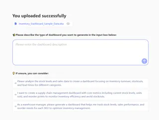
Step 1: Choose tools and practice
While modern BI platforms require technical skills, AI-powered tools like Excelmatic let users focus on insights instead of setup. Non-technical teams can perform AI Data Analysis, create Data Visualization, and generate AI Charts without coding.

Step 2: Define the analysis problem
Clarify what question you want to answer: "Which campaign delivered the highest ROI?" or "Which products drove the most revenue last quarter?"
Step 3: Select and design the analysis view
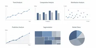
Different questions require different charts or visualization types.
| Analysis Type | Recommended Visualization | Purpose |
|---|---|---|
| Trend Analysis | Line charts, area charts | Show change over time |
| Comparative Analysis | Bar charts, waterfall charts | Compare categories or performance |
| Distribution & Patterns | Scatter plots, histograms | Identify clusters or outliers |
| Predictive Analysis | Forecast lines, AI-generated trend lines | Anticipate future outcomes |
| Segmentation | Tree maps, pie charts | Explore customer or product segments |
Excelmatic automatically generates these views. Users ask questions in plain language, and the AI handles Quick Analysis, format cleaning, and data prep, even from PDF to Excel or Image to Excel sources.
Real-World Example for Analytical Dashboard
A finance manager wants to monitor the Engineering department’s budget performance and identify areas for cost optimization. She consolidates monthly budget logs, actual spend data, and headcount records. Using Excelmatic, she queries: “Show me Engineering’s total annual budget, actual spend, variance percent by category, and highlight overspend vs. underspend trends.”
Within seconds, the AI generates an interactive financial dashboard with:
Key metrics panel: Total Annual Budget (59.64M), Actual Spend (5.13M), Average Variance Percent (–226%), Budget Utilization Rate (9.04%), and Headcount (1.93K).
Budget vs. actual bar chart: Reveals Personnel as the largest cost driver with a –135K variance, indicating overspending.
Variance share pie chart: Shows Personnel accounts for 91.3% of total variance, signaling a need for staffing budget review.
Overspend/underspend comparison: Highlights Technology as underspent by 5K, while Travel and Operations show minor positive variances.
With this dashboard, she immediately identifies that Engineering’s Personnel costs are the primary budget pressure point, while Technology spending is under control. This enables her to reallocate funds and adjust hiring plans in real time—turning complex financial data into clear, actionable insights in minutes.
This demonstrates how an integrated analytical dashboard empowers non-technical users to track budget adherence, optimize costs, and make data-driven decisions efficiently.
Conclusion: Analytics Made Simple
Analytical dashboards are no longer tools only for data specialists. With Excelmatic, any business team can generate interactive, AI-powered dashboards, perform Quick Analysis, and gain insight from Massive Data effortlessly.
Start a free Excelmatic trial and see how easily your spreadsheets can become decision-ready dashboards.
Frequently Asked Questions (FAQ)
Q1: What is an analytical dashboard?
A: It is a data visualization tool designed to help users explore, analyze, and act on data, often including AI-powered insights for faster decisions.
Q2: Who can use Excelmatic to build dashboards?
A: Business managers, analysts, and non-technical users can all create dashboards without coding skills.
Q3: How is an analytical dashboard different from operational or strategic dashboards?
A: Operational dashboards monitor KPIs and daily activities, strategic dashboards track long-term goals, while analytical dashboards focus on exploring data, uncovering patterns, and generating actionable insights.
Q4: Can Excelmatic handle complex data sources like PDFs or images?
A: Yes, it converts PDF tables and images into structured Excel data automatically, streamlining analysis.
Q5: How quickly can I create a dashboard with Excelmatic?
A: With AI-assisted tools, dashboards can be built and shared within minutes, not hours.

