Key takeaways:
- Operations teams rarely use analytical dashboards as BI systems; most dashboards are built on Excel workflows.
- Different analytical dashboard types serve different operational questions, from KPI tracking to ad-hoc decisions.
- Excelmatic is not an add-on tool but a practical way operations teams implement analytical dashboards on top of Excel.
- Matching dashboard types to real questions matters more than choosing complex analytics platforms.
In operations teams, analytical dashboards rarely start as BI projects.
They start as Excel files.
Files built over time, copied across quarters, adjusted under pressure, and reused because they work well enough. When leadership asks for answers, operations teams do not think in terms of data models or dashboards. They think in terms of spreadsheets.
This is why many traditional analytical dashboards fail in operations contexts. They assume stability where there is constant change, and structure where questions remain fluid.
For most operations teams, analytical dashboards are Excel-based workflows. Excelmatic exists inside this reality, not outside of it. It is the layer through which these Excel workflows become usable analytical dashboards.
Operations teams rely on different analytical dashboard types built through Excel workflows
Instead of asking whether a team “has dashboards,” a better question is:
what types of dashboards are they actually running in Excel today?
Below are the analytical dashboard types operations teams rely on most often, and how they are typically implemented through Excelmatic on top of existing Excel files.
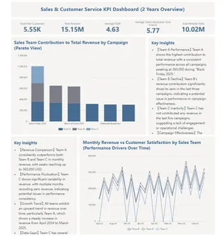
1. KPI Tracking Dashboards: stabilizing metrics that constantly change
KPI tracking dashboards are designed to give leadership a consistent view of performance. In operations teams, however, KPIs are rarely as stable as they appear. Definitions shift, sources change, and numbers are updated frequently.
In practice, these KPI dashboards are usually implemented as structured Excel views maintained over time. Excelmatic becomes the way teams operate and refresh these dashboards without rebuilding formulas every reporting cycle. The dashboard itself is not redesigned; the workflow around it is simplified.
In this scenario, Excelmatic’s role is not analysis depth, but metric stability at scale.
2. Performance Comparison Dashboards: rebuilding context without rebuilding files
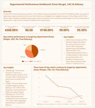
When leadership asks why performance moved, operations teams turn to comparison dashboards. These dashboards compare periods, channels, or segments, and they change frequently based on the question being asked.
Instead of duplicating Excel sheets or hard-coding comparisons, teams often implement this dashboard type through Excelmatic as a recomposable comparison layer. Existing Excel data remains intact, while comparisons can be reshaped quickly when new questions arise.
Here, Excelmatic is not an add-on. It is the mechanism that allows comparison dashboards to stay flexible without becoming chaotic.
3. Exception and Outlier Dashboards: turning spreadsheets into signals
Exception dashboards focus on what does not look normal. For operations teams working in Excel, this traditionally means manual filtering, sorting, and scanning across large tables.
When implemented through Excelmatic, this dashboard type shifts from manual attention to structured detection. Teams use Excelmatic to surface anomalies directly from existing Excel data, turning raw spreadsheets into signal-oriented analytical views.
The dashboard is still Excel-based. What changes is how quickly issues become visible.
4. Operations Efficiency Dashboards: dashboards that evolve with the workflow
Efficiency dashboards track how work flows through the organization. Cycle times, bottlenecks, and delays change as processes change. This makes rigid dashboard systems impractical.
Operations teams typically implement these dashboards as evolving Excel workspaces. Excelmatic acts as the interface through which metrics are tested, adjusted, and validated without locking teams into fixed definitions.
In this context, Excelmatic enables continuous iteration, which is essential for dashboards tied to real operational work rather than static reporting.
5. Ad-hoc Decision Dashboards: when Excel workflows face real pressure
The most defining dashboard type for operations teams is the ad-hoc decision dashboard. These dashboards are created when leadership asks an unplanned question and expects a fast answer.
Data is incomplete. Definitions are unclear. Time is limited.
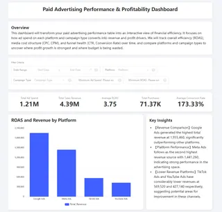
In these situations, operations teams typically implement analytical dashboards directly through Excelmatic on top of existing Excel files. Rather than rebuilding models or reports, they use Excelmatic to transform messy spreadsheets into decision-ready views quickly.
This is not a temporary workaround. For many teams, it is the core way analytical dashboards function day to day.
How operations teams build analytical dashboards with Excelmatic
Across all dashboard types, the workflow operations teams follow is consistent:
- Existing Excel files remain the source of truth
- Analytical dashboards are built on top of those files, not instead of them
- Excelmatic is used to structure, reshape, and operate these dashboards as questions change
- The same workflow is reused across KPI, comparison, exception, efficiency, and ad-hoc scenarios
 This approach does not replace analytical dashboards.
It defines how analytical dashboards actually work in operations environments.
For operations teams, Excelmatic is not a separate analytics tool.
It is how Excel-based analytical dashboards are built and used under real pressure.
Turning analytical dashboards into a daily operations advantage
For most operations teams, analytical dashboards are not a destination. They are a daily tool used under time pressure, shifting questions, and imperfect data. The teams that move faster are not the ones with the most sophisticated BI stacks, but the ones that can turn Excel workflows into usable analytical dashboards without friction.
This is where Excelmatic fits naturally. By working on top of existing Excel files, it allows operations teams to build, adjust, and reuse analytical dashboards across KPI tracking, comparisons, exceptions, efficiency analysis, and ad-hoc decisions—without rebuilding everything each time a new question appears.
If your team already lives in Excel, the next step is not replacing it.
The next step is making it work like an analytical dashboard system.
Frequently Asked Questions (FAQ)
Q: What analytical dashboard types do operations teams use most? A: Operations teams commonly rely on KPI tracking dashboards, performance comparison dashboards, exception dashboards, efficiency dashboards, and ad-hoc decision dashboards, usually built on Excel rather than BI systems.
Q: Are analytical dashboards in operations usually built with BI tools? A: In many operations teams, analytical dashboards are not built with full BI platforms. They are typically Excel-based workflows adapted over time to answer changing business questions.
Q: How does Excelmatic fit into analytical dashboards? A: Excelmatic serves as the workflow layer that turns Excel files into usable analytical dashboards, allowing operations teams to restructure, compare, and explore data without rebuilding dashboards from scratch.
Q: When should operations teams use ad-hoc analytical dashboards? A: Ad-hoc dashboards are used when leadership asks unexpected questions that existing dashboards cannot answer, requiring fast insights from incomplete or evolving Excel data.
Q: Is Excelmatic a replacement for analytical dashboards? A: No. Excelmatic is a way to build and operate analytical dashboards on top of Excel, making them more flexible and responsive to real operational pressure.

