- You're constantly busy and working long hours, but you have a nagging feeling that your effort isn't translating into meaningful results or career growth.
- Relying on gut feelings or falling into the "productivity theater" trap—working longer just to be seen—leads to burnout, not a breakthrough.
- AI-powered tools like Excelmatic make self-analysis effortless. They can turn your simple, daily work log into a clear and objective "Personal Performance Report."
- This guide will show you how to use AI to turn vague feelings about your work into actionable, data-backed insights, helping you find your unique high-efficiency zone.
Are You Trapped in the "Hours Worked" Fallacy?
Does this sound familiar? It’s late, the office is quiet, but you're still at your desk, polishing a presentation or answering one last email. You might even feel a strange sense of accomplishment logging a 12-hour day. But deep down, you wonder: did those extra hours actually move the needle, or were they just... time?
This is the "Hours Worked" Fallacy: the dangerous belief that being busy is the same as being productive. In many modern workplaces, this leads to "productivity theater"—the act of performing work to look busy, rather than focusing on impactful outcomes.
To break this cycle, you need an honest mirror, one that reflects your true performance without bias or emotion. In the past, creating this mirror required complex spreadsheets and statistical know-how.
That has changed. AI-powered tools like Excelmatic are that mirror, polished and ready for you to use.
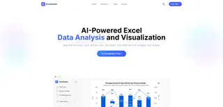
AI as Your Personal Performance Analyst
Imagine having a dedicated performance analyst. You hand them your daily notes, and moments later, they present you with a visual report that clearly shows your efficiency patterns.
This is exactly the role an AI tool like Excelmatic plays:
- It Understands Reality: Your work log won't be perfect. Some days are productive, others are not. The AI is designed to handle this messy, real-world data without errors.
- It Reveals Connections: It does more than just chart your data. It calculates the actual statistical relationship between the hours you put in and the results you get out.
- It Presents the Facts, Visually: Most importantly, it translates cold, hard numbers into an intuitive visual story. It gives you a straight answer, not a hundred confusing options.
Let's walk through how to use this AI-powered mirror to conduct a powerful self-assessment.
Your Three-Step Guide to Uncovering Your Productivity Truth
Step 1: Log Your Real-World Data
You don't need a fancy app. A simple Excel file is perfect. For the next week or two, take two minutes at the end of each day to log your "inputs" and "outputs." The more honest you are, the more valuable the insights will be.
Data Prep: Create a file named My_Productivity_Log_2025.xlsx.
A Realistic Data Sample:
"Key Outputs" can be anything you define as a valuable accomplishment: reports completed, tickets closed, features shipped, client calls made, etc.
| Date | Hours Worked | Key Outputs (Count) |
|---|---|---|
| Mar 3, 2025 | 9 | 2 |
| Mar 4, 2025 | 11 | 1 |
| Mar 5, 2025 | 10 | 3 |
| Mar 6, 2025 | 12 | 4 |
| Mar 7, 2025 | 8.5 | 1 |
| Mar 10, 2025 | 9.5 | 3 |
| Mar 11, 2025 | 10 | 2 |
| Mar 12, 2025 | 8 | 4 |
| Mar 13, 2025 | 11.5 | 3 |
| Mar 14, 2025 | 8 | 1 |
Note: This data is intentionally imperfect. On March 4, you worked 11 hours for only 1 output. On March 12, you worked 8 hours for 4 outputs. This is precisely the kind of pattern an AI analysis will illuminate.
Step 2: Upload and Ask Your AI Analyst
Upload your Excel file to Excelmatic.
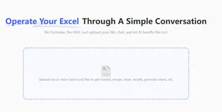
In the prompt box, ask a clear, simple question in plain English:
Create a scatter plot with 'Hours Worked' on the X-axis and 'Key Outputs' on the Y-axis. Add a trendline and the R-squared value.Step 3: Interpret the Insights From Your Performance Report
The chart generated by the AI is your objective, personalized performance report. Here's how to read it:
Insight 1: Where is Your "Point of Diminishing Returns"?
Look at the slope of the trendline. If it starts to flatten out after a certain point, that’s your "point of diminishing returns." The AI has just shown you the exact hour in your day when more time on the clock leads to exhaustion, not excellence.
Insight 2: How Much Does "Working Longer" Actually Matter?
Focus on the R-squared (R²) value. Think of it as a "Correlation Score" from 0 to 1. It tells you how much of your success can be explained by simply working more hours.
- A high R² (e.g., above 0.8) means your output is strongly tied to the hours you work.
- A low R² (e.g., 0.4) is the most powerful insight the AI can give you. It means that a staggering 60% (1 - 0.4 = 60%) of your success has nothing to do with working longer. It's driven by other factors: your focus, your energy levels, your methods, or who you collaborate with. Your next big win isn't in working a 12-hour day, but in optimizing those other factors.
With this data in hand, you are no longer guessing. You can make confident decisions to stop work at your point of diminishing returns and reinvest that time in learning, health, and optimizing the 60% that truly drives your success.
Frequently Asked Questions (FAQ)
1. Q: My personal performance data is sensitive. Is it secure on your platform?
A: We take this extremely seriously. Excelmatic uses end-to-end encryption for all data and is built on a foundation of strict privacy principles. We will never use your data for model training, and you have the power to permanently delete all your files and history from your account at any time.
2. Q: Do I need a background in statistics to understand things like R-squared?
A: Not at all. That's the beauty of using an AI tool. You don't need to know the formulas. Just think of R-squared as a simple "correlation score" telling you how much your time and results are connected. The AI does the complex math so you can focus on the simple insight.
3. Q: What if I miss a few days of logging or my data isn't perfect?
A: That’s perfectly fine and expected. The AI is designed for real-world use, not for a pristine lab environment. It can handle missing values and inconsistencies. As long as you have a reasonable number of data points (we recommend 8-10 or more), it can still identify meaningful trends.
Final Thoughts: Evolve, Don't Just Revolve
Stop letting vague feelings of "busyness" dictate your career. It's time to let clear, objective data guide your actions. The rise of AI analytics tools means that anyone can now become the chief architect of their own efficiency.
True high-performance isn't about winning the "who stayed latest" game. It's about deeply understanding yourself and continuously evolving how you work.

